I’m actually in this demographic.
If I’m looking for information on plants, I’m not looking for a clean trendy, modern, hipster logo website. For me, growing plants is all about dirt and green and environmentally pleasing. Maybe not black oil slicks on waves. I want something that looks like it knows what it’s talking about. And quite honestly, this kind of website, the logo isn’t going to sway me as much as the first couple of posts I read. But it would help if the logo were sincere.
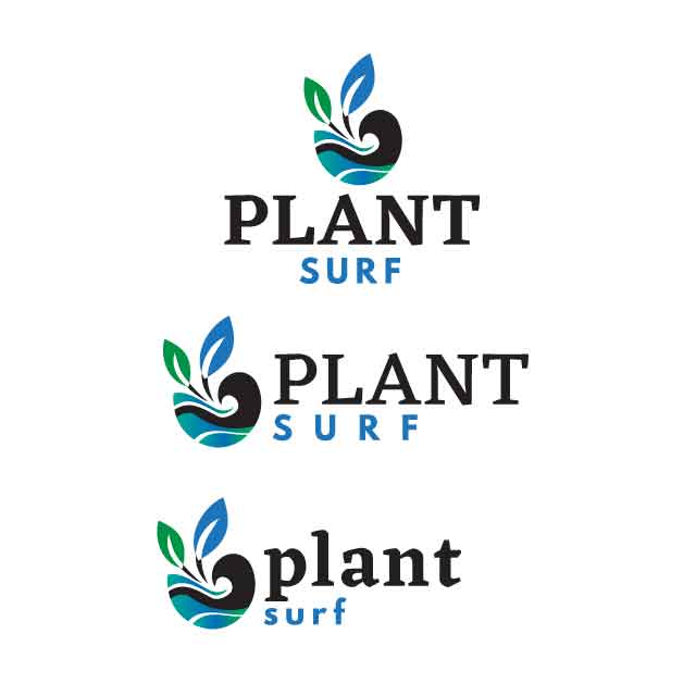
I guess now that I know your focus a little better, I have to ask why the focus on wave and surf rather than green and plants? The color black also has a weird connotation in gardening relating to “black thumb” so either it’s about killing plants, or maybe where someone would look to get information to avoid killing them, but the second is a stretch.
Or maybe this is a hydroponics website? Then you might have hit your target with the top one.
You can go all trendy and modern and maybe appeal to the people who mist their gift orchid til it dies, or you can appeal to people who actually grow things. If this is not aimed at the trade, but more toward hobbyists, you might want to rethink. Take a look at sites like Dave’s Garden or GrowVeg.
(Those are just two sites I use and DG has grown beyond the capability of their webmaster and is quite a mess now. But usable.)
This kind of style would be more suitable for a community or an exclusive club I suppose, or more classy lifestyle?
I think sans serif will look much better, as it’s simple, generic, non-specific, common, precise and straight forward
thank you!
The focus is the plant, because it’s with colors while the wave appears in black. I think it will make easier for the eyes to recognize the shape as a wave with solid darker color.
I’d like to have the pictorial mark that is not part of the text, so it can also work as icon for the business.
@Smurf2 , @PopsD
However, I’d still want to see how the Eczar font could represent the company business, so here’s my try
I agree you should be concerned about that, but I disagree with your color solution. Your color use is confusing what you’re attempting to communicate.
For example, you have a green leaf and a blue leaf — both with black stems, yet plants aren’t blue and stems aren’t black. Your water is composed of a blue-green gradient, yet the wave part of that same water is black.
Plants aren’t blue or black and waves aren’t black. I’m not saying you shouldn’t take artistic liberties with colors, but I am saying that if you’re choosing color to help clarify what the objects are, you’ve done the opposite.
thank you.
It’s a logo, not a painting
I just need to find good balance with the color combos. If the pictorial mark just using black color, hope it would still be noticed as how it’s expected.
Found an inspiration of a logo that uses uncommon color schemes:
I don’t know what you mean or how it’s relevant. We could discuss how Franz Marc’s painting of blue horses works just fine, but like you said, this is a logo — not a painting.
My main point is your colors aren’t working — they’re confusing what you’re trying to clarify in the logo.
The snail works, because it looks like a snail, despite the playful and unusual colors. Your logo, on the other hand is an amalgamation of disparate elements of leaves waves and water that aren’t nearly as easily resolved into a meaningful object or objects.
There is no overall shape to clearly define what it is. You’ve essentially said so yourself in the statement about making the wave more obvious by making it black. Again, rather than helping to clarify what’s going on in the logo, your choice and application of colors are making more confusing a combination of shapes that are already a bit confusing.
what I meant was that a logo would probably not always be as realistic as what it can be visualized in painting.
So far, that’s the concept I stick onto. There are many ways to visualize plants, or waves. It can be subjective all the way for each audience. I can not always changing my concept each time someone gives comment .
I can only hope not much audience getting confuse with the pictorial mark.
Nevertheless, thank you for your constructive feedback
Problem is - you didn’t do the modification as requested and you went your own path.
Imagine if you did that with the client, they could ditch you for things like that.
You had a nice balance of Plant Surf - and I wanted to see was the combination of the two fonts. So two instances.
I’m giving up on this one early. Like I said, on something like this, the content is more important to me as a user. As the site owner? They might have a different opinion.
Bonne Chance!
I’d like to add that your color choice is going to be influenced by the most common background color, if this is for a webgroup like a forum. For instance, you made the wave black to make it stand out and be more visibly wave-like, but on the white background you’re using that high contrast and…what’s the word, relative density?.. also makes it the focal element, not the plant leaves. It’s a very dark, solid object , and on a white background that’s where my eye goes first. I have to pull away and deliberately look at the rest of the logo. I think in general you should tweak and rebalance your icon - the colors should be helping with the communication, not trying to carry it.
Fontwise, since that was your initial request, on the latest iteration I like the last pair of fonts together, but I’d rearrange them. If this is going on a forum or website, maybe try arranging them horizontally so they form a nice, long header bar, not unlike where you started.
Thank you for your comment!
The thing is, if I used lighter color for the wave, the whole pictorial mark might look like an apple
I could just simplify the pictorial mark, but I am not sure that it’ll be as unique as now, or i would be too literal in visualizing the business name.
It’s a plant that surfs ~ so I need the nautilus shape to be there, side by side in a unity with whatever that can symbolize plants.
Maybe I’d just change the leaves into cactus
@Smurf2 actually this logo is part of my personal project, so I am the client lol.
I think this is totally true for grotesque san serif typefaces, however I don’t know whether the same can be said for geo san serif typefaces, they have more character.
That’s the problem, the bug ain’t working either.
But well over a combined 100 years of experience in this thread can’t convince you otherwise. I stand by my second post.
@PrintDriver forgot to say thank you, so thank you!
Regardless of how the logo design would end to be, I really appreciate everybody’s feedback, everybody’s time and I respect your experience.
I’m a studious person, so I currently digest all of the information in this thread. I am learning and still.
I’ll keep posting some more of my logo designs here, I have like a dozen more to design