Hello!
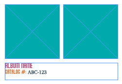
I’m new here. I hoping fellow designers can help me out with an element of a project I’m working on, as I’m second guessing my font choices. I’m working on a book that’s going to list a slew of music albums.
When viewing everything on screen, I was happy with it, but I recently printed out a review copy and I’m second guessing if the serif catalog number works with the sans serif album name and “Catalog #” label. Any feedback would be much appreciated!
Just to give a quick disclaimer, because I’m sure from your point of view, the three colors may look…for lack of a better term…stupid. However, it does fit in with the design. It’s matching a poster from the 70s or 80s that was used as the inspiration for the book concept.