Hi there, I am currently working on the final project in my school where I need to design a logo for myself, since I’m planning to go freelance.
I’ve been looking for a name for a while, I know I don’t want to go with my real name as the company name since I really want to separate the personal with the professional. I aim the gaming industries and everything that’s not traditional corporate (if you know what I mean )
I mainly do photomontage with surreal composition and fantasy ambiance and, of course, logos.
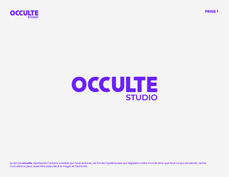
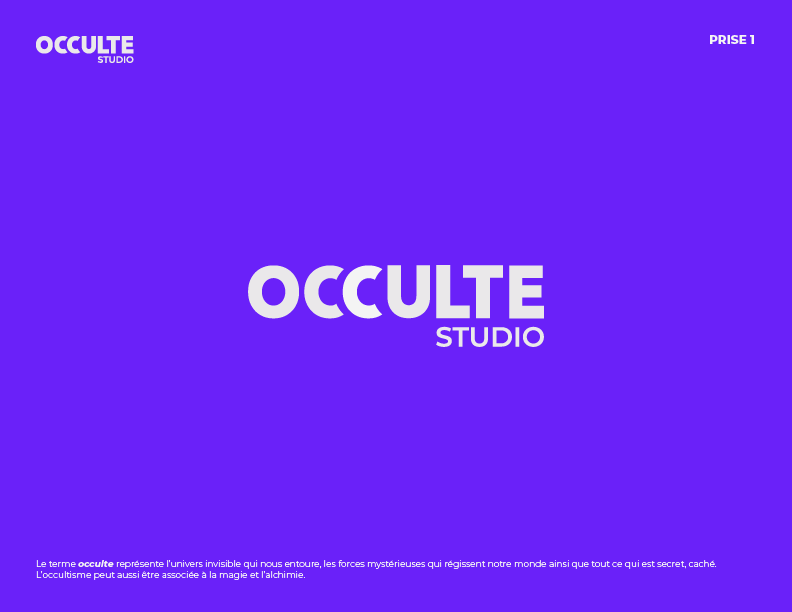
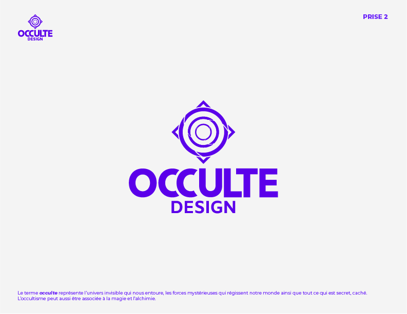
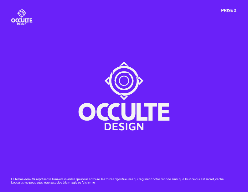
Here is what I found : Occulte Design or Occulte Studio. My region mainly speak French (canadian-french) so that’s why I chose a French term eventho Occulte is nearly the same as Occult (occultism).
Here is what I ask ; I would like you guys to critique my logo with the technical aspect and with the meaning of it.
My advice would be, shelve the logo for a while, then go and get four or five years’ experience in the industry before even thinking about going freelance. You need industry experience.
The logos are OK (first better than second with some work). Kerning needs looking at, but it’s better than a lot of graduate work I have seen, which is why I am suggesting getting real world experience first. You have potential, but straight out of college is the time you start learning how to do the job.
Not what you want to hear, I’m sure, but with pushing three decades of experience behind me now, I seem so many optimistic newbies fall by the wayside. Get all your ducks in a row and it will stand you well for the long term.
Yes, I’m planning to find a job but I’ll be freelance in the side line and I hope someday I will be able to quit my job and just doing my freelance work. Where is the kerning looking weird?
All of it needs looking at, but the largest uncomfortable hole is between the second c and the u. Also needs adjusting differently when black on and reversed out. Compare the visual space between the o and c on the first example on the black on and reversed out versions. Looks far tighter on the reversed out example.
I’ll suggest removing the small, thin lines from the logo. I don’t know why they’re there, but they’ll cause problems when reproduced at smaller sizes.
So, about the letter spacing. Yeah, it needs some work.
The objective is to get a visually even amount of space between the letters. It can never be perfect and it can’t be based on actual measurements. Good kerning is always a truce that reached between letters that just don’t want to coexist beside each other, so something of a compromise needs to be reached.
For example, the U and L can cozy right up next to each other, but that draws attention to itself since none of the other letters can do that. The absence of negative space between those letters create a heavy area in the word mark that isn’t repeated elsewhere. The compromise is to move those two letter apart a little more.
You’ve dealt with a problem with the two Cs by shaving of the ends of the first C, which creates a nice bit of customization, but maybe you’ve got a little too far with it and made the letter look narrower than the rest. Then you’ve unnecessarily carried over that truncated shape to the next C where it contributes to the problem of there being too much negative space between the C and the U. Compound all this with the always problematic uppercase LT pairing, which is a letter combination that’s always difficult to deal with.
What Pantone color is that? My color correct monitor is telling me it looks like it’s going to be one of those “brights” that does not translate well into CMYK.
Sprout’s advice is solid as far as gaining experience before striking out on freelancing.
The other part of that is, it may be difficult to find a job while maintaining an active freelance. Not many agencies are going to want you having clients on your own. It’s called a conflict of interest. In fact, even though it’s been a long time since I graduated, even back then we were advised not to use designed logos on our resumes when applying for work just to avoid that COI possibility. Where I work now, we can have outside clients, BUT you are not allowed to be on the phone or online with them during work hours, and if you are sent on site for an installation, no, you cannot sub someone else because you have a side gig in the works.
Logos. Of course. Everyone does logos. My proverbial nephew with Photoshop does logos. My take on logos is that any designer who does them should have to carry malpractice insurance. A logo is only one very small part of an entire business’s public face. If you aren’t integrating the logo into the whole, you are just making pretty pictures. Someone’s livelihood is riding on the success of what you create and how the intended clientele perceives it. This is not the realm of a student freelancer. In fact a lot of seasoned designers avoid logo and ground-up brand development because it is expensive and risky.
And on a last note, it’s all well and good to have a ‘style’ but a designer has to be a chameleon. And a mind reader. Trying to make a living doing photomontage and surreal composition in the fantasy realm is going to be tough, even among the gaming crowd. Creating sigs or team icons by colliding a bunch of online art together is a hobby thing. There are a lot of starving illustrators out there right now.
Whatever “not traditional corporate” is doesn’t pay the bills either. Unfortunately, with the 10% of the stuff you do like to do, there comes a good 90% of stuff that just plain pays the bills. And of that 90%, a good half is going to be the overhead areas of billing and marketing yourself to new clients.
Thanks a lot, It is really useful advices. I was struggling with the kerning and I don’t know why but what you said about the two Cs it might be the reason.
I’m not using a Pantone right now since it’s only in its early days. I am currently working on the concept and I will surely change the colour and then use a Pantone.
And I know what I have to do to get the bills paid. I was just saying that I would love to live with my artworks and I’m sure just like everyone out here.
I will probably join an agency or be the graphic designer of a company for a couple of years or maybe join a game studio. But with all the social media’s currently on the internet, if you put enough efforts in it you can grow a sufficient community or “fan base” to get enough contracts to keep the bills paid.
That’s my dream work but I’m a realistic person so we’ll see.
For now i’m just trying to get the best grade possible for my school project
Stick with Occulate Studio. You do need to address the space between the second C and the U. Mostly because the first three letters are so round and the last part of the word is angular. Try to find a creative way to manage this.
Also, ditch the icon and pick a new color. Since you’re starting out, find a Pantone swatch that is similar just to be on the safe side. Eventually, you’ll want to get this on a business card to hand out when you’re networking and you’ll want it to match your website.