These are the details for the whole project.
I’m starting a new business and I’m looking to establish a strong brand and visual identity. I’ve heard great things about your work as a graphics designer and would love to get your expertise. Here’s a bit about my business:
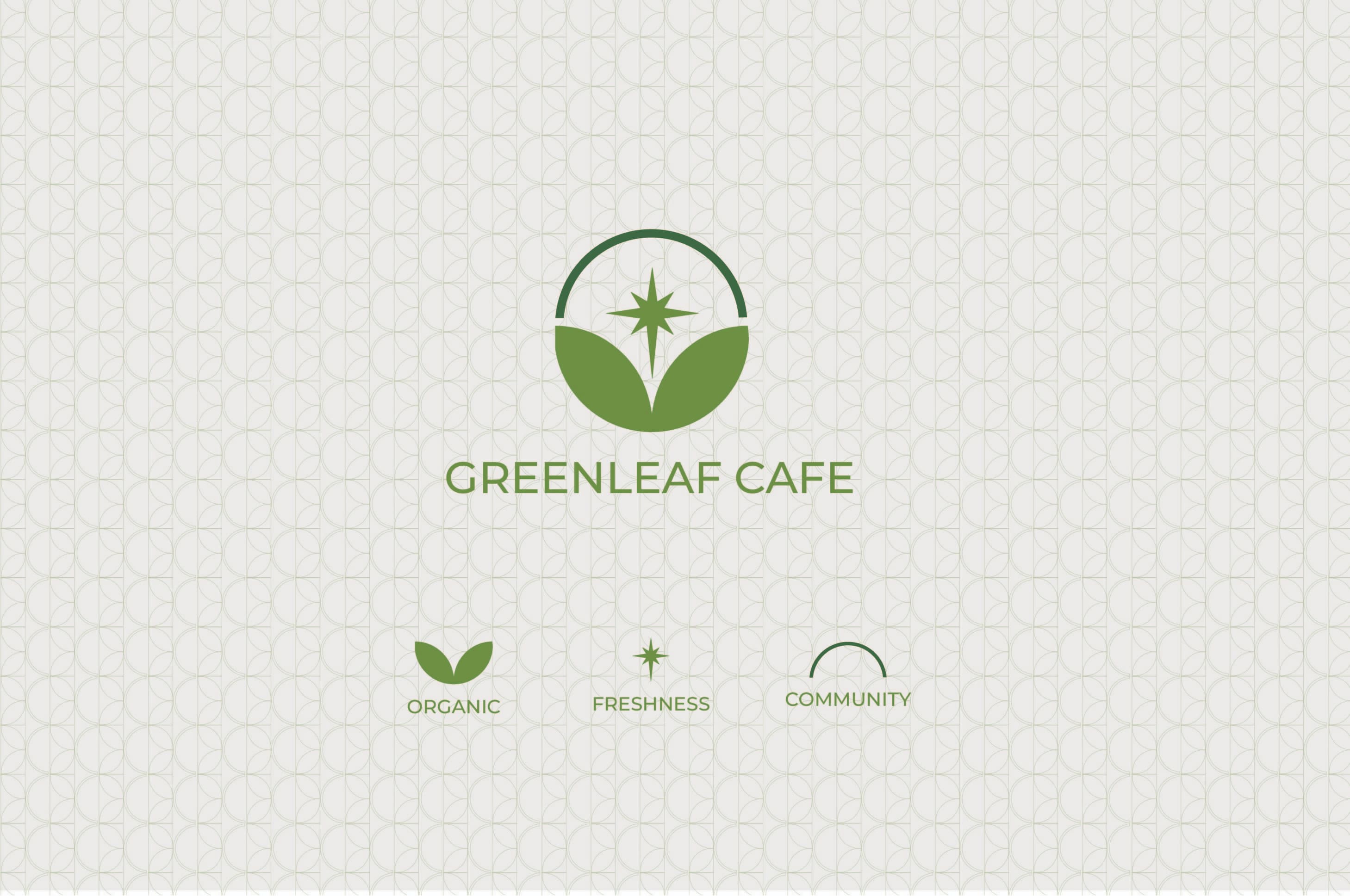
Business Name: GreenLeaf Cafe
Industry: Organic and sustainable food cafe
Target Audience: Health-conscious individuals, eco-friendly advocates, young professionals, and families.
Values: Sustainability, health, community, and freshness.
Its a fine logo and will do the job but in my opinion it doesn’t seem to be very unique. That’s not to say it wont do the job needed (I don’t know the price the proposal is set at) and if its a 25$ logo then you get what you pay for as a business owner. It’s just generic.
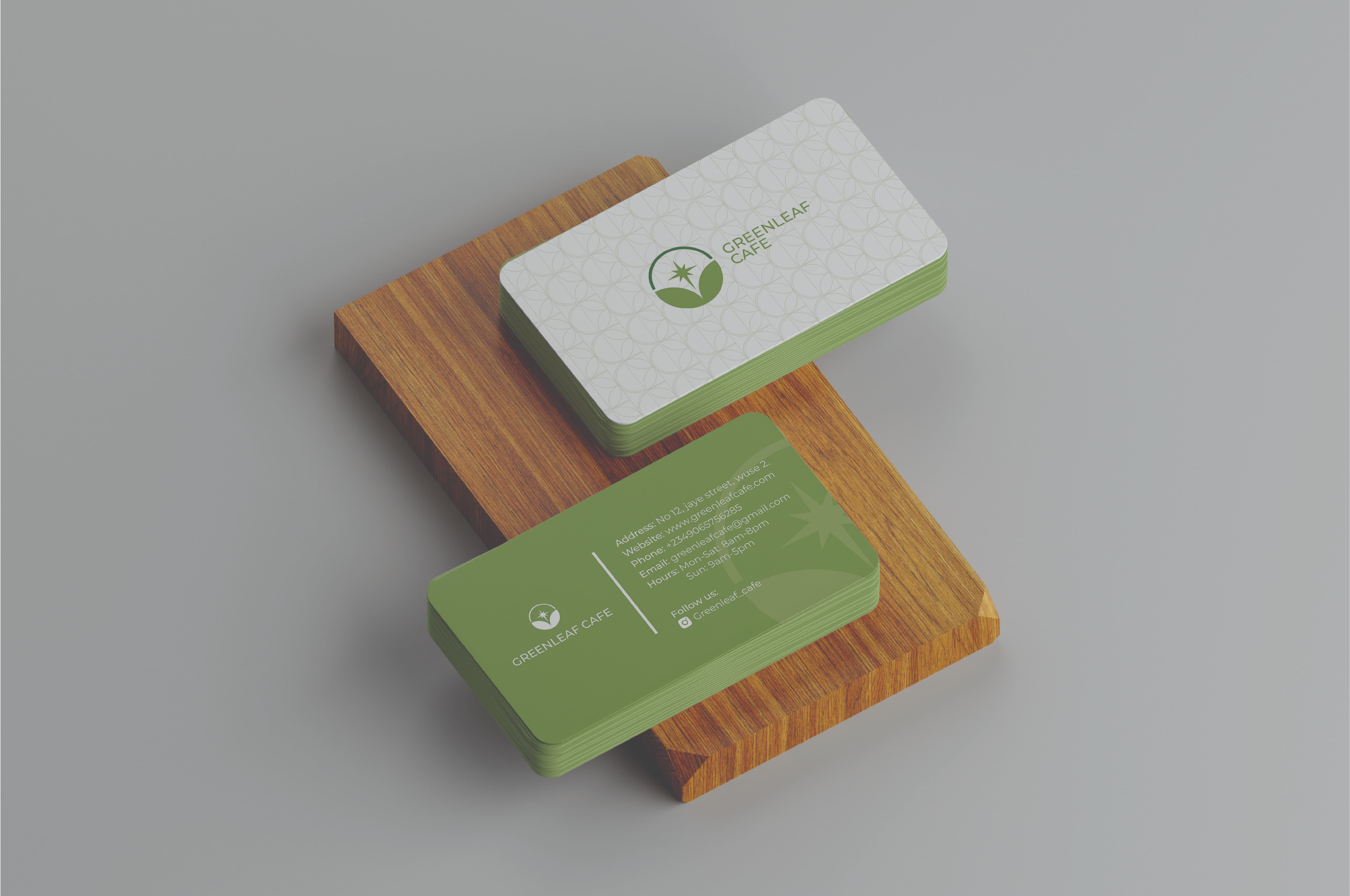
For the business card you might want to add more contrast with scale or texture.
As @Stefanos1984 asked, did you design these yourself or are they the work of a designer you hired? The forum rules frown on submitting the work of others without their permission.
My first thought was cleavage a la “Jessica Rabbit.”
My second thought after reading your post is that it is too clean and corporate-y looking. I think it needs more of a human touch than geometric shapes and a geometric sans font.
Way back in the pre-digital era, when I was an intern while attending school, I designed a logo for a program associated with state parks. It looked very much like this one.
The two leaves were the same, as far as I remember. It didn’t have the little star symbol, and the arc over the leaves that completed the circle was a rainbow (which didn’t have the same connotations as rainbows have today).
Over the years, I’ve seen several variations of this idea. — yours being the latest.
What you’ve done looks a little corporate for a café, but it would probably work. Something about the sharp pointiness of the star juxtaposed with the friendliness of the leaves seems a little mismatched. The line over the top that completes the circle seems awkward to me. In addition, I wonder why the line is a darker green than the leaves and the star.
To sum up, I like the idea, but it’s been done before many times. It seems a little too corporate-looking. The three component pieces could harmonize with each other a little better than they do.