Hi everyone!
The past two weeks have been quite a tumultuous journey for me.
Trying to find a graphic designer, who can create my studio logo.
Long story short, it wasn’t a successful search.
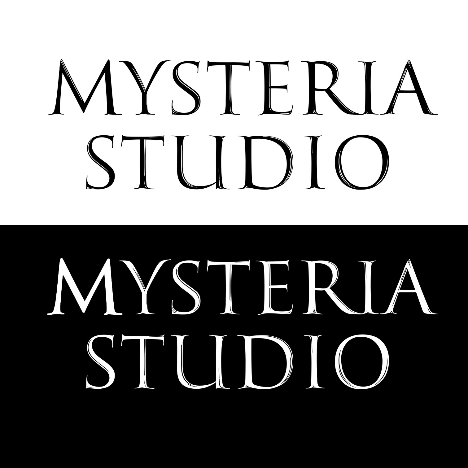
So I decided to give it a try myself. These are the results.
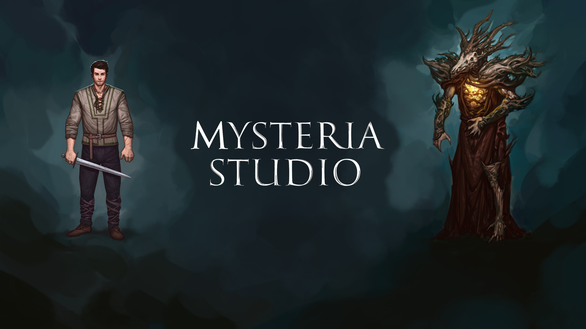
The first image is just the logo. The second is supposed to be the website header image.
My biggest worry is, that the logo itself is somehow not exiting enough, because it is so simple.
Though, combined with the background, I quite like it.
So now I’m curious, what do you guys think?
And what could be done to improve the logo?
What does your studio do? Who is your audience? What potential audience would you like to engage.
Where will the logo appear? Logos aren’t typically relegated to just website headers? Do you have products, signage, promotional items, invoices, receipts, and that sort of thing where your logo might appear? If not, can you be certain that you won’t have them in the future?
Aesthetics are only one consideration in logo design. They also need to be practical.
There’s nothing wrong with a simple logo. Logos don’t need to be exciting — they need to be memorable, practical and send the right signals to the intended target audience. Almost all useful, adaptable and memorable logos are simple. For that matter, simple is usually better than complicated.
This particular logo type has small inlines that will completely disappear into pixel mush at smaller sizes. You can already see this happening on your second image. It’s possible to keep them for larger sizes, but you’ll need a separate version of it for smaller sizes that leaves them out.
It also runs the risk of not looking especially unique — it’s basically just letters from a typeface. There’s not necessarily anything wrong with this approach, but considering your subject matter, (which I’m guessing has something to do with the imagery you posted) you might want to consider something a little more in keeping with the overall personality. Even if you decide to just use straight typography, my first inclination would be something more in along the lines of a blackletter or uncial typeface.
We develop a medieval fantasy action RPG for PC / Consoles.
The target audience are mostly men in their twenties, who like action RPGs.
Actually, I picked this website header image, because for the time being it will just appear in header images of the website, social media profiles etc.
You are absolutely correct though, in the long run the logo will appear in different formats, for example video game packages.
Awesome thanks for the tip, if I decide to go with this logo, I’ll create a separate version without the lines in the letters. For images, that are typically viewed at a small size.
True, it not looking unique enough is definitely a big concern right now.
My first idea there was to complete the logo with an image displayed above the text?
Or perhaps in the background, behind the text?
I’ve gone through dozens and dozens of blackletter fonts and they always either had really weird looking letters, and / or reminded me, or my friends of fonts used in Nazi Germany.
My company is German, so this is particularly problematic here.
I like the uncial typeface alternative though! I’ll definitely take a look at some more of those fonts.
There’s still lots of blackletter type used on signs and scattered about in other ways throughout iGermany. I’d think the blackletter tradition that heads all the way back to Gutenberg would be entrenched deeply enough to have survived the Third Reich.
There are lots of new blackletter typefaces that have been designed over the past few years that aren’t quite as ornate and difficult to decipher as the traditional German designs. But if you’ve looked and don’t think they’ll work, that’s sort of why I suggested Uncial, which is a form of European blackletter not especially associated with Germany, but definitely with a Medieval association.
Although, it would probably work, the typeface you’ve chosen has more of a French or Italian look and definitely not Medieval. When I think of Medieval fantasy games, my mind goes straight to the dark forests of northern Europe and not to the French countryside. Then again, I’m sort of a type geek, and not too many others would pick up on these sorts of things.
If you’re going to use this typeface, you’re going to have to address kerning issues (the spaces between the letters.)
I wouldn’t add a bug (image) to the logo, though you might want to explore Drop-capping Mysteria. Be careful when doing that though that you don’t overemphasize the letter by thickening it. It may require hand drawing.
Also check your M details on the reversed letters. You aren’t getting the blow-thru on the small detail that you have on the black letter version.
Regarding your figures in your header, they are boring and overly large. You might do headshots (shoulders up) rather than take up all that space on your page header. If your game includes some action, you might want to put the figures in action poses rather than have them just standing there being boring.
Your smoke details, is that a render from the game? The edges are a little harsh, but maybe that is intentional. You might want to ground your figures a little more, especially the guy on the left. He seems to be floating a bit.
I was kind of hoping someone would mention the kerning issues.
As they are bothering even me, and I’m a programmer, not a graphic designer.
Could someone please explain to me, what the most glaring issues are?
And, if that’s not too much trouble, perhaps briefly explain how to fix them?
Drop-capping Mysteria sounds like a good idea, I’ll keep that in mind.
I’ll fix the M details, before putting the logo on my website.
Don’t worry about the background too much for now, it will change and be improved like 3x this year. So it’s not a huge priority right now. I’ll make sure the guy on the left isn’t floating though!