Hi Guys - I’m working on my own company branding (not started trading properly yet) - my skills are in Web Dev, but I’ve recently completed a design course (you may have seen my student posts).. so I’m still finding my feet.
Anyway, my last name is Gosling, so I’m going with ‘Gander’ as the company name - or rather GanderCom. Like, have a gander, take a look, etc.
The logo will be used in all my media (cards, web etc) and form the basis of my marketing package.
The reason I’ve gone with purple is it’s my signature colour (I wear a lot of purple) so for my potential clientele it’ll be a good brand hook.
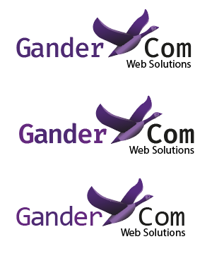
I started with a pretty stylised Goose with a secondary orange colour:
But thought I’d rather a smoother design, so came up with the following Goose and fonts. The fonts I’ve chosen are primarily used in programming interfaces, so I thought that might be a nice nod to my dev background.. the options I’ve come up with are:
I’m going to be totally honest, am not a huge fan of all of the gradients and all of the 3D detail in the icon, its too busy. I also think you should stick to 1 font and colour for the type, would say I definitely prefer the boldest font out of the ones you’ve picked.
I like the concept of the goose, have you considered exploring a 2D icon version?
I think something like this would look pretty slick, :
just personal preference but something about the word “gander” just doesn’t sit right with me.
Other then that something about it looks very windows 98 too me…has a retro, old graphic interface feel to me.The typeface your using has that feel too, especially that serif on the “r”, the word “gander” itself has an outdated terminology feel. I would think you would want something that stood out as more high-tech, innovative, clean, modern, sleek in order to express to your clients that you are at the cutting-edge of web development. And though the first logo has a more techy, abstract feel to it, it again still looks very dated to me.
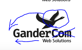
Other then that, I think the way you split Gander from “Com web solutions” doesn’t balance well. When looking at the logo the visual weight is on the goose and the Com/web solutions. Therefore, i completely ignore your company name. My eyeline is drawn to the right side of your logo.
If you were to keep the logo I would look to increase the size or weight on “Gander” and make the “com” smaller.
Look again. All the kerning needs a lot of work, assuming you decide to stay with these font choices. Not sure I would. I like the more realistic goose, but it still needs refinement. Impress me by eliminating the tint and gradient dependencies. Simplify. Make it embroider-able.
A word of advice: Don’t post any typography that “still needs work”. You’ll want to make sure that’s the first thing that you’re proud of. The icon is secondary.
I agree with @pluto that your goose icon is too busy. It completely breaks apart the way you read the logo.
Suggestions:
Remove the icon, work on the type, and then fold it back in.
Really put some consideration into your typeface. Is there anything else that you can use which can portray a more technical or more nature/bird-like quality that you can find?
Simplify the icon even more. It doesn’t need to be a silhouette, but keep pushing it forward.
Is the website gander dot com? That’s how I’m reading this logo. If not, consider removing the “com” part of your title.
I agree with what the others have said. I’d think about changing your name too. What is wrong with your actual surname. Gosling is a much more approachable word. Gander com does not scan at all well.
Thanks so much for all of your comments - apologies for the delay in my response (mental note: don’t post on COB Friday when I’m not going to be back in front of my computer until Monday morning!).
@SurfPark / @HotButton - funny - I was working on the icon so much that the type was a slapped on, secondary thing. I do need to pay more attention to it - thanks for that.
I have invested time and money into the gandercom name, so I’m going to stick with that..
Time to go through the rest of the advice carefully! Cheers
Of course, it’s entirely your decision and if you are happy with it, who am I to say different. However, the value in a domain name only exists really when it has profile and reach. The actual cost of a .com domain is less than $10, so if you ever plan on changing it, I’d suggest doing it now before it has any real capital.
I hear what you’re saying - but I’ve been using the name for the last 5 or so years as a trading name (just getting onto the branding now - eeek!). But fair point about if it was just the domain name I’d be losing!
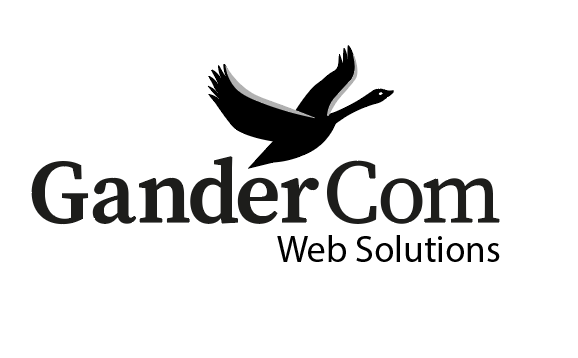
Right, had a chance to get back onto this today. I’ve taken on board about the fussy gradients and kerning and had another pass at the bird in more of a silouhette. Putting the bird on top does work a lot better than it flying through the name..
I tried it initially with the bolder font that @pluto liked - but at smaller sizes (business card) I’m thinking it might be too much..
So - is the black and white goose working better do you think? Too big / too small / about right?
Did I get the kerning right now?
Better, but, just make it flat black (or a flat second colour). The purple strip on the fore edge of the wing is almost indescernable and the tiny line on the other two will disappear.
There is a bit of tension between the tip of the tail and the e. Just needs moving up the tiniest smidge (technichal term!)
The type weight of the third option is the one I’d go for.
Kerning is more even (though still needs tweaking), but the overall letter spacing is too tight. It will all visually (and possibly, actually) merge at small sizes.
Finally, that lowercase m! Not your fault. But it’s hideous. Looks like it has been horizontally scaled to about 75%. Semi serif fonts can be nice, but the only one with a serif on is the r, which makes it look like a mistake. I’d find a font with a bit more integrity. The weights and stresses of this one are all over the place, which is half your problem. It just creates a sense of disharmony, what ever you do.
Perhaps look at something like Adelle for the main font and pairing it with something like meta for the secondary font. This should give you a similar feel, but look altogether more harmonious.
ZOMG - Adelle is huge!! I’ll try playing with some different fonts - it makes sense that only one letter with a serif makes the whole thing hang badly.
Looking at it now I think there are still some kerning adjustments to be made, but overall I’m really happy with it. Thanks to everyone for responding and giving me feedback - so very useful.
Much cleaner. However, you are still going to lose the eye and the wing fore-edges when you print at smaller sizes. Other than that, much better than previous incarnations.