So I’m very new to graphic design , I’ve started learning about it about a month ago and been doing research , learning to sketch things like that , & I recently got a laptop and wanted to do a quick logo design to see if moving in the right direction as far is creating logos
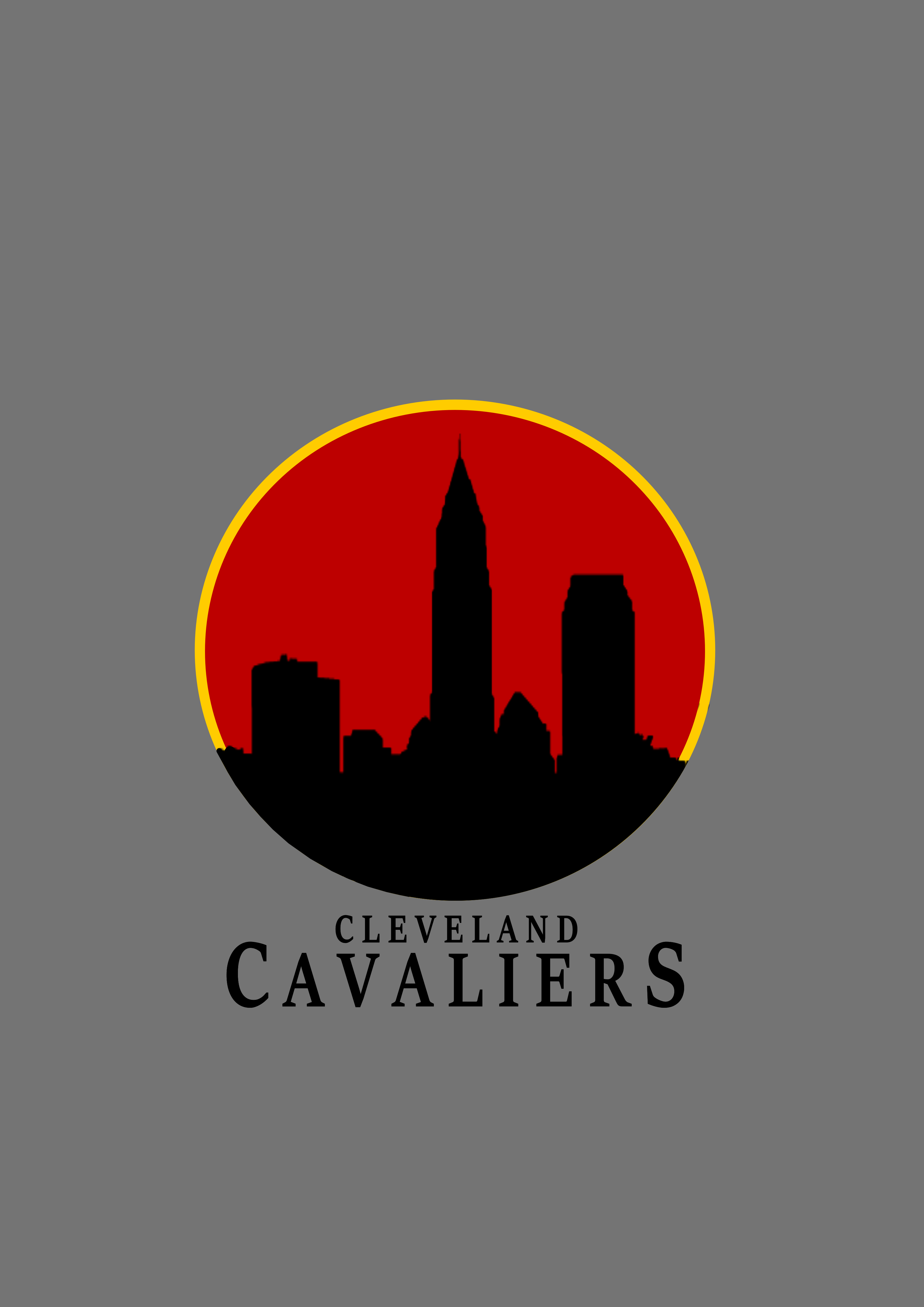
I wanted to start off simple so I just created a logo for the nba team Cleveland Cavaliers
I just want to know if it’s not bad for a first logo or if I am way off lol
If this is your first ever logo, I would say you did a fine job for just getting started.
a 3 Color logo could could run into some costly print expenses if the art were to be printed offset/spot color.
It’s also not going to convert well to 1 color black in it’s current state.
It’s also not very ‘athletic’ in nature for an NBA team. Their current logo looks ‘sporty’ and has a graphic element that reflects their name - The sword, represents the weapon of a mounted cavalry soldier or cavalier.
Your graphic reminds me of a radio station logo, or a news team - or a corporate firm of some-kind.
Designing a logo for a professional sports franchise is not simple. Simple would be a neighborhood dry cleaner or a friend’s blog. As an exercise to learn the software, this is fine; but as a logo for an NBA team, it isn’t working.
Yeah I originally wanted to have the letters outlined but I couldn’t figure out how to do it with the software , it kept coming out uneven , but yeah I agree
Most professional logos are done in Adobe Illustrator. There should be a way to precisely outline characters in any vector illustration app, but I haven’t used InkScape. I’d be surprised if there weren’t a way in InkScape.
Keep practicing! Read up on principles of logo design, look at “best logos of 2018” blog posts & articles, watch software tutorials, and research, research, research. Logo development is extremely complex.
When I’m starting a logo, the first thing I do is do a Google image search for logos of similar organizations. Then I spend a few hours analyzing the logos—colors, mark styles, typefaces, effects, usage.
For every logo, you need to know things about the organization you’re branding too. Research the organization—find out their target demographic, their brand “personality” traits, their main competitors, and what you want the logo to do for them. It can’t be a rebrand just for the heck of it. What does the new logo need to do that the current logo doesn’t do? What does it need to say that it currently doesn’t say well?
The way to outline letters properly is to build a stroke outside the letter form.
In Illustrator that means setting the stroke to go to the outside of the path.
You can also offset a path from the letter after converting to outlines.
In inkscape a workaround is to copy and paste your letterforms converted to outlines to the back, then stroke those and unite. That’ll give you a stacked version with your letters on top of the bloated shape that is the stroked letter.
This is actually an acceptable method of logo creation too. Stacking is good. Lines cutting through other shapes when viewed in outline mode is not.