General Critique

Hey there,

I want to improve myself, I know I can do better but I need the help of your harsh critiques, the following logo designs are from a " Daily Logo Challenge " thus I did not have the time to really improve them, also… they are the only designs that I kind of… you know have to show to other people. It seem that I cannot get a single client out of my design skills and I really need that because I somehow lost my motivation. Please help me get better. I need an overall impression on what I should do next because I feel a bit stuck. Thanks a lot !

1 Like

Overall, your work is nice. A few comments that might help. I like the fonts you’ve chosen.

Lighthouse – I’d say this is the one that could use the most work. The type is getting pretty small – especially on “lighthouse.” You might have some reproduction issues. Not sure what’s going on with the two lines up the sides. Is this illustration based on a photo of an actual lighthouse? Also, I’d rather see the type bowing up than bowing down. Not sure if there is a strategic reason for the downward bow based on the name or some directive.

Pine National Park – Decrease the leading to tighten up the type.

Sterhip Bike – Nice job on the bike illustration. Maybe nix the top of the wheel above the B or lower the Sterhip Bike name to show more of the top of the wheel. Bump up the “vintage bike shop, est. 2017” a bit, but not too much.

Fireball – Nice. Oddly enough, I don’t mind the downward bowed type on this one.

Foxof – Nice.

Quick Shot – Nice. I might suggest working on the type a little bit. It looks like the Q is in line with the left side of the camera body while the T is not in line with the right side.

Bounce – Has a nice modern look to it, but maybe a bit generic.

Stevens and Taylor – Take the slant off of the logo. You want your home to be square and stable. The slanted house gives the impression the house is falling over or not square.

Procar – What would it look like with some highlights to indicate the top of the wheels?

Crunch – Nice, but could use a little refinement. I’d like to see a little more space between the left and right sides of the grain and the white border and a little less space between the top of the grain and the white border.

You say you do not have any clients from your design skills. I’d ask this: what are you doing to get clients? Participating in a daily logo challenge isn’t enough.

1 Like

Your stuff looks pretty solid to begin with.

Your next step should be to take these logos and morph a few of them into a brand.

Great work, and good to see you’re seeking advice to improve. I’m unable to give you any advice other than, try to incorporate an idea into your logos. Bounce has a cool visual idea, but the rest less so.

Many prospective clients wouldn’t know “design skills” if they were bludgeoned with them. Design skills might actually help land a client once you have their attention, but you need more than just design skills to get that initial attention. You obviously possess the mechanical abilities necessary to design logos. Your work is generally a lot closer to marketable (and viable from a production standpoint) than many of the examples that get posted here for critique. Other than that, I only have questions:

What does your own brand look like?
What kind of self-promotion measures and activities have you tried?
Do you have a web presence? A portfolio?
Are you educated? Have you considered that getting a position might be easier than getting clients?
You’ve lost your motivation? Is your age, health, or life situation a factor? Is someone else stocking your refrigerator?
Are you practicing in a city? Small town?
Have you been more motivated and/or successful in the past?

Apparently, I could go on . . .

First of all I want to thank you all for having the time to look over this topic, I really appreciate it and it made me… wake up to reality in a way. I guess I kind of knew what the problem was but I have not acted as I should have done. Maybe I needed someone to confirm the things that are wrong with what I do. Thanks again peps, I am glad I have joined this forum. :relaxed:

@Steve_O

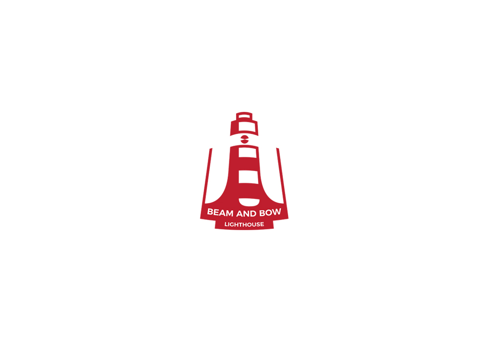
Lighthouse - I agree with you, the font is small and I should have place the name outside of the logo symbol. About the two lines on the side, at first the logo was inside a badge shape, but it was not looking that good so I erased some parts. I thought it was looking alright, but has no function at all. As for the bowed down type, I thought it looked more positive this way.
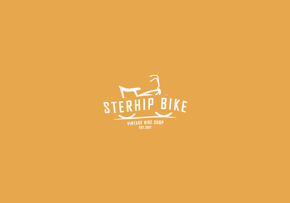
Sterhip Bike - I agree with what you said. I guess I got to pay more attention to this kind of details and get more creative.
Stevens and Taylor - I never thought about that, but it makes a lot of sense, going to keep this in mind in the future.

I appreciate all the other feedback you gave me, it looks like I need to take a closer look to the details of the logo designs I make.

@CRHain88

I thought about that, but haven’t done anything about it yet, guess it’s time to start, thanks! :smile:

@iraszl

About that, I sometimes find it hard to incorporate more meaning to my logo designs. I am going to watch / read more about logo design theory, I guess that will help. Thank you !

@HotButton @Steve_O

I know that a logo challenge is not enough. I tried being active on my social networks, getting some people to like my pages and searching for work here and there. I know that my brand is not a powerful one and needs a lot of work, I am kind of dissapointed of this and I find myself overwhelmed and not knowing where to start because I know there is a lot to do. As a self-promotion, other than some networking and trying to approach people that seem to be in need of graphic-design services, I haven’t really did anything. As a portfolio, I had my website, which now is down due to some financial issues, I am planning to re-open it in the near future.

I guess I got to work more to get what I want and promote myself a lot more than I previously did.

1 Like