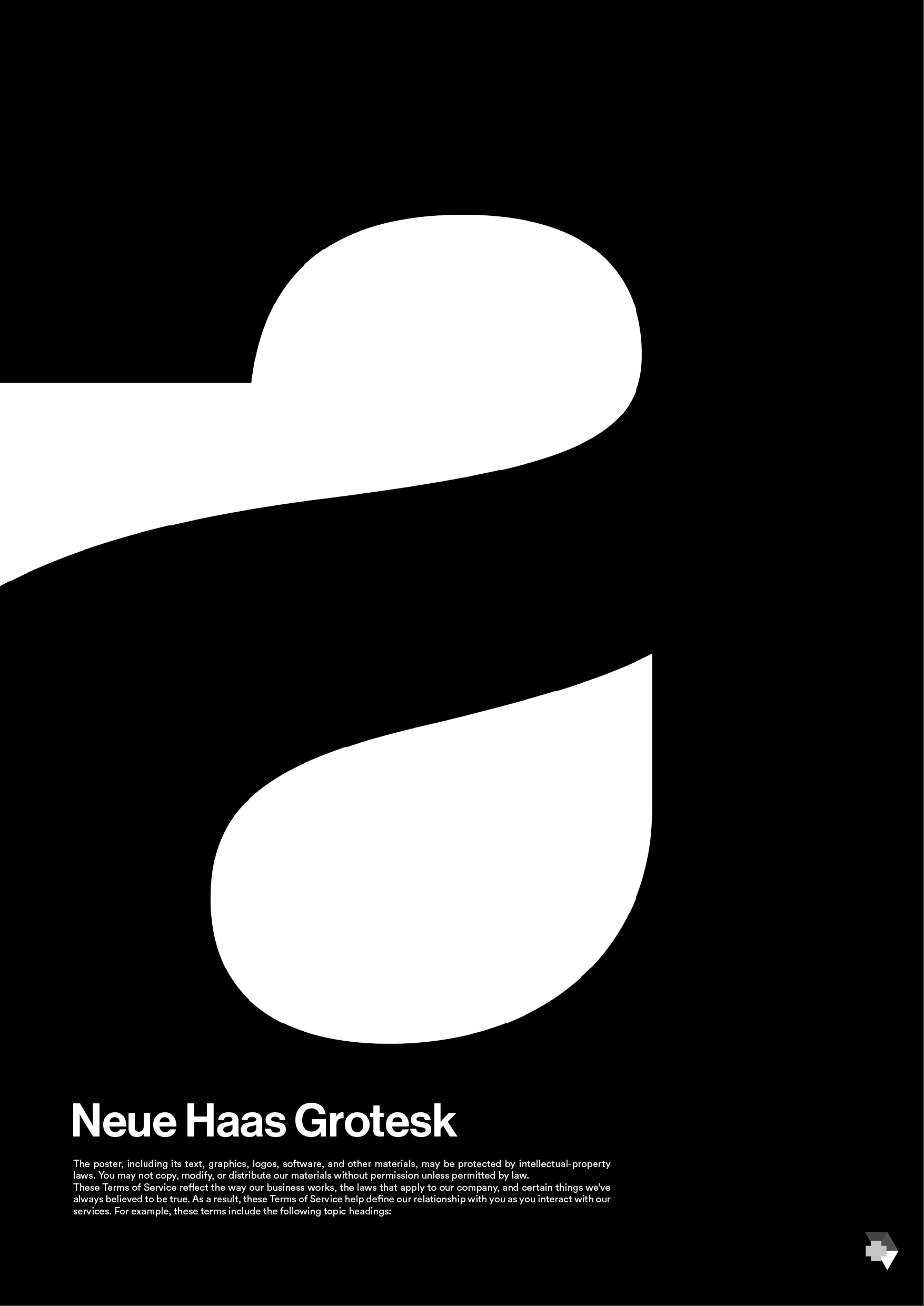
It’s an interesting composition, but you haven’t explained why the tiny text says it’s a poster. Is it actually a book titled “Neue Hass Grotesk”? Is it a book about a typeface?
Book covers (or any graphic design) don’t exist in a vacuum of just looking nice. The design needs to address the problem it’s meant to solve. Without that information, the design has no basis for critique beyond aesthetic merits, which may or may not be appropriate to solving the problem.
1 Like
Just-B’s point about context is spot on, and it’s the first thing that struck me here too. Visually, that huge cropped curve is bold and confident — as a piece of abstract art it grabs attention right away — but I couldn’t tell from the image alone whether I was looking at a book cover, a poster, or a type specimen.
The tiny text in the corner saying it’s a poster only adds to the confusion, especially when the thread title says book cover. If “Neue Hass Grotesk” is the subject, that changes everything: then the cropped letterform makes sense as a celebration of the typeface. If it’s meant to sell a story, though, a reader needs at least a hint of title, author, or mood to connect with it.
Luca, what were you hoping a viewer would feel or understand in the first couple of seconds? Adding that, plus whether this is a real brief or a personal experiment, would make the feedback a lot more useful than just “nice composition.”
Don’t bother. This OP will not be back to repsond to this post.