Hi Crit pit.
Give me your full force on the below two test palletes - font is really not my strong point but let me know what you think / any ideas. It’s for a newsletter aimed at young professionals/ college students.
Hi Crit pit.
Give me your full force on the below two test palletes - font is really not my strong point but let me know what you think / any ideas. It’s for a newsletter aimed at young professionals/ college students.
Hi opotter. Welcome to the forum.
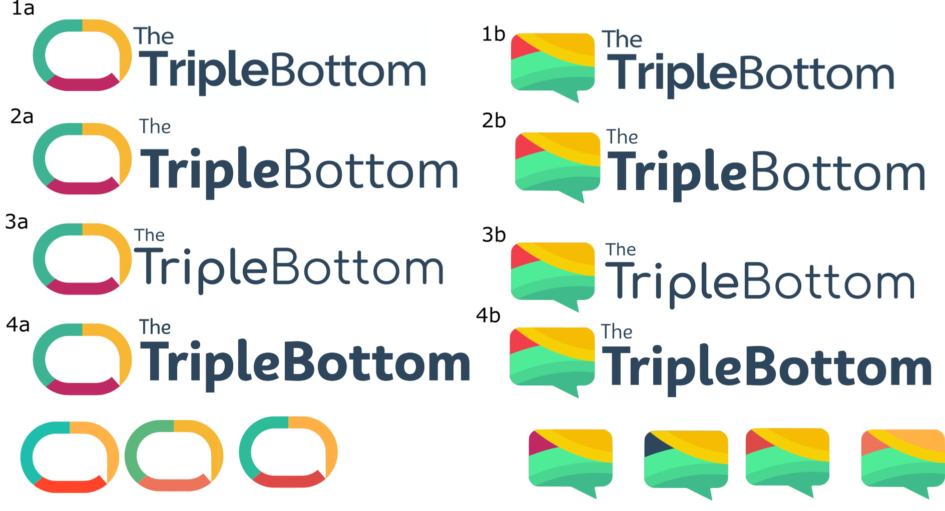
I’m not sure what you’ve posted. I’m assuming it’s a logo or a nameplate for the newsletter you mentioned, but I’m not sure. Will this newsletter be printed, sent out electronically or as HTML email?
What’s the reasoning behind the word/speech bubble and the color scheme?
I suppose I’m just not getting what you’re trying to accomplish. Design involves developing solutions to problems, but I’m not at all sure what the problem is or how what you’ve come up with might solve it.
Before I realized it was a speech bubble, I thought the top group’s circular graphic/logo/icon was a carabiner. The second group’s icon/logo is more obvious, but I’m still not understanding what it’s for or the significance of the colors.
Hi Just-B,
Thanks ! Apologies - should have included this in OP. Yes a nameplate and logo for mentioned newsletter sent out as HTML email.
Industry - Curated Newsletter
Description
The Triple Bottom is a weekly newsletter aimed at young professionals and college students focussed on Sustainable Tech & Business. The newsletter is sent out as HTML email but the logo will also need to be appropriate for all social media
Logo Concept
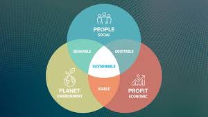
The topic of the newsletter is sustainable business and tech - The triple bottom is a concept in sustainability showing that businesses should consider people, planet and profit - the 3 colours are trying to demonstrate that all 3 need to be considered (yellow - (gold/profit) , green - planet, red- people). The significance of the speech bubble is that the aim of the newsletter is to condense all the important stories of the week into a 2-3 minute read - the purpose: to ensure people aren’t left out of the conversation around sustainable business and tech.
Hope that sheds some light on your question, but appreciate your input so far. Thanks!
G’day Opotter - welcome to the forum ![]()
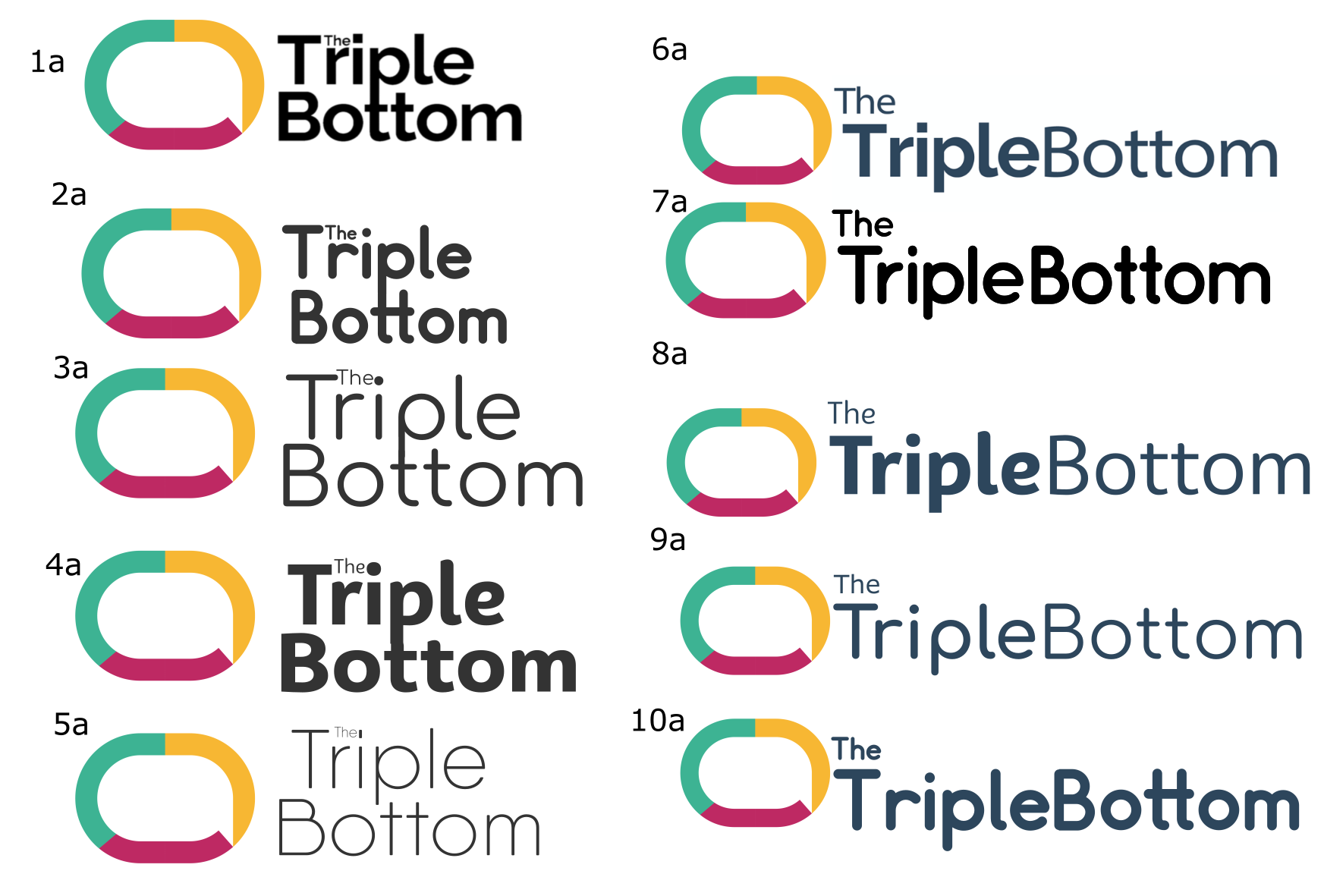
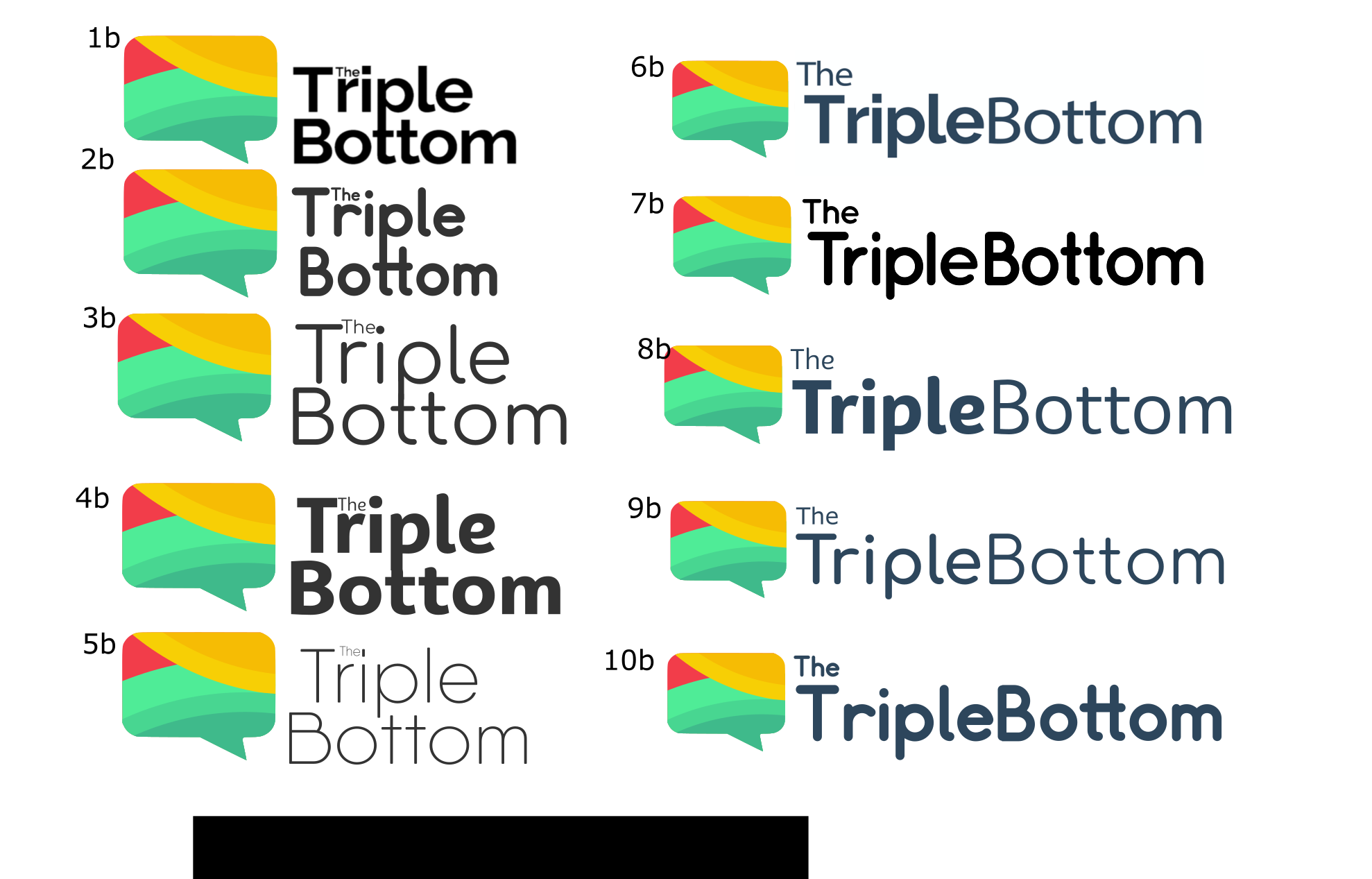
Similar to @Just-B - I struggled to recognize the speech bubble in this mark:
I would recommend trying it with a thicker line weight and making it more obvious that it’s a speech bubble.
Regarding the type: legibility needs to be No.1
Would just opt for something simple and clean like this, would also recommend increasing the size of the “The” to the same as the other worlds:
Regarding your colour choices: I hate to say it mate, but my initial thoughts were rastafarian.
If you’re going for a sustainable business/tech would opt for a basic green and if you were really desperate for a second colour would go for a blue.
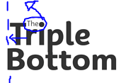
That’s nice logic, but no one will pick up on that without your explanation. Instead, people will just see strong colors with no apparent logic behind them. They might even invent their own associations, like Pluto did about Rastafarians.
The little, tiny The is just too little and tiny. Squeezing it into the space between the T and the i might seem like a conveniently good idea, but it’s not working.
I’m not really a fan of the descender on the p merging with the ascender on the t either. You might think it was a lucky accident that they aligned so perfectly, but it draws attention to itself as a typographic oddity that draws attention away from the colorful mark. Let the type just be type without forcing it to do something it doesn’t want to do.
About the speech bubble… If this newsletter is full of editorial opinions, the speech bubble, I think, could be a good idea since the bubble implies the news letter is about someone speaking their mind. On the other hand, if the content focuses news rather than opinions, I’m not so sure what it suggests matches the newsletter’s content.
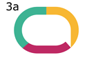
As for what I like the best, I’m inclined to go with the second column of the second group. I like the name on one line best. 8b is probably my favorite, but I’d align the baseline of the type with the straight bottom of the speech bubble.
Wow! Overwhelmed with the comprehensiveness of your response - massively appreciated. Really nailing home a meaning behind a somewhat abstract concept is a real challenge. Having reflected on these 8b was also my favourite. Still lots of work to do but this has been an extremely useful guide - will post what I come back with. Thanks!
Hi Pluto, This all makes perfect sense. The tiny ‘The’ needs to go! I totally take on board your comment regarding the green - in total honesty this was partly an exercise in trying to escape a ‘cliche’ sustainable logo (all green) - perhaps there are better ways to do it. Thanks for your help, I’ll post back what I come up with.
@Just-B @pluto -Thanks for all your help so far. Small ‘the’ has been banished. I’m keen to keep the tri colour logo but have experimented with different combos at the bottom to try and avoid that rastafarian confusion . Still need to work on the left column shape to make the speech mark more obvious. Also tried to align the baseline with text as mentioned.
Out of interest are you against the mix of bold/ non-bold font in 1b and 2b ? Would be great to hear your thoughts.
Personally, I like the mix. It helps separate Triple Bottom into two words instead of it appearing as a camel-cased single word.
Would say this is my favourite so far: