I am working on a restaurant logo how does this look? Please let me know.
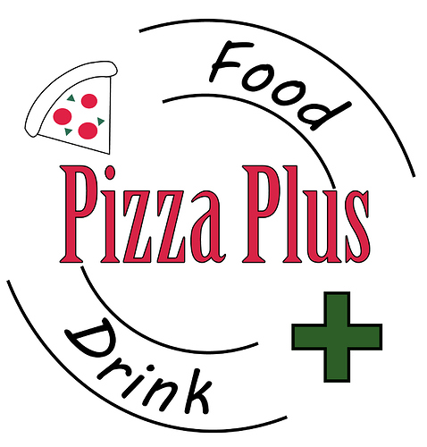
Victor, I’m not trying to be a jerk, but this isn’t very professional looking. Poor type choices, very generic-looking clipart, outlined type, everything looks tacked on, bizarre line break choices, bad visual weight and hierarchy . . . I say time to go back to the drawing board.
Sorry, but frankly, it looks pretty weak. Without a real brief against which to judge the concept, all one could really address is the mechanical aesthetics:
- Thin, black strokes should always be avoided, and you’ve got them throughout.
- The pizza slice is a token element you’ve installed so that your “picture” says the brand name. Its shape is squat and unappetizing. Both the concept and the composition would be much better without it.
- The plus sign is also such a token element, but even more directly redundant, as it only repeats the word I just read in front of it. It would be better to include only one or the other; not both.
- The logo is designed like a sign, which isn’t necessarily a bad thing, unless it constitutes poor sign design, and this does. The typography is wussy and un-dynamic, providing no focal point or visual anchor. The type layout is okay, but would read better (left to right) if the whole thing was rotated anti-clockwise 90°. You’d want to avoid having the uppermost word positioned and rotated to the right like that.
If you do a Google image search for ‘pizzeria logo,’ you won’t necessarily get all good specimens, but possibly some inspiration and real-world examples against which to compare your work. As you look at the images you find, imagine yourself on a city street deciding where to eat, and consider how the signs and their styles would affect your choice. This is how you begin exercising the muscle in you that recognizes what works and what doesn’t.
Thank you. I am a student in high school working on this project thanks for the advise.
Not trying to be mean, but here’s my opinion;
This looks like it was created in MS Paint. The type choices are not good for the idea, and
don’t fit in well at all. The composition is just not good enough to be professional-looking.
But good for you for making the attempt. For advice, try redoing the pizza illustration and choosing a
new typeface.
You’re in high school, so some of the feedback may be harsh, but it is accurate.
Even in high school, I would say the best bit of advice would be to think about what you want someone to feel or think when they see the logo.
When someone sees the logo, what will they think of the pizza place. Will they think “casual”, “trendy”, “fun” “laid back” “fusion” “unique” “no frills”, etc. Then do some research look at other restaurants that match some of what you want your logo to convey. What about those logos helps to convey that?
Then, and I know this seems not too exciting, grab some paper and a pencil and just start sketching out ideas, they don’t need to be polished, but they just need to help you get some ideas out on paper. Once you’ve sketched out 40 or 50 sketches look at the sketches and focus on the ones that you feel “work”. Which ones help convey that message.
Then take those handful and maybe do a few more sketches, a few more variations. Then identify the strongest of those and start recreating those on the computer in black and white. And then once thats all said and done, then think about what colors you need to use to convey that same earlier message about the restaurant and incorporate those colors into your logo.
I’ve found it can help to keep a mood board, pinterest board, a collection of screenshots or saved images from the web in one spot when you’re sketching ideas. And use those as inspiration behind your sketch.
First off, I think you were really brave posting this here. However, I don’t believe this is a good logo.
I think you have too many elements in the logo. The one that throws me off the post is the cross. The cross makes it look like a pharmacy and I’m pretty sure the pizza has no healing properties.
Also as stated by other designers, the font choice is wrong. It’s always great to know the exact emotion a brand wants to stimulate in their customers.
When you are done with a logo. Ask yourself, do I feel (insert emotion here) or not.
You were brave to ask and that’s awesome. A person that asks questions never misses his way. Kudos again!
Pizza shop logos are some of the most mistreated logos out there.
If you look at the stuff that comes up in a google search for pizza logo, almost anything can be an improvement.
Besides people might get the wrong idea, with the green cross on there, as to what kind of toppings you are serving on your pizza. LOL.
Wait, that’s not oregano???
![]()
