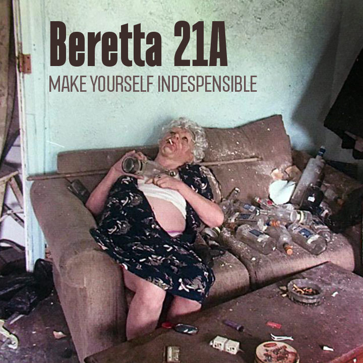
The original type said “Beretta 21A Bobcat,” so I cheated a bit by shortening it. Sometimes, the photo carries the whole thing. What’s going on with this woman anyway?
Oh my … Granny has seen some better days 
That’s no granny. It’s a creative director in her prime.
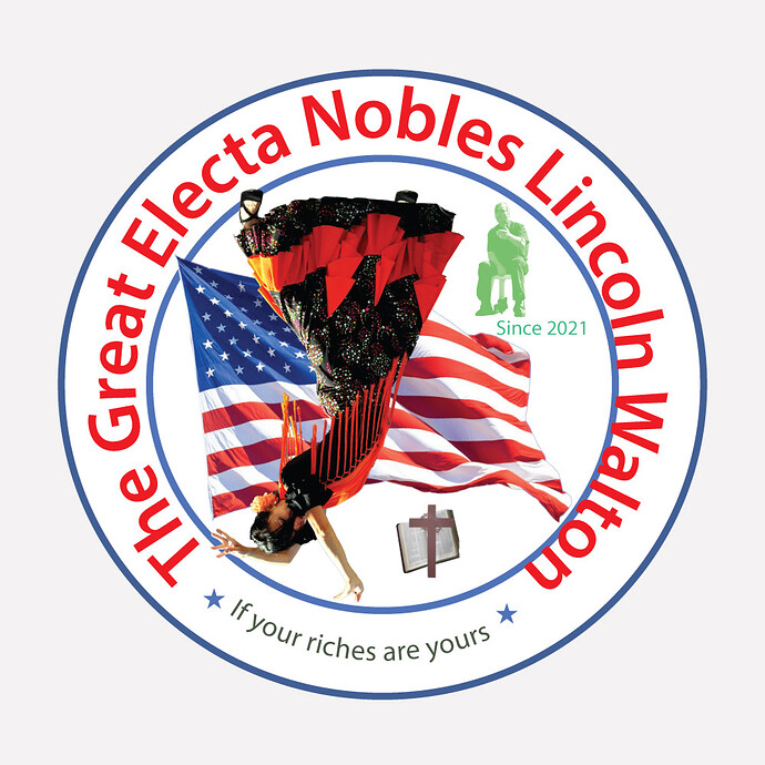
Your design is simply oozing with a powerful richness, beauty, and subtlety. Placing the woman upsidedown in defiance of gravity is a nice touch.
OMG…You should really go into the design business Craig … that is fantastic!

Her fringe defies gravity … I like it!

Ha. It was oddly fun working on it. I discovered a few other fun details. The original seal, and my recreation are not perfect circles. They are both a little wider than they are tall. I also like how the inner circle and outer circle are different shades of blue.
I never noticed the two shades of blue … even better! 
No doubt symbolic of the tension between American flamenco, the church, and the dude in the chair. Brilliant. 
Great image draw.
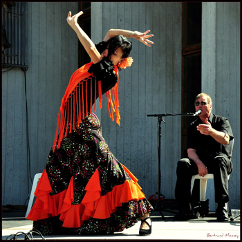
Yeah, I agree. Here’s the original.
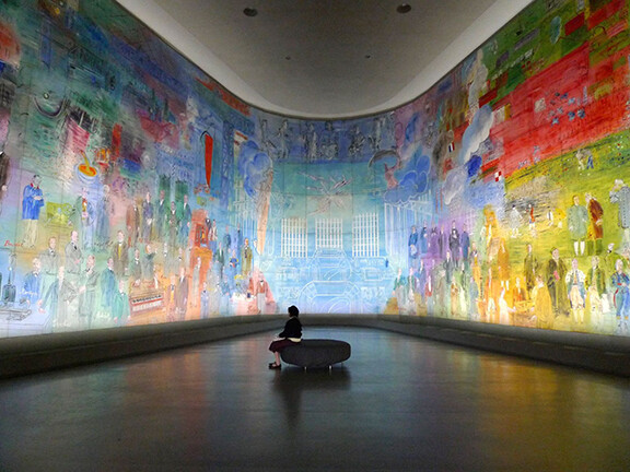
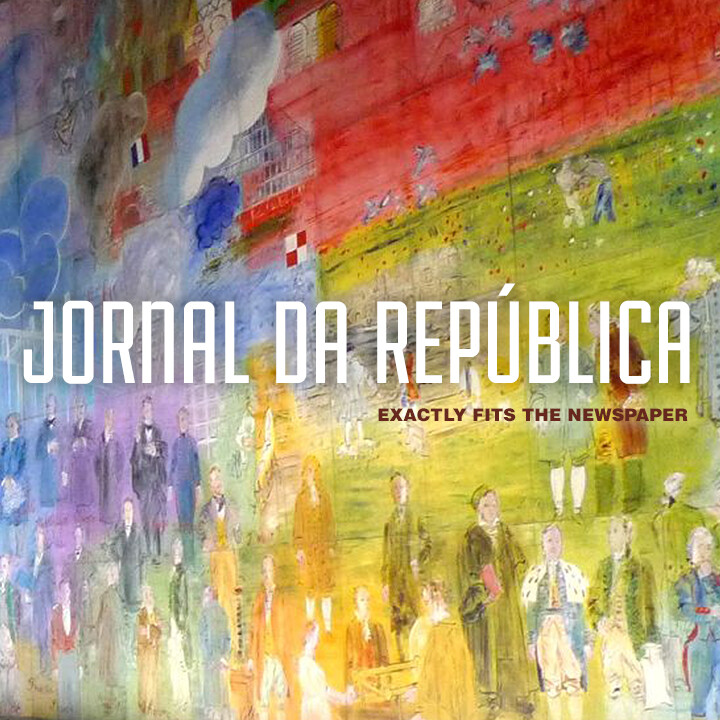
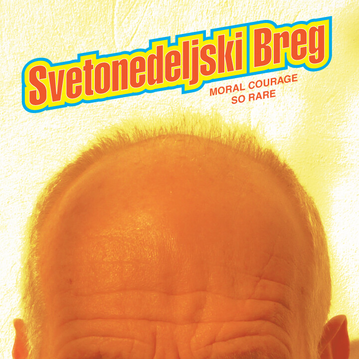
Geech, the three items play off of each other perfectly. You even have two newspaperish lines of type plus an image that relates to a republic. On top of that, the artwork itself is good-looking, as is the way you put it all together. Nice!
Good stuff there Steve! I love that mural 
