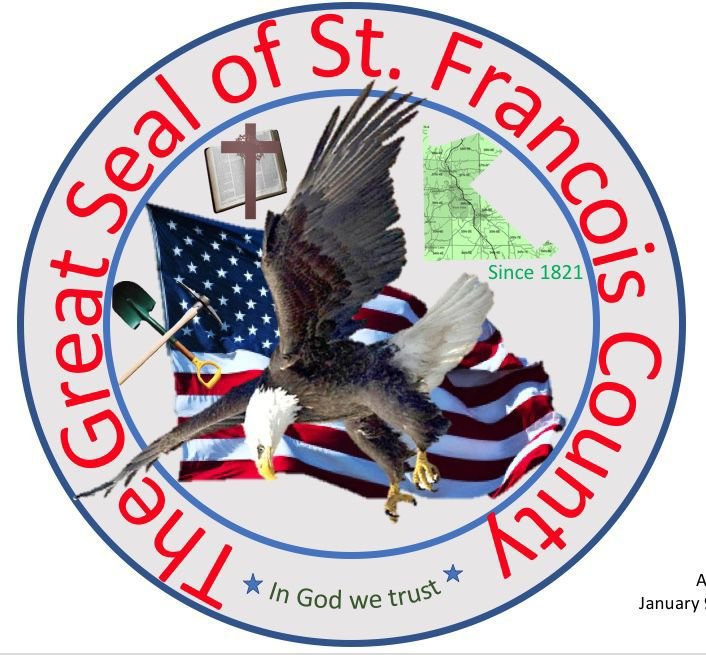
Yes, it is real, sadly. You can find it on their website.
There is so much wrong with it, but I am especially fond of the off kilter eagle and the text on the curve that is not even a true circle or centered (along with the descender of the y overlaying the blue circle.) The blue stars not being centered or evenly placed on the in god we trust area is a nice touch as well.
You know it’s a great seal when it says great seal right on the great seal. You people are just jealous.
Pretty funny too, how little of their web site actually works. The “Pay County Taxes” link works of course, but if you’re looking for the Sherriff, you are SOL.
I really like the county navigation map they thoughtfully included in the logo. A quick scan with an electron microscope completely eliminates the bothersome need to call up Google maps to find one’s way around the county.
At first I thought the company providing their web hosting three in the logo, but I checked their site and they actually don’t offer that service. I did see the County is using the “logo” on its building signage. All I can say is wow. Just wow.
I’ve never been involved with city flags, but I have designed government logos and been on government committees charged with developing logos, license plates, badges, seals, etc. A city flag design wouldn’t be much different.
Most of these projects were train wrecks for variations of one of the same three reasons:
Too many of the wrong people inserting their naive ideas. The end result was always a lowest-common-denominator mess that included something from everyone — especially those who were the loudest.
Nobody really caring. Initially, a lack of interference seemed great — a design project without a committee, needless compromises, or fending off boatloads of bad ideas. In the end, though, because few people were involved, no one became invested in the end product. These projects always died due to apathy from the organization.
No point. This problem was usually the result of someone wanting to spend the remainder of their budget at the end of the fiscal year. Whatever idea they had was usually pointless, didn’t need to be done, and would never be used. At the end of the fiscal year, the money was gone and any interest in the project evaporated.
Yes, it is excellent and worth watching. I saw it first several months ago and watched it again after you mentioned it. The lousy flag designs reminded me of my experiences with government design-by-committee projects, which headed me off on a tangent.
Our state flag is one of the “seal on a bedsheet” designs mentioned in the TED talk. A marketer I know from a previous job is in the state legislature. Over the past several years, he’s introduced several bills for a new flag design. The legislature argues over it, forms committees, makes compromises, gets input, solicits new designs, argues some more, and still, here we are several years later with the same seal on a bedsheet flag.
On the other hand, my city has a rather nice, simple flag. The city council formed a committee composed of designers, artists, a vexillologist, and others qualified to choose a flag. What they all agreed upon isn’t too bad.
There was a good quote in the video. “Good design and democracy don’t often go together.”
One of my local cities was called out in this video for their seal on a bed sheet. I guess it shamed them into doing something because they had a contest in 2018 to come up with a new flag, and it actually looks pretty nice now. Definitely an improvement. And then the city next to them got inspired and had a contest too, and they just approved their new flag a few months ago. Both follow the principles he laid out here. In both cases they took some criticism from residents who felt the simpler approach was too radical.
Every once in a while it comes up that not only does our state “need a new state seal, it therefore needs a new flag,” but it sorta dies out not too long after. ie it’s still in committee even though they were supposed to have a solution by last October (before Columbus Day.)
I think they should keep the coat of arms seal and just change the flag.