Hello ladies and gentlemen! Posting after a year here.
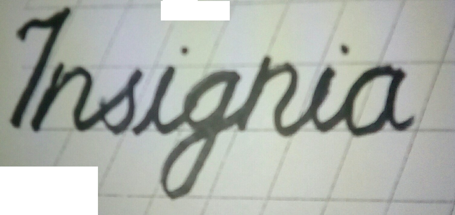
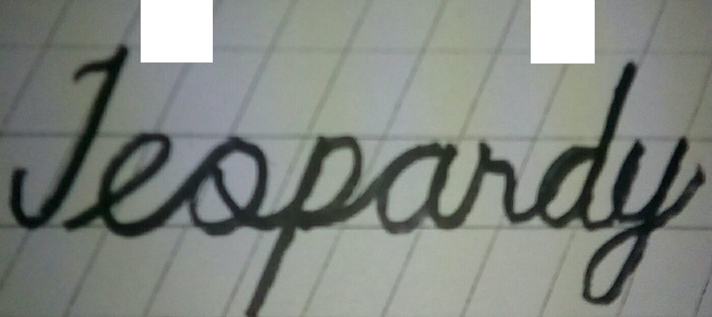
Anyway, I’ve been practicing lettering lately for about 1 and half month . So I’ve been doing this exercise creating hand lettering of words beginning with a certain alphabet and progressing sequentially. Today I covered the letters “I” and “J”. Here are the best 2 pieces I came up with
Are you practicing calligraphy or just hand-writing?
What kind of pen/nib are you using?
You are over-duplicating your lines where your pen returns, making them unnecessarily thick. With calligraphy, I can’t think of an instance where you drag the nib back over a made line.
The height on the small r and small s should not include the top loop, you notice those two letters look smaller and out of proportion to the rest.
Your other proportions are looking good.
Try for making your strokes in one motion, with no dwell-time in any one place.
Keep practicing!
It’s a classroom book for a handwriting course in the “Palmer Method of Business Writing” that was offered or required in most United States high schools at the time. This was back at a time long before computers, when cursive handwriting using a fountain pen was the standard way of writing most anything. I have one of these old books and bought a fountain pen several years ago for the sole purpose of practicing.
As for the images you posted, in cursive handwriting, there’s lots of room for individual variation and expression. The loop on the lowercase o, however, should probably not drop down to the baseline and should, instead, form a small loop at the top that, in this case, connects directly with the top portion of the p. Computer fonts that simulate handwriting typically have the o do what you did, but this is just so it will more easily connect with the proceeding letter in the font. In handwriting, this isn’t necessary and probably shouldn’t be done.
Now if you’re trying to practice calligraphy instead of handwriting, the emphasis there is on the beauty of the hand-drawn letters rather than clean, rapid, even, smooth, flowing handwriting. Lots of the same skills still apply, though.
I love Chalkfulloflove hand lettering. I found this very useful as a stress reliever. Besides, the pages are easy to write with. It contains numerous amounts of blank practice pages. The pages are thick enough to prevent bleeding of the ink on the other side. Working on inspiring words and quotes has never been this convenient.