I’m looking for feeedback on my early logo design.
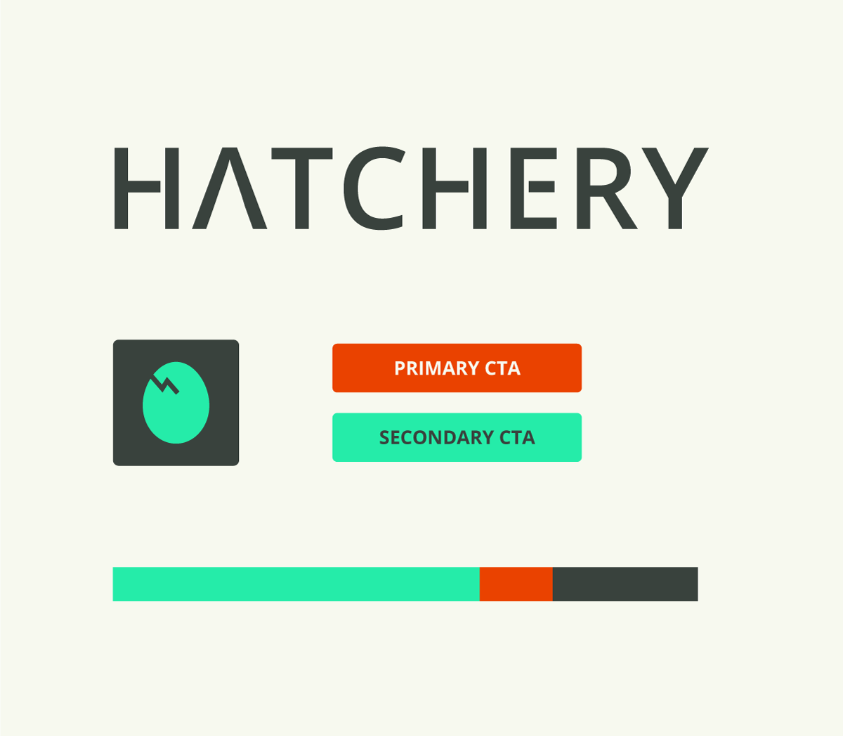
Hatchery is a consultancy that helps startups turn their ideas into digital products. All you need to bring is the idea (represented by an egg) and funds. Hatchery takes care of the project from then on, starting with research, through product development, design, coding, infrastructure, training, and finally maintenance.
For example, let’s say you wish people planted more trees to save Earth. You assume there are people who are willing to plant and even take care of trees, but they don’t have land. Others have land, but don’t have the time or money to plant and nurture the saplings. Your idea is to connect these two parties and make new forests happen. You bring this idea to Hatchery and the consultancy builds the website and all associated systems for you from A-Z.
The egg symbol will only be used when the name of company is already present in text form, like on a twitter account. The logotype would not be used together with the egg symbol. The color scheme is intentionally, non-organic. I don’t want people to think Hatchery is actually in the business of hatching chicks. The color scheme includes one highlight color to help the user find the actionable elements on a web page.
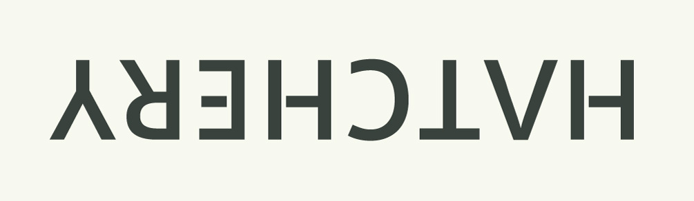
Simple, elegant, has that tech-industry / start-up feel . . . I like it. The secondary mark is nice, and I like the plan to only use that when you’re not using the primary logotype. The one thing I’d say, and this could just be my eyes since I’ve been in front of the computer far too long today, maybe tighten up the kerning between the A / T and the E / R.
What style is that? Sometimes I miss trends and this might be one of them.
I do like it @iraszl. It’s clean, simple, yet distinctive enough to be remembered. I agree about the kerning. Some other tricks, in addition to tipping it upside down, are to reverse it (as in a mirror view) or reverse the dark/light values. Blurring it can also make dense and more sparse spots more obvious. The type design application I use, Glyphs, has these kerning tricks built into it. The cracked egg (hatching, I guess) is cool too.
Yeah, I first think of fish hatcheries too. But both fish and bird eggs are incubated. Fish in incubating trays and birds in various kinds of avian egg incubators. Whether fish or bird, the large facilities in which they’re incubated and hatched are called hatcheries.
I don’t know what to call it, but to describe it maybe as “ultra modern clean engineering based”. It started with Volkswagen about 40 years ago and has gone through a lot of flourishes (Mac does it very well), but the main stylistic points seem to be 1. utilization of more negative space than traditional designed “pages” (that now look stodgy or “heavy” by comparison), and 2. clean use of ultra simple “engineer-like” design elements (like the egg) to convey messages.
This is done well.
It has the newer trending style in the color - moving away from flat whites to “ivory?”, pseudo-pastel/fluorescent colors, and flat black instead of rich… Also, the egg is fantastic because it is global understood.
Iraszl,
I like the use of an egg, but a cracked egg can have a bad connotation too… How about an egg that is in two halves with the “idea” coming out of it newly birthed? a question mark, a singing bird, light and music notes. Doing so would show the process the client uses directly. They take your idea and make it live, give it birth, whatever.
I do like it, however I am a firm believer that anything can be critiqued. It’s up to the designer whether they agree or disagree. Good work so far.
Just to add on the kerning front; another little trick I use is to break the word into threes, so if you break it down in your head to hat, then atc then tch etc the kerning issues become more obvious. Doesn’t work, if you do it in consecutive threes, ie hat-che-ry. It has to be 123, 234, 345, etc. It may not work for everyone, but I just happened to see it that way accidentally once and it worked for me.