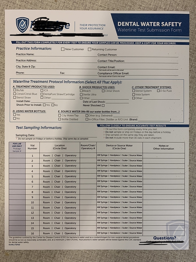
Looks pretty good.
The solid blue is a bit tight around the text on the left. I would make the blue a little wider and/or move the words DENTAL WATER SAFETY and the line below a touch to the right.
Some of the text looks very light. I would use Regular or Book if possible instead of light.
Vial number column can be much narrower Is there a reason why Room / Chair / Operatory are spaced out so much but AW Syringe / Handpiece are very tight? I would make the Location column more narrow and the Device or Source Water column wider.
How will the forms be stored? Is there any chance these will be hole punched? If so, punch one just to check that no important information strikes where a hole punch would go.
The only way to design a form is to list the absolute essentials. You should be having a discussion with the client regarding what information they actually need from this form. Over time, some fields become outdated and irrelevant. For example, they have 16 lines for test sampling information – How many samples does a typical form usually process?
Before I’d touch the design, I’d make sure all the information is necessary.
