What’s more, even if your M-pepper was executed impeccably, you’d probably still have to read my stupid and too-often repeated speech about how mutating type into pictures only results in a marketable logo about 1 time in every 1000 attempts, if you’re lucky.
Practicing such things while skills develop can be good; selling such things can be impossible, no matter the skill level. As you get better at the mechanical aspects of producing vector graphics, it can be tempting to try all sorts of frankensteinery. Be careful not to get so far inside your ideas that you over-commit your time and effort. In logo design, this is where the sketching phase delivers its value; if 5-10 of your 50-100 sketches are quick-and-dirty tries to make the M-pepper work, you can make a better decision as to its feasibility. Maybe you see you can’t pull it off, or maybe you come upon the one approach that makes it click. Either way, when you start taking client work, it won’t be long until you think you’ve just presented the most ingenious idea you’ve ever had, and the client says, “Umm, nuh-uh. What else you got?” Be ready for that.
2 Likes
Do you think I should omit the M, and do something less complex?
1 Like
You should do about 100 sketches. That may move you beyond some of your current ideas.
That doesn’t help your software skills.
Being a student of design, you can’t let the software limit your creativity. But first you have to have a solid concept to put into the software. Sketching helps with that. Then you don’t waste your time trying to make the software do something that’s going to turn out to be a poor concept anyway.
I agree I think I’ll do some more sketching, and how I can do it in illustrator.
The idea is NOT to use the software. That limits your creative process to what you know you can do on the software.
Pencil
Paper.
Or equivalent.
I manage to create the jalapeño pepper with the pen tool how do you create the grill effect?
Do you have a really good reason to add “effects” to a logo? A lot of times, less is better. You could maybe give it some minimal tapering lines to suggest grill lines, but don’t be using transparency effects to make fuzzy burn marks.
Could I use the pen tool or line tool for that?
Agree with HotButton! Combining the pepper and the M will hard to make work.
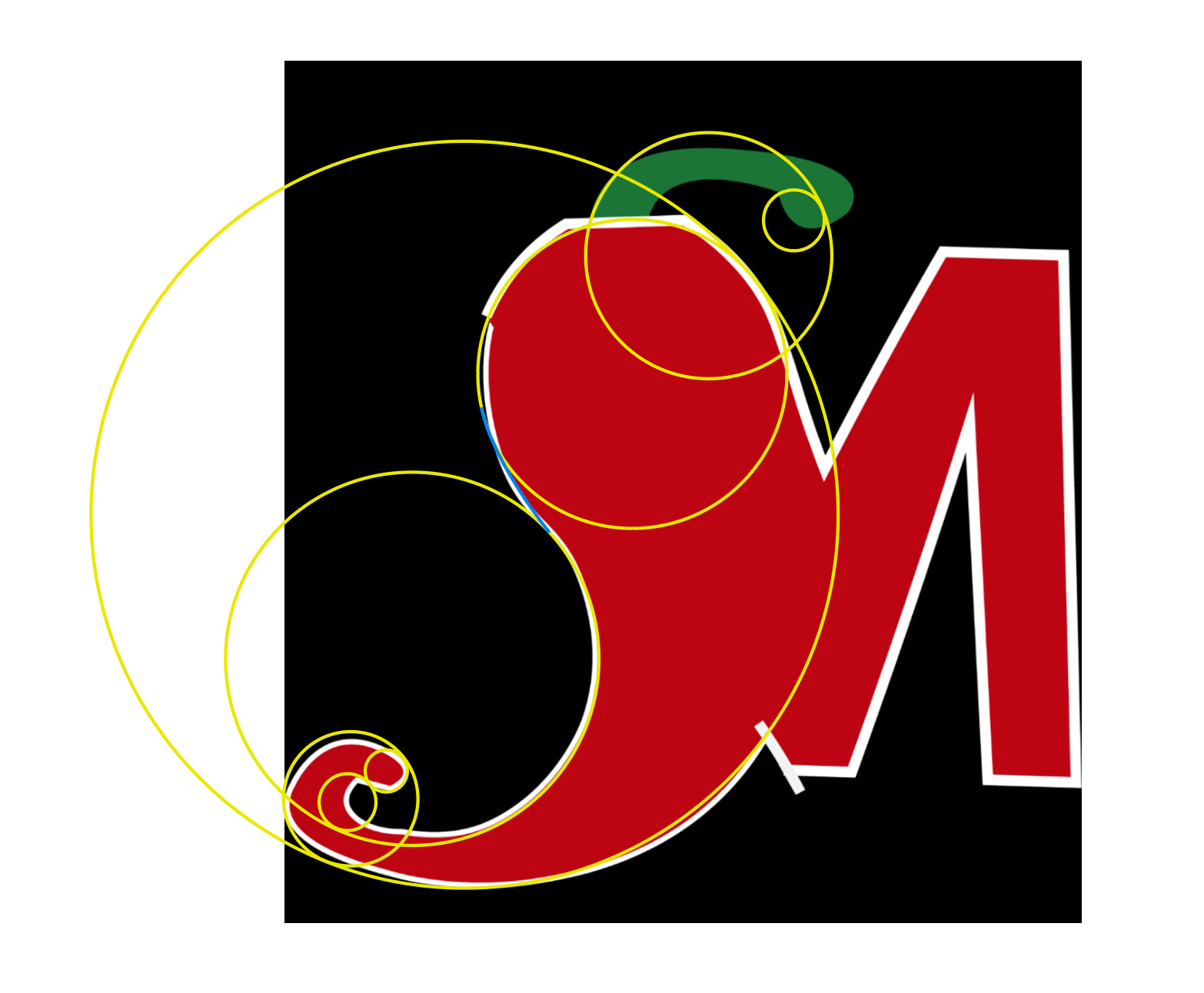
Try using simple shapes “Circles” to get all of your main area shapes, align them accordingly, add and delete anchor points where needed and join all of the shapes/points. Without breaking any rules of the forum… I’m not doing this for you, just pointing you in the right direction… see pic. When using Illustrator, always think “simple”… simple shapes.
The “Yellow Lines” as you’ll notice make up the “main shapes”… and the blue line is where I would join them… it takes practice, but this should help and point you in the right direction.
2 Likes
I managed to create the pepper using the pen tool. How do I adjust the colors, and add grill markings?
Thanks, the original plan was to use that pathfinder tool, but I didn’t how I would do that, and I could find the path-finder tool, so I will try this.
I think that’s my problem I’m not seeing it as simple shapes.
Could I use the pathfinder tool for the M?
I’m fairly certain that in one your posts you mentioned that you were wrapping up a design degree at a junior college or something like that. I have to wonder what in the world they’ve been teaching you. The kind of questions you’re asking are all Illustrator 101. If they didn’t teach you how to use the pen tool or adjust colors, I’d go to the dean and demand your tuition money be refunded.
They never went over the software they just assumed everybody knew it. Same goes for when I was in high school we never did projects. It was just copy what the teacher was doing. That’s why I came here never was taught properly how to use it.
Basically, I’m trying to play catch up. I didn’t know about the Pathfinder tool or the shape builder tool just recently.
When you say join them together where the two circles meets the blue line, do you mean use the pathfinder tool, and unite them?
Yes. Unite.
When you create a logo, when you look at it in outline view, it should be solid shapes. No lines crossing other lines, no hidden junk for the sign guy to clean up (he may not do it right.  )
)