Could I use the pen tool or line tool for that?
Agree with HotButton! Combining the pepper and the M will hard to make work.
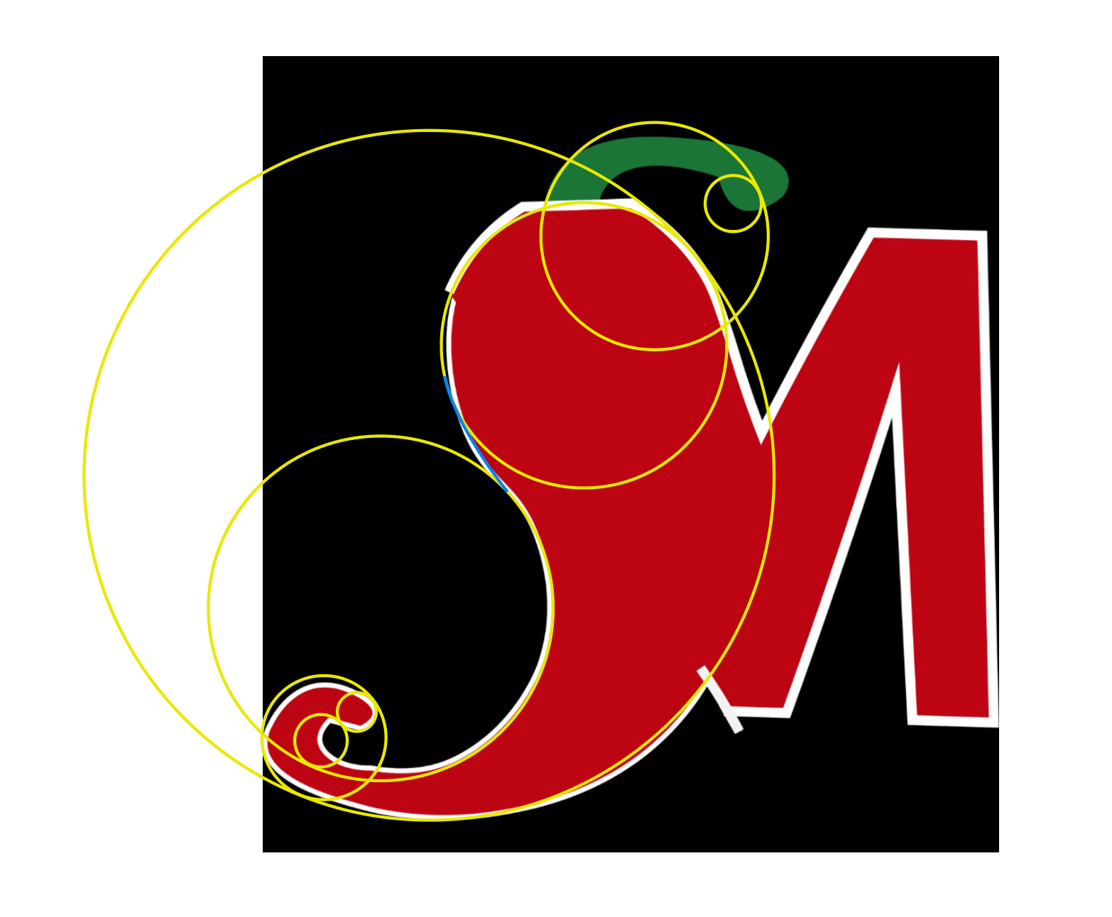
Try using simple shapes “Circles” to get all of your main area shapes, align them accordingly, add and delete anchor points where needed and join all of the shapes/points. Without breaking any rules of the forum… I’m not doing this for you, just pointing you in the right direction… see pic. When using Illustrator, always think “simple”… simple shapes.
The “Yellow Lines” as you’ll notice make up the “main shapes”… and the blue line is where I would join them… it takes practice, but this should help and point you in the right direction.
2 Likes
I managed to create the pepper using the pen tool. How do I adjust the colors, and add grill markings?
repost
Thanks, the original plan was to use that pathfinder tool, but I didn’t how I would do that, and I could find the path-finder tool, so I will try this.
I think that’s my problem I’m not seeing it as simple shapes.
Could I use the pathfinder tool for the M?
I’m fairly certain that in one your posts you mentioned that you were wrapping up a design degree at a junior college or something like that. I have to wonder what in the world they’ve been teaching you. The kind of questions you’re asking are all Illustrator 101. If they didn’t teach you how to use the pen tool or adjust colors, I’d go to the dean and demand your tuition money be refunded.
They never went over the software they just assumed everybody knew it. Same goes for when I was in high school we never did projects. It was just copy what the teacher was doing. That’s why I came here never was taught properly how to use it.
Basically, I’m trying to play catch up. I didn’t know about the Pathfinder tool or the shape builder tool just recently.
When you say join them together where the two circles meets the blue line, do you mean use the pathfinder tool, and unite them?
Yes. Unite.
When you create a logo, when you look at it in outline view, it should be solid shapes. No lines crossing other lines, no hidden junk for the sign guy to clean up (he may not do it right. ![]() )
)
For the M how would I achieve that?
The pathfinder tool can also be used to divide overlapping shapes as well as unite them.
For example, as PrintDriver mentioned, a final logo should be built as efficiently as possible without overlaps. The pathfinder tools can help remove those shapes that are behind other shapes by dividing up the shapes where they overlap and allowing you to remove the pieces that aren’t needed.
The best way to get used to how it works is to just draw a bunch of overlapping shapes, then experiment with what the various pathfinder tools do with them.
I believe that Shape Maker (shift+m) would give you a better understanding of how pathfinder works. It’s a simple case of clicking and dragging over different overlapping areas to either join or separate them from the main area. Once you grasp the concept of that, you will be able to move on to understanding the various methods of using pathfinder.
Sorry - was on my phone when I sent that, so couldn’t check the name of the tool!
You seem to be ignoring the fact that a lot of people are pointing out that what you are trying to do is reeaally hard to get right. This is a matter of considering your skill level with sober judgement.
Go look around the internet and find examples of successful logos that integrate food symbols into letters?
Here’s an example search, and none of these utilize any “trick” that combines text with any other element:
Why? Because mutilating your text is not really a strong design skill. You’ll notice all manner of fonts and type treatment, but nothing in there that compromised legibility.
Being good at Illustrator tools is a complete and total waste of your time if you aren’t willing to learn and understand the fundamentals of good design.
The sketchpad is your friend at this stage in the project Try to come up with a concept that is less cliché…a strong design concept doesn’t honestly need lots of Illustrator tricks.
If this is a for school project, where they’ve told you that you have to learn the specific skill of combining an “M” with a pepper, and then put grill lines on it, then I apologize to your on behalf of your professor. This doesn’t come across to me as a real-world application of solid design fundamentals and they should not be structuring their lessons this way.
1 Like
I’ve already designed the logo I didn’t go that route because obviously it was challenging for my skill set. But, I still liked the idea so, I used the “M” as the pepper and put the stem on top of the pepper.
Here’s the fourm to the logos that I did: Critique my logo - #4 by Bear