This looks like a very clean project and if I recirved that brand identity id be pretty happy as a client.
Some curiosities of mine are:
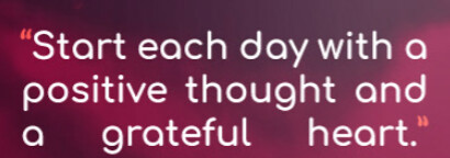
The decision to use center justified type on page 1.
Typography is a huge part of design and I don’t see center justified text anywhere else.
You also have some paragraphs that have hanging Chad’s. Maybe tightening up those rags would help.
Bouncing off typography it looks like everything is structured well and the header and iconography is great. However when it comes to introducing sections the type is hard to read. I don’t want to get lost.
Lastly dealing with color is tricky and I think you’ve about nailed it. I’m just concerned the Burgundy and Crimson color may not have enough contrast with eachother.
It strains my eye however I’ve spent the 7 hours designing/editting so maybe its just me.
Really nice package you put together there, @HamoudaBaccar! Only thing that irks me is the script type for “Agency”. It is a bit too small in relation to the “HEART” wordmark and I also feel it breaks away too much stylistically. Otherwise well done!
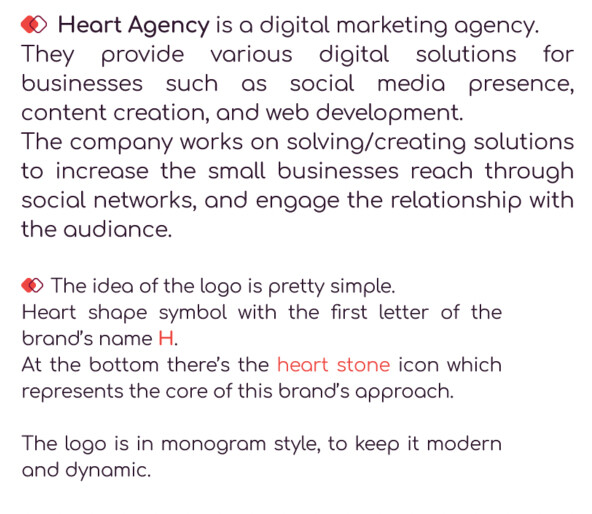
The Agency part in the small text knocking out the back of the R and part of the T.
That is going to be really lost at small sizes, even business card sizes you might run into print issues.
Right from the start, you’re going to have technical production problems.
Looks really good! I agree with others, and in addition:
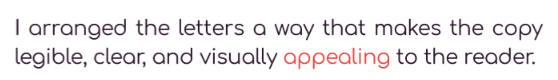
Brand guidelines are to be used by any designer or staff member when implementing new marketing strategies or print items, so the sentences need to be structured away from “I arranged the letters…” to a more narrative style “The letters are arranged so copy is clear…”. It needs to be more “this is how it is” and less personal sounding. Additionally, make it present tense. “The approach was to make…” Remember people will be using these in the present, so “The approach is…” is more applicable.
Your clearspace is always a good section to have, however there’s no way for me to find out where that “x” box came from and how big it is. Typically an element of the logo is used as the space-maker so the spacing ratio is the same no matter what size the logo prints. I see now that the letter spacing is your sizing mark, however it’s not very clear and needs to be stated what you’re using.
“… along with Orange, and White for the touch.” is not a complete thought. I don’t know what you mean by touch.
Very nice work, but what’s up with the typography? You definitely have the talent, so why are there so many basic typographical mistakes?
I see huge holes in word spacing of the justified columns, spelling errors, grammatical mistakes, punctuation errors, a mix of justified and ragged right, inconsistent spacing between paragraphs, and inconsistent point sizes.
These kinds of mistakes and inattention to detail largely overshadow the great work you’ve done. It’s like finding a fly in bowl of soup — it ruins the meal no matter how good the soup might have been.
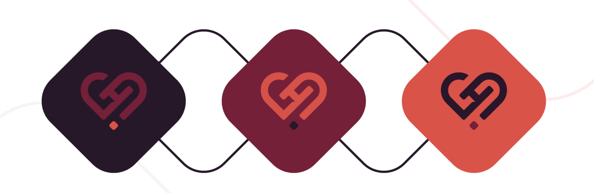
Nice work! I like the logo animation. I do agree with the others about agency in the logo being too small.
For me the heart doesn’t visually look centred in the container, even though I’m sure it is. It probably has this effect because the bottom of the heart comes to a point. If you nudged it down a bit it might visually feel better
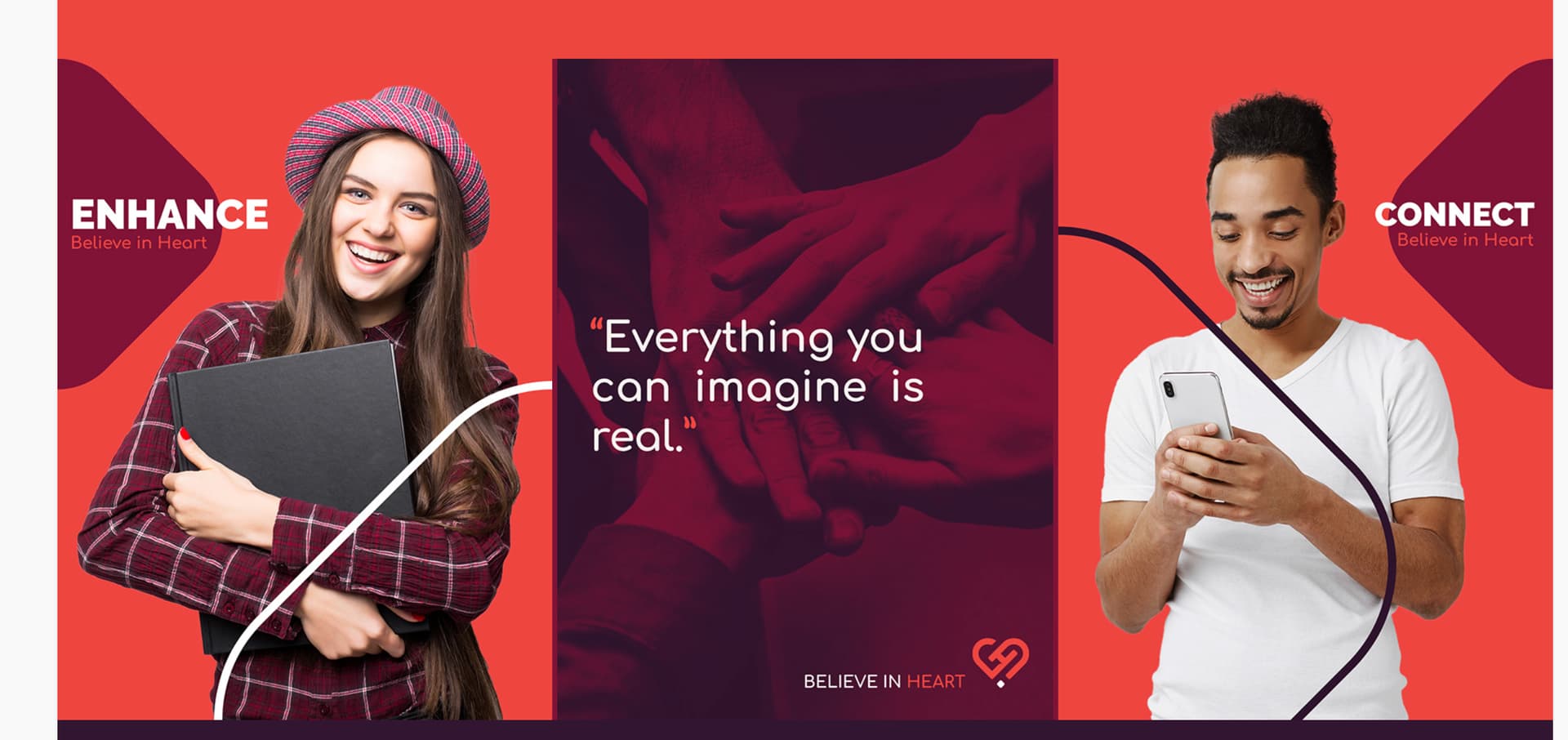
I think the purple overlay in the middle image is bleeding over the left and right edges. Not perfectly aligned with the background image.
Also I don’t think you need the stroked objects going over the people. Looks a little distracting and busy to me. Maybe instead change the objects that are behind “enhance” and “connect” to one with an outline and the other solid to keep consistent with the rest of the project.
Those are some great thoughts, but the post is from last December. The person asking for the critique hasn’t visited the forum since just after that. I suspect this project was in his rearview mirror long ago.
Hello! Thanks to everyone for their replies, and I apologize for the inactivity. I surely read all the critiques and considered them to improve my qualities and fix my mistakes. I’m more of a listener, so I rather read/listen to critiques and try to work on them. Sorry for not replying and thanks again for your words! highly appreciated! <3