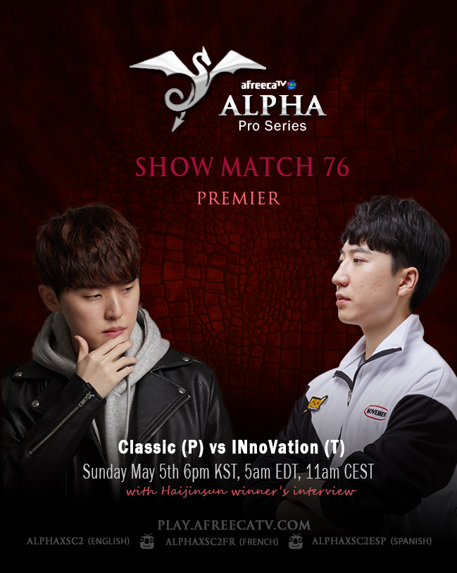
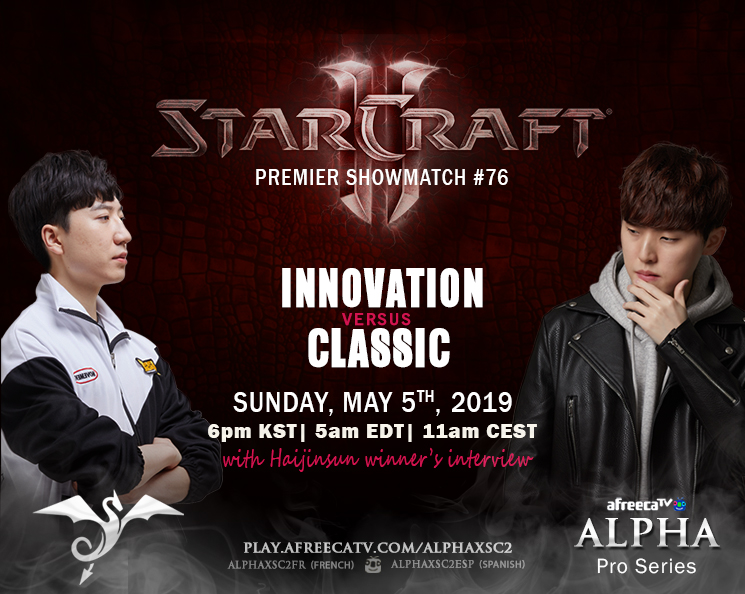
I’m hoping to get a critique on this poster. It’s 100% web only. Afreecatv sponsors our event to promote use of their streaming site over their competitor, Twitch. Koreans are the top players in the world for this game (Starcraft), by a considerable margin. At the moment, it’s only really promoted on websites where people know the game, which is why I haven’t included it (although I’m not sure how I would if I wanted to). Now that I’m thinking about it, is that a mistake? The target audience is largely male between 18-34.
Work a little bit on your hierarchy.
All of your text is the same size. Is some more important than the other?
Right now there is no place to focus the eyes except on the photo.
Ack, is that Trajan? Do a search for Trajan an Movie Posters and see what happens.
LOL.
Looking at the poster without reading your post, I’d have no idea what this was about. All I’d know is that something is happening on May 5th. That said, I’m not a gamer, I am not familiar with Afreecatv, Alpha Pro Series has no meaning to me, and I don’t know Classic or INnoVation. If this ad is on a gamer website or Starcraft website and people know what they’re looking at, perhaps this will have more meaning.
Even if someone knows what all of this means, I feel the design, for lack of a better word, comes across as “flat.” I think PrintDriver got it right saying you need to work on the hierarchy.
I feel unqualified to offer much of an opinion on this other than the aesthetics, which are nice.
The subject matter is so esoteric, that I find the poster confusing. As you mentioned, your target audience is supposedly specific enough that the cryptic nature of the poster would be understandable to them. Are you sure about that, though?
By the way, what is a web poster? I’m assuming this is an ad, but it looks more like something designed for print than online use.
It doesn’t look like a very exciting event to watch based on this poster. Your hierarchy still needs work. What is going to be exciting about it? Are the players well known? Is this match up going to be an epic battle? Why would viewers tune in to watch..? For example “Classic VS. Innovation ONLY on Afreecatv!” Whatever it is, that should be the largest most prominent thing in your poster.. right now to me its “May 5th”. Maybe google “boxing posters” or “wrestling posters” to get some inspiration.
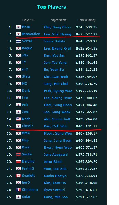
@Just-B As far as esoteric..yes and no. It’s had it’s ebbs and flows of players, but peaks upwards of 500,000 players. It’s a very difficult game (which is partly why it is on the lower end for #of players in the e-sports community) and does have it’s “own language” so to speak. It’s poetically been called a mix between a musician (actions per minute averages around 3-400 for a good player) and a chess master. These players on the poster are very well known within the community and also have won a lot of money playing this game. This might make your jaw drop, but I looked up the winnings for these two guys.
A web poster, well, we use it to advertise on different online mediums like you thought. Game specific sites like Team Liquid, Discord (which is a chat program), Reddit and Twitter.
@wdesign This is going to sound silly, but I have never really thought of creating a poster that is “exciting”. I guess I’ve just thought they should look nice and provide the needed information. So, that will definitely change my perspective going forward. The poster is always accompanied by text in the form of a post, so some of your suggestions are placed there rather than on the poster. Do you still think it would be worthwhile?
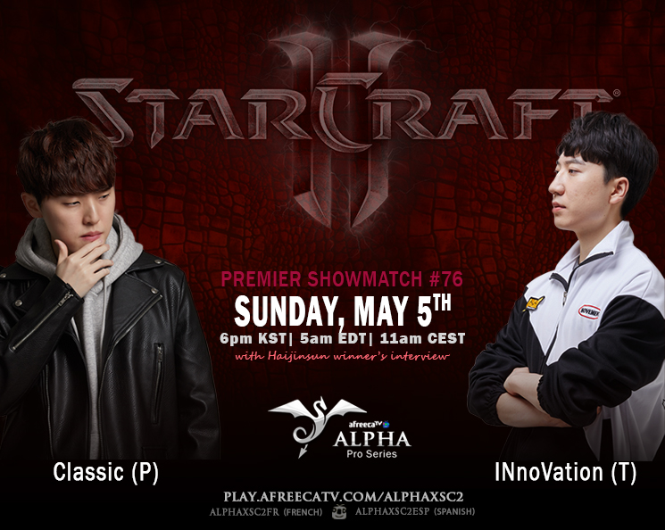
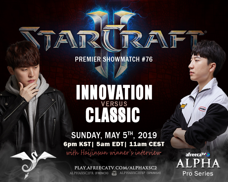
I agree these 2 options are much stronger! I do prefer how the blue pops on the top one over the red of the 2nd option. Also I feel the 2nd option you’ve made “versus” and “with Haijinsun…” more prominent because of the color pop, however I like the spacing more on #2. I agree, there is more “room”
IMO Graphic design projects should (whenever possible) evoke a feeling to the audience along with the information. Remember you’re communicating something and making a viewer ‘feel’ is a more enhanced way to communicate over just words. (eg. someone reading a story to you in a monotone voice vs. someone reading with intonation). In this case, I would think that those who will watch, will think this is an exciting event and so make the poster exciting too.
BUT… while it IS better, I’m still not feeling that I should check it out. Ok I realize I’m likely NOT your target audience, but if you get me to think/feel, then no doubt you’ll get your target audience to feel it. It could be the photos.. especially the one with the player sort of “pondering”..sometimes we get stuck with using “supplied” images (where we don’t get control of a photoshoot for example) and so it can become challenging to get the feeling across you’re going for. In this case, maybe try making the guys more intense somehow.. lean them towards each other, or back to back maybe… make them look like they are sizing each other up or trying to psych each other out… not sure.. but you have improved the design so far and if you want to go further, maybe try a few more options. :)
Thanks @wdesign I appreciate all the feedback! As far as the photos, I did ask Afreecatv if they would send them to me and they do, but you are right in the fact I don’t get a choice. Perhaps I will eventually be able to stock enough of the same player that there will be variety. Some of them are actually tiny causing pixelation, while others are very large files…but I don’t want to ask more of them than I already do.
The picture of the one pondering, is actually cut off on the right side, so it has to be against the edge. As I get new pictures of different players, I will toy with your ideas. Thanks again! I’m pleased with how it turned out and being pushed to think differently
That’s my opinion too. In addition to obvious things, like written words and aesthetics, subconsciously engaging a target audience with just the right emotion creates an instant rapport with that audience before they even know the details of what they’re seeing.
It’s one thing to engage people with information, but really making a connection requires evoking just the right emotional response from them. Like you said, good design solutions usually do this — at least those solutions that require more than being purely functional.
Not to be a wet blanket, but can you use the Starcraft II game logo on this poster? Just wondering about the legality of this.
If you are allowed to use it, not doubt you’d have to have a disclaimer on the bottom that says this competition is not legally endorsed by the game manufacturer.
After spending some time reading the trademark guidelines, I confess some of it goes over my head and is confusing. However, it looks like I am fine to use the logo in this way, although the red tinted one I believe is a no-no since it’s ‘altered’ in a way other than size.
I know a looooooooot of people use the logos/images from the game, but I never knew for myself how the trademark/copyright worked in order to allow that. I appreciate you mentioning it, so I don’t find myself in trouble accidentally!