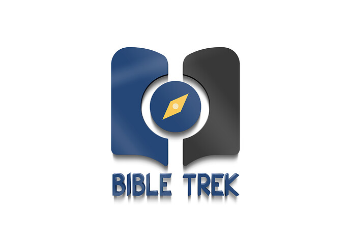
The program deals with answering questions people have using the bible as the basis.
Third one is best. Gold for heaven and reward. Blue for trust and the compass for navigation not just trekking but the bible itself. Pretty clear to me.
Maybe I’d go for matte instead of gloss. Spec: The white brush strokes.
I swear I’ve seen this theme since I was a little kid.
The drop shadows add clutter that impairs legibility. The third one isn’t even a logo; it’s a logo surrounded by a yellow vignette. As a television logo, there’s a possible opportunity for motion and animation, but that’s a different challenge from designing the logo, which, in its basic version, should be kept simple and unadorned. Hold off on the bling until it’s needed.
If it’s a TV logo, you have the wrong aspect ratio for the one with the yellow vignette.
Do you have any other sketches or concepts?
I’m ignoring the blinged out versions.
I assume it is generally supposed to look like a stylized open bible, and of course the compass point. If so, what made you decide to have the right hand page be black/dark gray? It’s not necessarily “wrong”, but it is the only part of the logo mark using that color. Likewise, what was the thought process with having the top outside of the pages have a more rounded corner than the bottom outside pages? Why is the white “outline” around the compass circle wider horizontally than vertically?
I will say, it is nice to see something other than just another sans serif font, which seems to be more and more the norm, but at least IMO the font you selected may be problematic in that t is a little light (from a "weight distribution’ standpoint to the book/compass) and the sharp angles especially with the I, L, K and the leg of the R compete with the overall roundness of the book/compass. I’m not saying the font has to be rounded, but the current sharper angles do seem to not compliment the rest of the mark.
The center of the compass being a slightly different shade of yellow adds nothing. IMO you’re better off just having it knock out to white.
Other than that, it’s fairly straightforward and somewhat uninspired or unique.
And lastly, just a general thought. But I imagine the point of the logo and the trek is to point one more to truth and faith. If so, perhaps having the compass point “true north” would reinforce that, even though visually I think the angle breaks up everything being so horizontal and vertical and mirrored.
I asked about sketches because it seems that it is more and more common to not do actual pen or pencil and paper sketches. And that may seem old fashioned, but the freedom and speed in which you can quickly sketch out concepts and ideas or even parts of ideas without worrying about fine tuning execution is under-rated. You should be able to knock out at least 50 or so sketches which also help you get past “obvious” ideas and solutions which help you get more creative in your approach.
Maybe you didn’t do this, but too often when you go right to computer you have a few ideas in your head, and you quickly focus on one of them and do your best to execute it through software, and spend time worrying more about execution than on concept. Likewise, people will then simply try out several fonts they have on their machine to find one that works and voila! … a logo.
I glanced through these pages that also illustrate the benefit to sketching logos, and at a quick glance they show the importance and benefits of this valuable step.
How to Get Better at Sketching Logo Concepts
9 reasons I start my logo design work on paper
Maybe you do have sketches, great! If you’re willing to share them, post them. But if you don’t have sketches, read the links and give sketching a shot.
The blue color is too dark. And the shadow under the lettering is too close in value to the blue color. It’'s better without them. Remember, Readability is primary. Don’t make viewers “work” to read the text. As a person who spent years working on such projects as a TV Art Director, make color work for you. Everything is too dark. And a Bible-looking graphic should stay away from anything with black for the theme. Color is television—Use color wisely!


