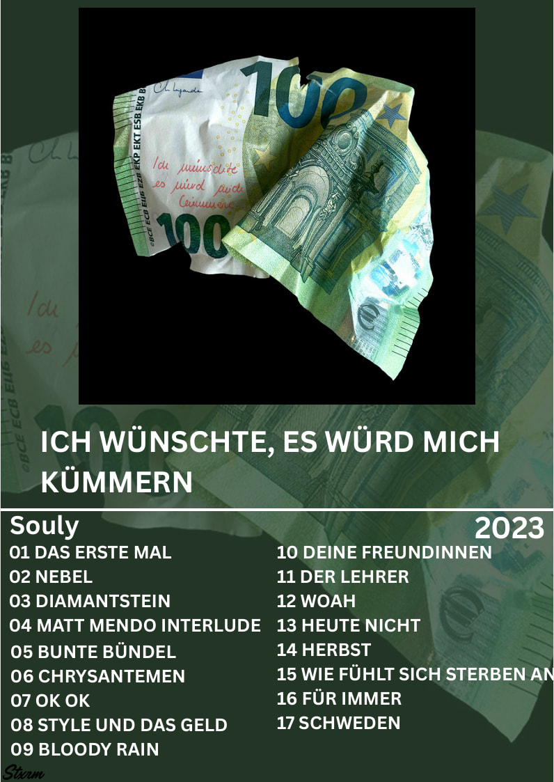
I have just created my first ever project. its a album from my favourite artist and i need help to improve it. Im using Canva.
I’m confused by this. Is it supposed to be an insert for a CD jewel case? If so, once folded, the track list would be upside down. And why isn’t the name of the band on the cover instead of only on the track list? And why isn’t the track list area also a square instead of a rectangle? Why is the name of track 15 running off the edge?
Maybe I’m misinterpreting the purpose of what you’ve created. If so, perhaps you could explain what you’ve designed. As I said, I’m confused about what you’ve designed and the purpose it’s supposed to serve.
Its supposed to be like an poster for an album to kinda hang on a wall or sum like that
You do a great job of using the main photo to drawn the attention of the viewer’s eye first thing. It is clearly the element at the top of your project’s hierarchy, especially as the rest of the designs colors feed off it. However, I would suggest using different a font size or typeface to clarify and separate the rest of the information. The album’s title, for example, seems to blend in to the song titles, which makes it a little chaotic and a bit difficult to understand. Using more space and a clearer hierarchy within the text could help with this.