The angles are better but I would like to get the font bigger if possible, but I dont see how I can feasible do that. This one is my most recent attempt.
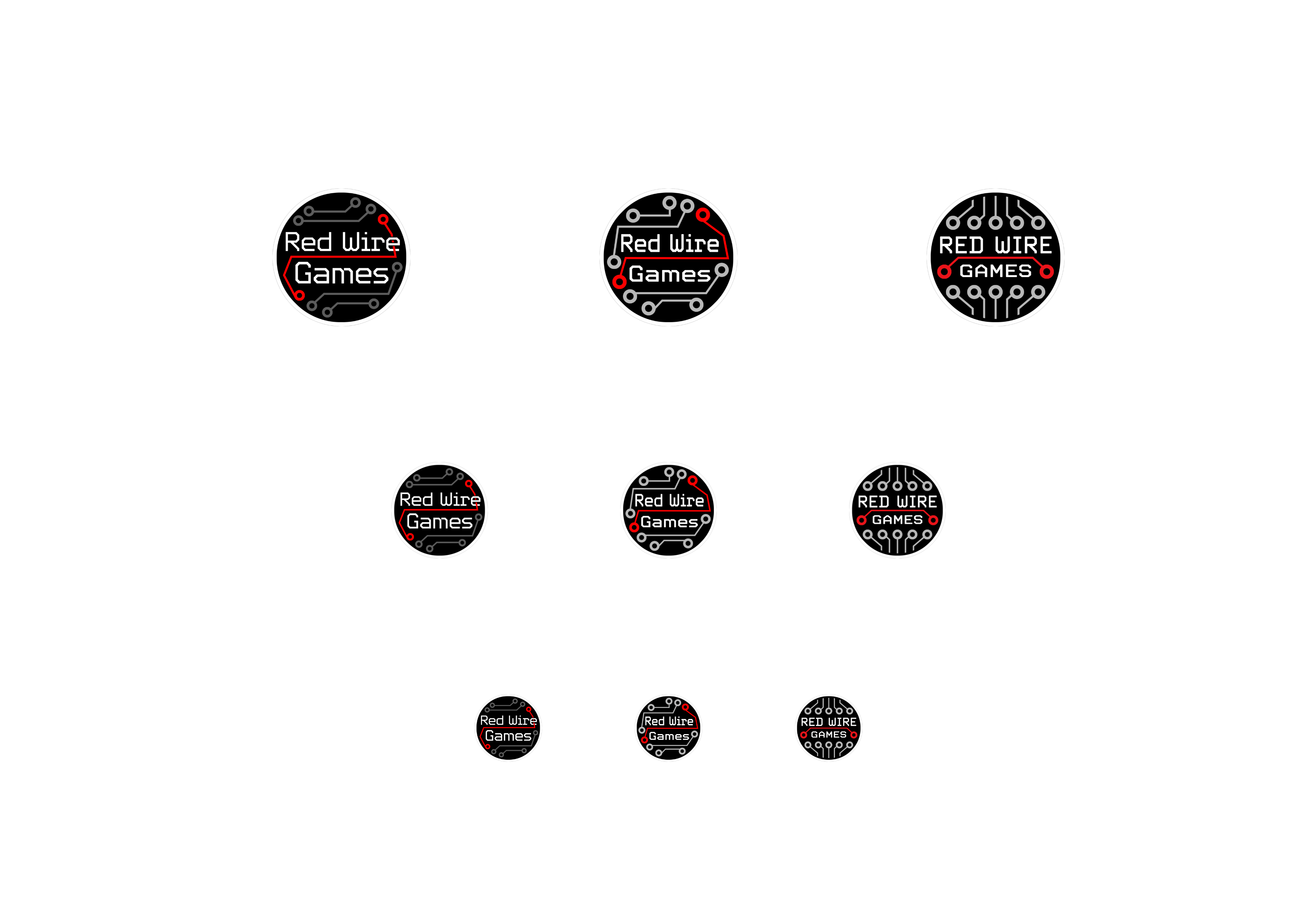
From a technical standpoint, none of those designs is going to work since they’re all too detailed to remain recognizable at smaller sizes.
You should hire a professional graphic designer who will first research your company, target audience and competitors and then create a whole brand identity system, rather than just a logo.
I agree with the others. In addition, you mentioned not wanting a corporate look, which none of them have, icluding the one you said looked “too corporate”. Along the same lines, I suspect you don’t want a corporate-looking font, but why did you choose this one? To put it bluntly, the font s poorly designed and awkward-looking.