Hi everyone,
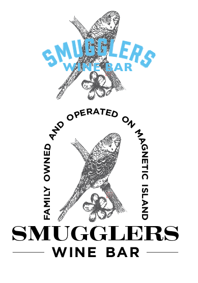
This project that I am doing is for a wine bar on a tropical island. They wanted a quirky yet sophisticated logo, and were set on a budgie. I went with a vintage-y feel that connects to the winery but also appeals to people that aren’t generally looking to go to a wine bar. Any help is appreciated, I am here to learn!
Is the bird a raster image?
Most logos are created in vector to avoid the resolution issues you will have putting that on something as large as a sign.
Is the bird clip art? Most clip art sites, by license, do not allow clip art to be used in logos. It is not trademark-able.
Do you see your contrast issue in the top version?
What is the shape of your sign blank? (the board the sign is printed on.)
I’m not getting a “quirky” vibe at all.
You can’t use clipart for a client’s logo, or anything with that much small detail.
As others have pointed out, there are issues using clip art and bitmap art for logos. In addition, there are legibility issues, particularly with the word “wine.” That said, I like the general direction of the first option. I like the font you choose for Smugglers and the color palette. Check out Flora Grubb Gardens for inspiration as to where this could go.
Using raster/bitmapped artwork for logos is typically a bad idea for various reasons — some of which have already been mentioned. Enlarge them, and they get blurry. They’re problematic to screen print or embroider on t-shirts or hats. Shrink them down to really small sizes and they often become illegible. The options for making them into storefront signs are reduced down to those techniques and materials that accomodate that kind of detail. I could go on, but for all these reasons and more, it’s usually better to stick with simple, vector artwork.
As for your concepts, how do you intend to color the budgie and the flower? Black & grey are sort of dull given that color is one of their main characteristics of flowers and budgies. The contrast between the budgie and the blue type is nearly non-existent and cause the type and the image to visually blur together (squint your eyes and the blend together). Does anyone except the owners care that it’s family-owned and operated? People are likely already on Magnetic Island or looking for things to do on the island, so there’s really no need to state in the logo that the wind bar is on Magnetic Island.
As for aesthetics, I do sort of like the top one, but the type really does need to be a different color, and the image needs to be color as well. The typeface you’ve used is good. Even so, as we’ve said, using bitmapped art is really going to create an ongoing set of reproduction problems.
1 Like
Hey, no this is not raster/clip art it’s hand drawn vector in illustrator, I wanted a woodblock type feel. I agree with legibility and would use the type on it’s own for smaller stuff, but was worried about making a drop shadow overly complex because the bird is complex. Do you think I should experiment with simplifying my drawing? I chose th blue because they have an accent wall painted this colour and it would match.
The quirky is because it’s a budge and the wine bar is called smugglers… Budgie smugglers, aka Aussie slang for Speedos
I did hand draw this in illustrator, so it’s vector. I was planning on using the type for smaller stuff.
Hey, as I replied to others it’s not clip art it’s hand drawn vector in illustrator, but I agree with the viability aspect. Do you think a drop shadow would over complicate things? I’m up for suggestions :). I wanted a woodblock type feel, but was worried about walking the line of too simple and it not coming across. I would use the type alone for smaller things
Hey, no this is hand drawn vector done in illustrator so scaling isn’t an issue for large stuff. As f9r scaling down I would use the type only. I replied to others asking their opinion about drop shadows ect. I used the blue because it’s the same colour as an accent wall in the wine bar so it has to be in the colour pallets, or at least not clash with it lol. I like the idea of colouring this, like linoblock printing! Do you have any suggestions on placing the type with a coloured version? I really like the idea. Thanks for your reply, appreciate it!
Drop shadows are raster effects. Don’t use them on your initial logo lockup.
If you are talking about a solid drop shadow, yes it will just add additional complicating elements.
Don’t add elements for the sake of adding something. Make them meaningful.
Simpler is almost always better for logos.
Budgie Smugglers. I wish American slang was as creative. LOL!
Simplify, simplify, and simplify some more. The best logos are the simplest ones.
I agree with PopsD, vector or not, a logo that is, in essence, a complicated and detailed illustration is a recipe for future problems.