Hello, I’m new here but have already learned a ton from reading the crit pit and I’m hoping I can get some critique of my own. I’m not a true graphic designer, but as a 3D artist working in archviz my duties ranges from adjacent to slightly overlapping with said discipline. I frequently create what would amount to graphic design sketches i.e. quick and rough graphic designs that look fine when adorning a magazine cover or sign in the background of my renders but have issues when viewed up close. This has gotten me into trouble this week as my client really likes one of these designs and wants to use it as the logo for the winery i am visualizing for her. I’ve done my best to clean it up, Kern the type etc. but I wont feel right letting her print this on wine labels and marketing materials until I get some feedback on it from career graphic designers.
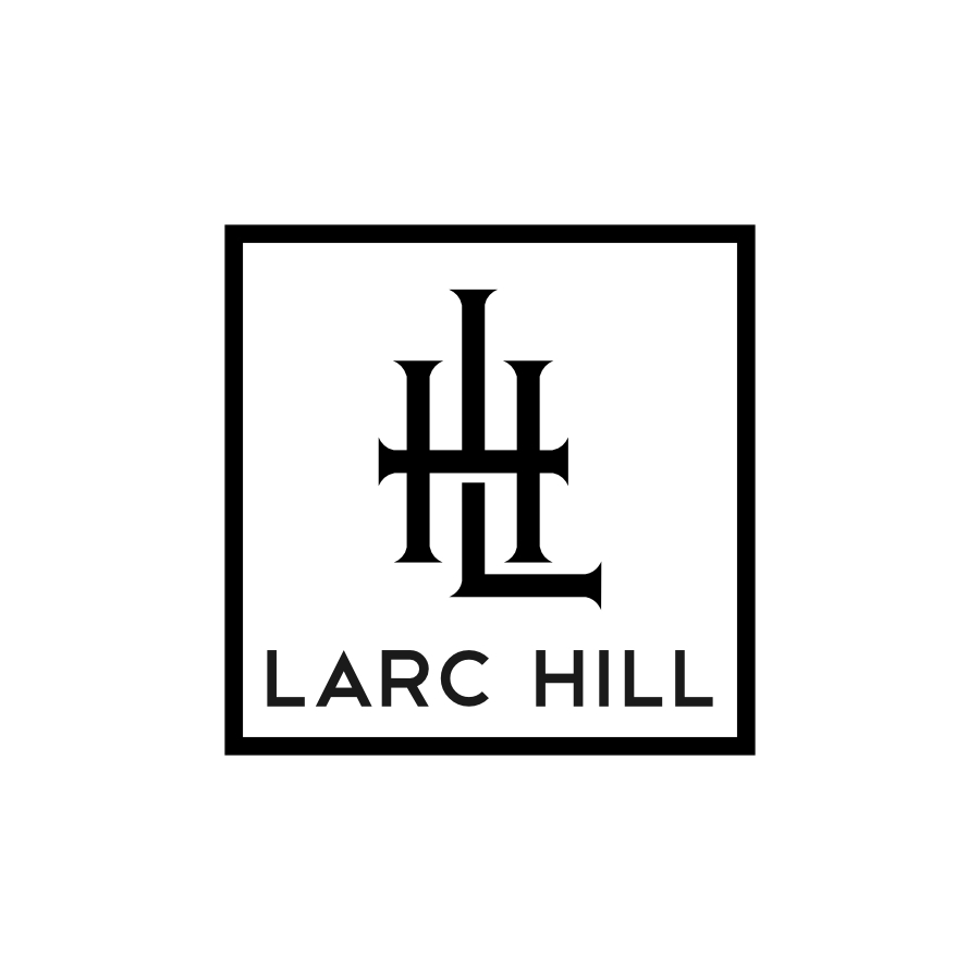
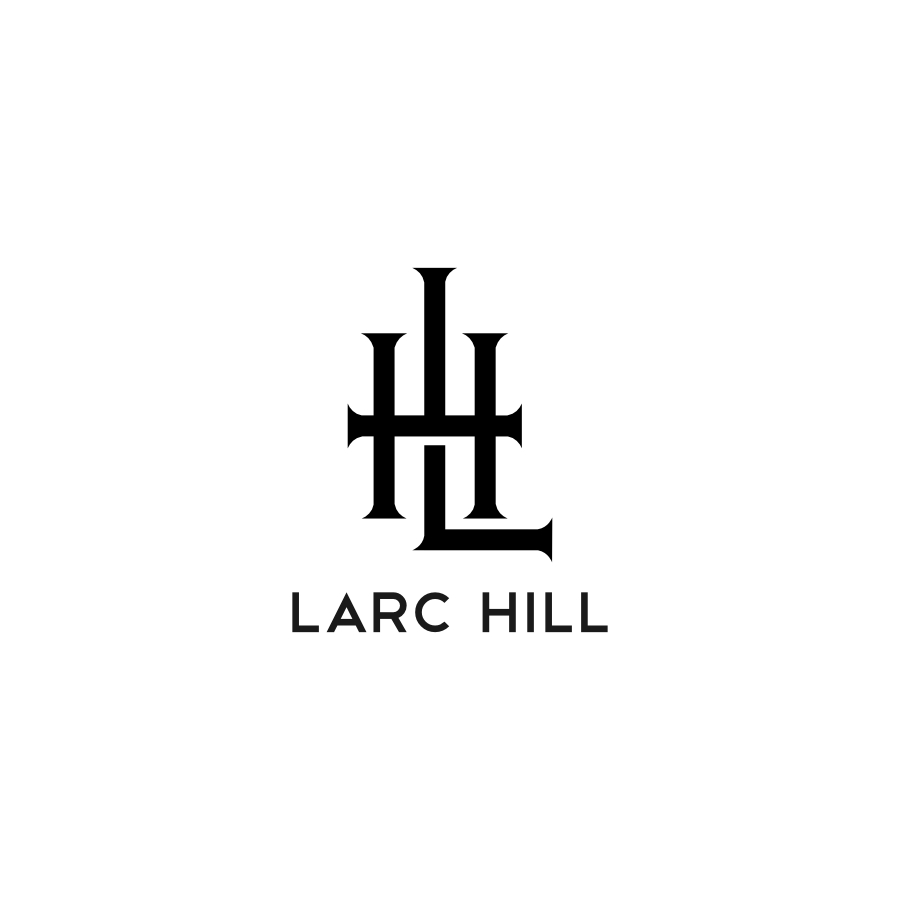
Its a simple monogram logo inspired by the wrought iron fixtures throughout the site and vintage cattle brands to a certain extent. Since shes very sold on it, I’m hoping to avoid any major changes that I’d have to pitch but input about kerning, sizing of the subtext, etc. would be highly appreciated.
I think this is looking pretty good. Out of the two you’ve presented, I prefer the version without the frame. I would say you could bring up the type size could come up maybe 50% and increase the amount of space between the monogram and the type. You cdid a good job picking a sans face to work with the monogram.
I think it’s good and reflects a solid, conservative, higher-end winery (assuming that’s the case).
If it were me, I might repeat that little break in the monogram’s L beneath the H’s crossbar immediately above the crossbar too. I might also thin down the horizontal strokes a tiny bit to offset the optical illusion of them being a little heavier than the vertical strokes. I might try making the terminal area of the strokes between the serifs just very slightly concave, but I’d need to see it that way.
As for the typography, It’s a nice contrast of faces, but I would definitely (no mights) scoot the L just a little closer to the A and do the same with the LL in Hill.
I too like the one without the surrounding box best.
Wow guys, this feedback is fantastic. I will definitely be turning to this community for help more often. Hopefully in time I will be in the position to be offering some help as well. I’ll make a few variations combining some and all of the recommended changes and then post them here. Thanks!
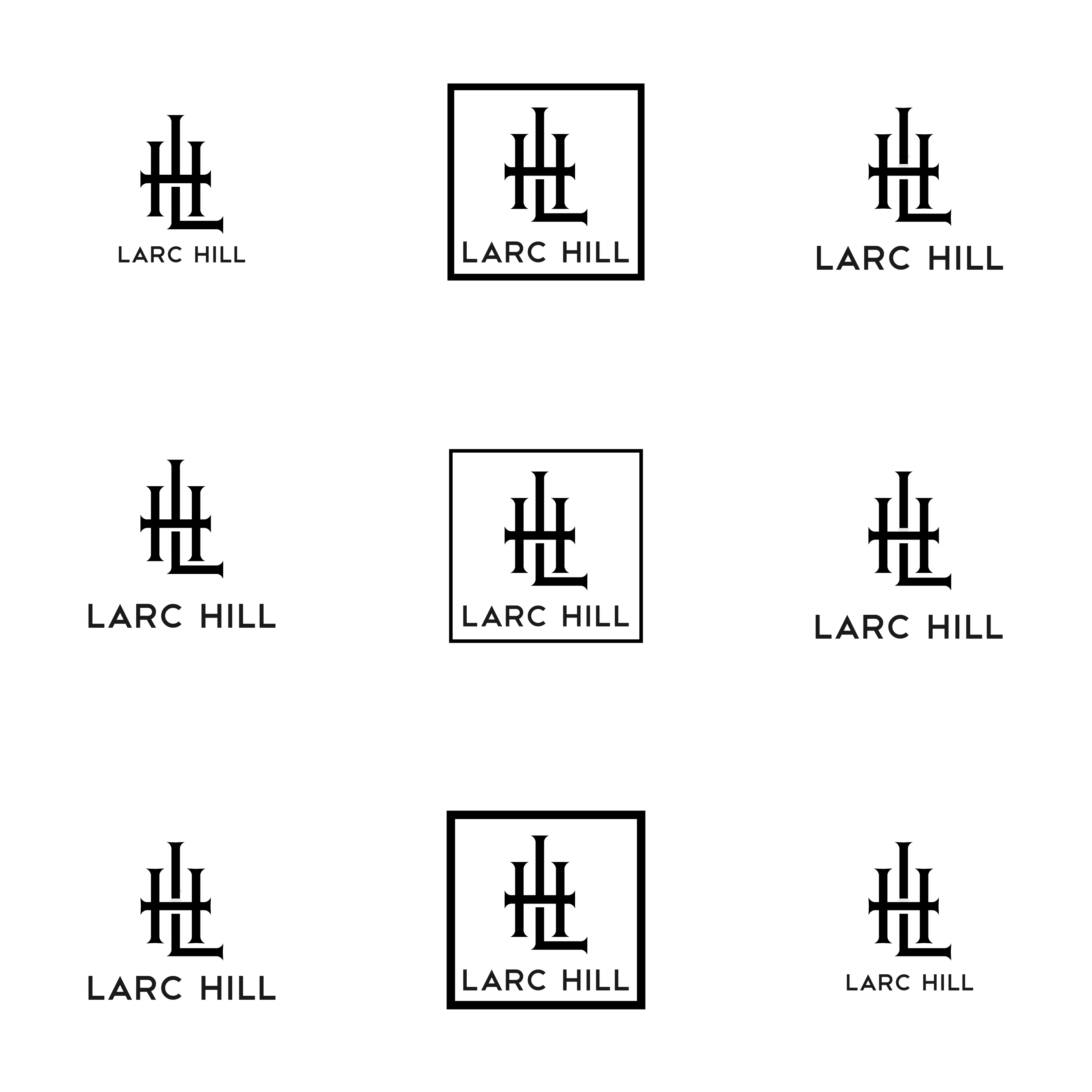
Here is a comparison of all the variations including some of the suggestions. Let me know if this is too cluttered for you guys and I’ll just upload the revisions separately.
It’s a tough call, but I think I’m liking the third one in the top row. The only thing I might change is to round the needle-like points on the serifs just a bit. At small sizes, I don’t see an issue, but when reproduced larger, the pointiness is more apparent and might have a similar psychological effect to a rose thorn.
This is looking pretty good. I respect Just B’s suggestion of adding space between the top part of the L and the crossbar in the H. Having seen both options, I actually prefer having them touch. Probably personal preference, though, I don’t think you’ll go wrong either way.
The main reason I suggested the white bars on both the top and the bottom is for consistency with the illusion of the L being behind the H. With only a white space below, it diminishes that illusion and might even counter it by placing the light space where a shadow would actually be. If there is no intention of creating that illusion, I’m not sure it matters whether there’s one or two white spaces — at least as far as aesthetics are concerned. I might try equalizing the height of those spaces (whether one or two of them) to match the white space between the right vertical stroke of the H and the horizontal stroke on the L.
Like Steve said, I don’t think you’ll go wrong either way. I think we’re to the point of nit-picking, which is usually the place to stop and call things finished. Keep in mind that I’ve used the word might liberally in my suggestions.
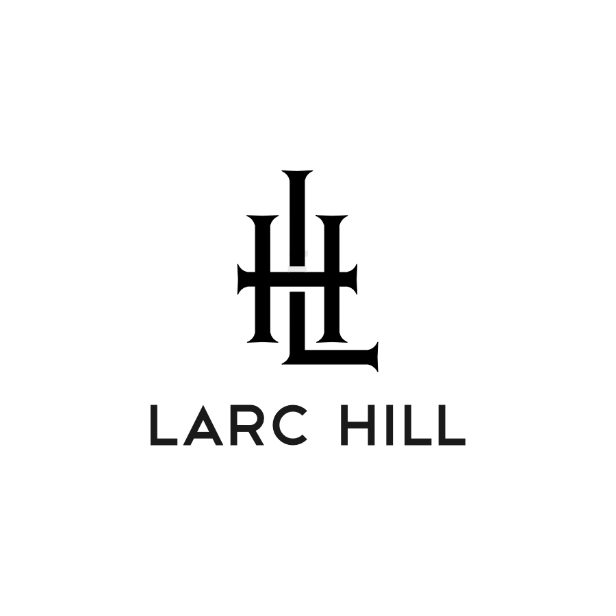
Thanks guys, I need to send it off in the next hour or so, so there’s only so far it can be nitpicked anyway. All this feedback has been great and given me the confidence to deliver on something that’s not exactly my forte. This community is a godsend.