Hey all, could you vote on our new company logo?

Thanks so much for your help! Could you take a moment to vote on these two logo options for us?

*** Circular Living: Reuse • Recycle • Repurpose.

*** Everyday Life: Cook → Store → Dispose, smarter.


*** Always Improving: Continuous innovation for homes

Truly appreciate it!!! :blush:

I like the idea of the wordmark incorporating the infinity symbol, but I would tone down the complexity of the remaining letters to make them more conservative and straightforward. Done right, it would focus attention on the infinity loop as being the nugget of creative goodness in the composition.

4 Likes

I like the first one and also the second one but for the second logo there is not continuation with the other letters, just the L and the first O then the other letters are separated (not connection or like way or a path). It should be a sequence between the first letter until the “y” and I mean they should stick each other for making that loop sequence.

1 Like

You shouldn’t choose your logo based on the results of a forum poll.

You need a design that both appeals to the target audience and makes you stand out from the competition. Such a logo is created through careful analysis of your company, customers and competitors.

Moreover, you need not only a logo but a whole brand identity system: branding patterns, brand colors, typography, iconography, the right style of photos etc., as well as a brad book that tells you how to utilize those elements to effectively communicate your message all across the board.

I highly recommend hiring a branding specialist.

2 Likes

Hmm. I wonder what’s going on here.

First, there is some odd text in your post, the three lines preceded by ***, which makes me think this post is some sort of spam or SEO thing.

Second, I’d be surprised if these two logos were designed by the same person. This makes me think we might be looking at submissions from a contest site or crowd sourcing site.

Of course, I could be completely wrong and maybe a bit cranky … I didn’t get coffee this morning.

4 Likes

Thanks for your comment! Just to clarify, the logos were designed by two people. One is my partner’s daughter, who graduated a few years ago in graphic design from England. The other is me, I graduated from Cal Poly Pomona 22 years ago also majored in graphic design and have been running businesses for the past 20 years.

The * you saw appeared automatically when I clicked the bullet point formatting on the chat board. I then added two extra * to make it clearer since it wasn’t actually a bullet point.

You won’t find my company online yet since we’re still in the process of forming. It’s definitely not the right time for me to spam anyone :blush:. I’m not selling anything at the moment, no Amazon, no eBay. I just wanted honest feedback to help decide which logo direction works better.

I agree with you. I majored in graphic design, but shifted into business a couple of years after graduating. For my other company (where I’m the majority owner), I spent $3,500 on brand identity and it turned out well. For this new company, my partner isn’t budgeting for design, so I’m handling it myself even though I’ve been out of the game for a while, just doing what I can to make it work. Don’t want to argue about it. #2 is my design; #1 is by his daughter, who also majored in graphic design and is a recent graduate.

Thanks for your input. If we decide to use this logo, I’ll make that change. Thanks again!

1 Like

Got it, thank you for your input! I like the idea of keeping the loop as the hero, great suggestion.

This is just my impression but I am happy to help !and good luck with your new Logo !

1 Like

Thanks for the clarification. So I’ll either be insulting you or your partner’s daughter. :grinning:

Option 2 is, hands down, the better logo. If it were me, I’d spend a little more time on the oo / infinity symbol to see if it could be smoothed out and maybe a bit more symmetrical. See the attached screen shot with circles laid over. And maybe a tiny bit more letter spacing between the F/i pair or slightly shorten the top crossbar on the F. Aside from those, I think it’s pretty nice work.

1 Like

If I were to be brutally honest I don’t particularly care for either, I’m afraid.

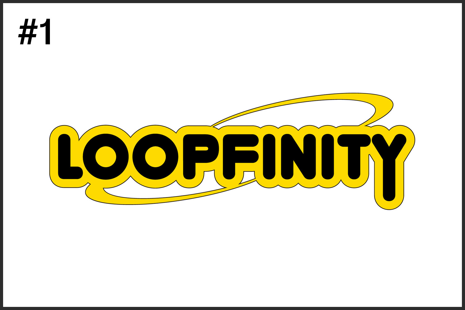
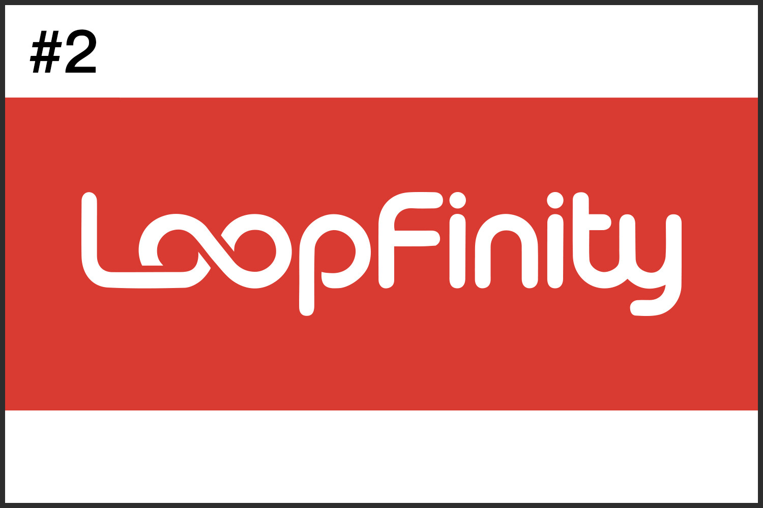
As others have said, the second is better, but even then, that’s not glowing praise. The use of the infinity mark is, at least, an idea – albeit one that stopped at the first hurdle and settled. It’s a bit cliché and obvious, if I’m being honest. It says little about the company, what it does, or the way it does it.

Aesthetically the thing that irks me the most is the type itself. Is this something you drew yourself, or based on a cheap, or free font? Either way, some of the curves make my toes curl. That lower case p is painful. In addition, there’s little or no optical compensation on the vertical / horizontal. This just serves to make it look very clunky and unbalanced. The gratuitous ligature on the ty just serves to distract from the main device.

Above this, though, if a client came to me with this brief, the first thing I’d do is question the name itself. I have no idea what the company does, but the word itself does not trip off the tongue. It is a cumbersome hybrid. What does the company do?

You said that for your last company, you had a budget for design and it worked out. Do that again.

To my mind it is madness to put all the effort required into starting a business, that may even be the next best thing in its market, and then rely on communicating its services with no budget. If you have the skills to do it yourself, then all well and good, but I’m afraid both of these look like crowd-sourced $50 logos.

I am not trying to be scathing for its own sake, but hopefully if you’ve both been through design education, you’ll take an honest critique the way it’s intended, even if it is difficult to hear.

1 Like

Wow, thank you so much for your time putting this together for me. I will do just that, truly appreciate your time. :blush: :pray:

Thanks for the honest feedback! It matches what I told my partner. I’m a design grad, but I’ve been in business for years and haven’t really touched PS/AI since graduating. Logos were never my strongest skill; I double-majored in Computer Information Systems (specialized in Web Development), but I’m giving it a shot. He keeps emphasizing that product and management are the priorities. He’s the type of person who doesn’t place much value on art and aesthetics. As a small shareholder in a new startup, I just have to go along. Again, I truly appreciate your time and feedback, I learned a lot from your comment. :blush: :pray:

I’d argue the point with him until something sticks. It’s a very blinkered attitude to liken it to art and see it as a waste of money. It has nothing to do with art. It’s about communication. As I mentioned in my previous post, what is the point of having the most efficient, well-managed company with a knock-out product, if all your potential customers think you’re an amateur mom-and-pop-shop. How does cheap communication reflect on your company and product?

It says that you can’t be bothered and becomes akin to turning up for an interview for a high level banking job in torn jeans and a tee-shirt.

These days a brand identity can represent a significant percentage of a business’s worth. It is definitely not something to be scrimped on, unless you are happy to undermine all the o.ther work that’s gone into it. There’s a reason top performing companies invest wisely on their brand. It works.

1 Like

There’s a whole host of big companies with bad logos
https://www.google.com/search?q=big+brands+with+bad+logos&oq=big+brands+with+bad+logos&gs_lcrp=EgZjaHJvbWUyBggAEEUYOdIBCTEwOTM3ajBqN6gCALACAA&sourceid=chrome&ie=UTF-8

Your 2nd option is much better than the first.

Concentrate on the content and make it a good product/site or whatever this is.

Google, Bing, GAP, Microsoft, American Pediatic Society etc. all have terrible logos - absolutely awful.

You’ve got good bones with the 2nd option - go with that - and evolve it over time.

People get too focused on the logo when the product is ready to go and waste time on developing something that the average person won’t even read into.

How many years did it take people to spot the arrow in the FedEx logo - and I probably expect that was a happy accident.

You’ve got the logo - work on it over time - evolve it as the business evolves.

Look at all the bad logos, they don’t matter as long as the product/service is good, people will use it.

1 Like

It costs an awful lot more to undo a bad brand than it does to get it right in the first place. Once people have made emotive decision about a company, you have to go a long way to unpick that and rebuild their perception. Ultimately people buy on emotion, not entirely of course, but it has a huge sway in the way people perceive a product or service.

Also, apart from the comically bad logos out there, those that are historically rubbish are usually just that. The date from a time when marketplaces weren’t so saturated and markets were so brand savvy. The have already built in their emotional capital to them, so it can be commercial suicide to throw the baby out with the bathwater. If you are starting up now, if you want any sort of market penetration, I think you have to start well, rather than fix later.

1 Like

I know, some logos cost hundreds of thousands, even back in the 70s. Well, he’s in his 60s and a successful businessman, so it is hard to change his mind. As someone with a design background, I completely understand where you’re coming from. I also appreciate your time sharing such valuable advice with a stranger like me. This forum is wonderful, I got nothing posting this on Quora or X. I just deleted them. Love you guys! :+1: :+1: :+1: :pray: :blush:

Love your perspective! You’re absolutely right, so many big companies have questionable logos, yet their products still dominate. Too bad we don’t have the budget for it, otherwise I will take Jakub_Trybowski’s advice to hire a professional designer. I’ll take your advice and let the logo evolve over time, I may just adding a small twist here and there based on other designers’ suggestions. Really appreciate the encouragement and the reminder not to overthink it. :+1::pray: :blush:

Sprout, I think it’s worth pointing out that a logo on its own isn’t a brand.

A logo is just one piece of a bigger puzzle it’s a symbol, a shorthand. What makes it meaningful is the full identity behind it, colour palette, type choices, imagery style, tone of voice, how it’s applied across packaging, website, social, even down to business cards and emails. Without that system, a logo is just some letters or a shape.

So before getting too caught up in whether version 1 or 2 looks nicer in isolation, it might be worth stepping back and asking what do you want people to feel about this company, and how will every design decision consistently reinforce that? That’s the part that turns a logo into a brand.

Logo 2 is clearly the better more professional logo.

But Logo 1 could be better for a cartoon, a character, or something else.

For me Logo 2 fits better - logos evolve over time.

So I wouldn’t get bogged down in the logo if it’s for a service, I’d focus on making that service awesome.

Amazon didn’t just pop up with the most amazing logo

It evolved over time and grew with trends.

We’re 25 years with the current logo.

All I’m saying is that the logo is only part of the story.

I wouldn’t care if the logo was

LOGOFINITY

As long as the service delivers.

1 Like