So here’s my story: In my old job I had some surface-level contact with design and branding, and I absolutely loved it. It was so much fun that I decided I want to make money with this in the future. I’ve been learning like crazy ever since, which has only strengthened my decision.
I now have my first “client” - I get to do a rebranding and create a website for a friend of mine. I’m not getting paid for it, but I didn’t ask for money either. I want to use this opportunity to gain experience and have a kind of test project where there’s actually something at stake. Since my friend is an entrepreneur with a big network of business contacts, I really want to do an amazing job so I get recommended and can hopefully land my next clients - the paying ones.
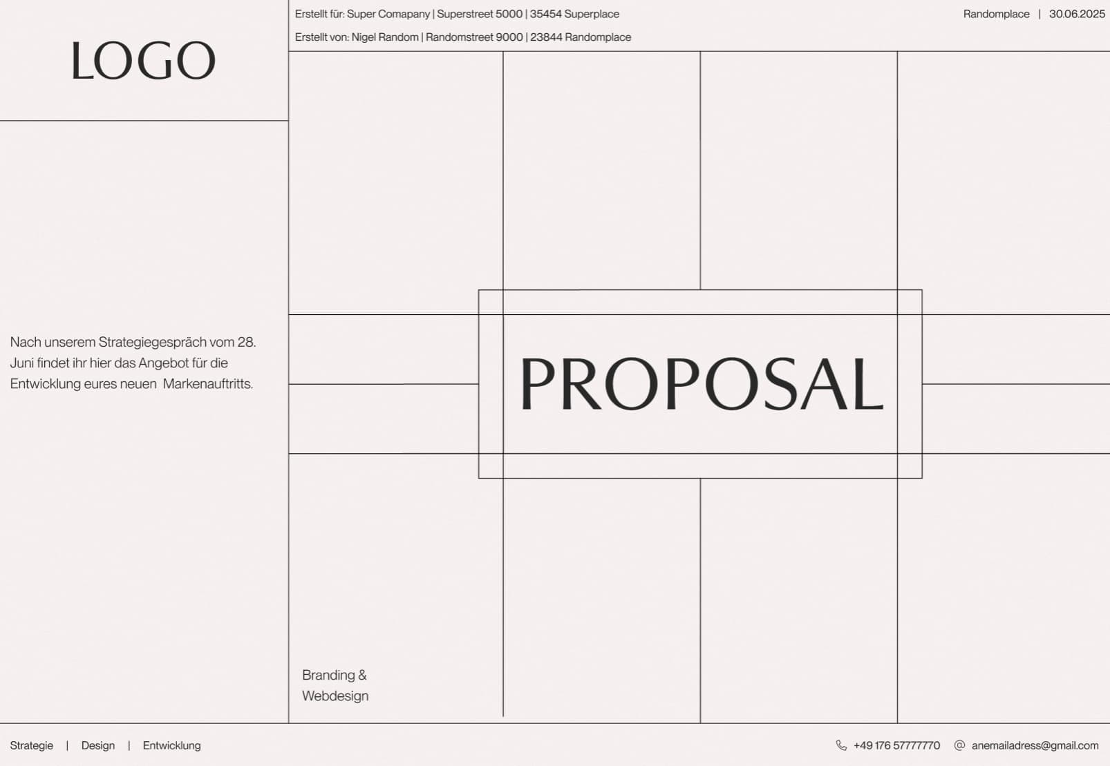
That’s why I also want to give him a nice proposal to make a good impression right from the start. My idea is to use decorative grid lines as a common thread throughout the entire proposal. Each slide would have a different grid layout. The proposal will be a web presentation and I plan to animate the individual lines so they grow to their full length from different directions when loading.
Well, that was the plan at least. I’ve now created the cover and I’m massively second-guessing myself. I’m overthinking everything and feeling extremely unsure about the whole thing. Does this even look professional enough? Doesn’t it look more amateurish? Is the grid concept working or does it feel gimmicky?
Looking for people with more experience who might be able to help me, I came across this forum. So… that’s where I’m at right now. I’d be super grateful for some feedback.
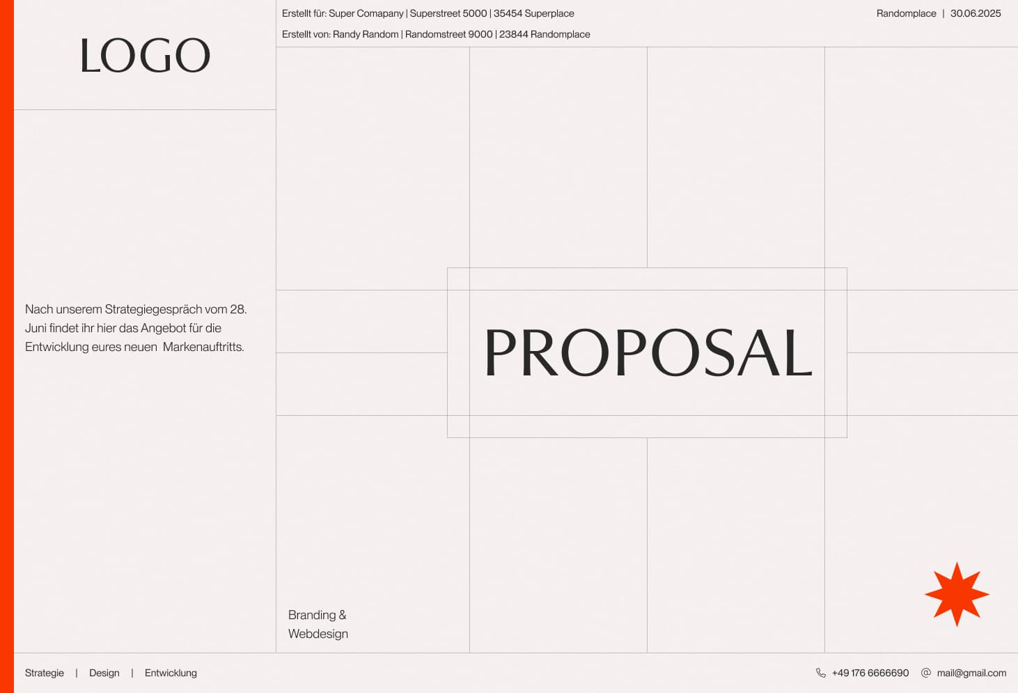
Hi and welcome. This isn’t anything new. I’ve seen this a lot in websites and even in media such as t.v here in North America. Whether or not this theme would work for your friend would entirely be up to the profession he works in. If he was into drafting/architect/interior design to name a few, this theme would work well I believe. The orange doesn’t compliment the black and ivory (paper color) I think it subtracts from the theme. But it’s hard to say because right now there is no logo and no proposal. This is just a base template.
When you write “proposal,” do you mean the proposal document itself, or do you mean the proposed rebrand? In other words, the proposal document contains the rebrand proposal. Does that make sense?
If this is only the cover of the proposal document, do you have the rebrand ideas ready to put together? If not, you might be putting the cart in front of the horse.
Like Just-B, I’m a little unsure about exactly what you mean, but if what I can glean is correct, it feels more like you are worrying more about the glass, than the wine you plan to put in it. Of course the glass matters. You don’t want to be serving a Bordeaux in a Sauternes glass, but, more importantly, I’d be putting far more effort into making sure the wine I choose suits the food well.
Any presentation format needs to be appropriate and, as a rule of thumb, simple and clear. If the presentation format is gimmicky, you risk overshadowing the presentation itself and that will only piss your client off. It will look like you care more about your own ego and showing how brilliant you are than solving their problem.
Not sure I’d care about the idea of animated lines, if the work being presented wasn’t show-stopping. Even then, it is far better to employ brevity in the presentation style itself. Classy, elegant and understated. Remember, it is there only to support the work. ‘Less is more…’ in this case – in fact, in most cases. If there is a solid reason to include something, include it. If not, don’t. It just becomes visual noise.
@Sprout was seemingly reading my mind, since his concerns are very similar to my own. He phrased it more elegantly than I could, however. You don’t want the glass to overpower the wine.
I’ve made a career out of working at advertising agencies and design studios and have been involved in many branding projects. The document that pitches the idea is almost always simple and meant to showcase the pitch, not compete with it for attention. In essence, the pitch document, whether printed or digital, is a straightforward, transparent container for its contents.
There are exceptions to this rule, of course, and in those cases, the pitch document typically adheres to the brand design guidelines you’re proposing. In effect, the document becomes an example of the proposed visual brand in use.
Although this isn’t relevant to your situation, more often than not, clients are conscious of their budget, and you don’t want them to think you’re wasting their money on preparing a glitzy pitch. Again, there are exceptions with big-budget projects, but typically, the pitch document format is simple, clean, transparent, and minimal in design.
The moving lines animation might look nice, but in the document, those moving lines might compete with the contents rather than transparently complement them. They might also be confusing to the client, since they might confuse the design of the document with what you’re proposing.