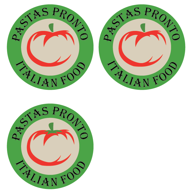
Same student from earlier, hey. I got feed back from the logos I made for this restaurant earlier, and I improved the logos accordingly. I made the colors brighter so you could see the text better, although I kept the Algerian font because I couldn’t find a better one that matched the feel of the restaurant.
To be clear, Pastas Pronto is a pasta restaurant. No pizza. I should have mentioned that last time.
The ones on the left have different kerning, and the bottom left has a stem added.
Feedback?
![]()
No attachment/image?
This is a good start, I could see it also working as a one color stamp.
It looks like the text isn’t quite sitting on that circular path; “Italian” pinches in.
You did a fairly decent job kerning the text, which can be a job with text on an arc. A couple spots missed your attention, most specifically the AL and IA combos in Italian.
Just a disclaimer, I’m a student, not a professional. Here are my thoughts though:
I think it looks great, but I think it could still use a little tweaking.
Both of the S’s in “Pastas” appear to be a little too close to the previous letter. Maybe adjust the kerning a little more on that.
I would also remove the colored shadow behind the lettering, it complicates a simple logo. A good rule of thumb is, will it look good on a postage stamp and a billboard and would it be easy to print on both of these? I think the shadow on the lettering adds cost to printing in an unnecessary way, and it won’t be visible on something as small as a business card or postage stamp, so why not get rid of it?
Hope this helps
The typeface used isn’t speaking to me. It doesn’t make my mouth water and make me want to come and have a slice of pizza. I think you can play around with the colour of the typeface too.