My current portfolio, unfortunately is stacked with older, very niche projects. As such I’m working on project briefs from sites like briefbox and fakeclients to better show my abilities in branding and a wider application of styles with substantially different design directions.
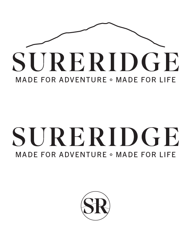
This is a branding identity for a fictional high end outdoor outfitter Sureridge.
The full brief is available here.
At this stage, I’d like to solicit some feedback on my initial logo options. Each is presented as a full signature, logotype, and brandmark.
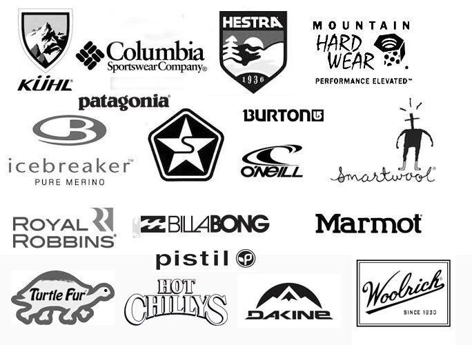
This is a tough product category. There are a lot companies out there that make high-end gear. Some of them have nice logos, but, more importantly than that, they have years of branding that have turned them into aspirational and lifestyle brands. I don’t think what you have so far is ready to compete in that space. Spend a little more work on brainstorming and see what you can do to convey personality through type.
Yeh if you look at high-end luxury logos they are often not great, DG, YSL, Chanel, Dior etc. the logos are not the best.
The brand is well established so the logo is recognisable and coveted by some who aspire to wear the luxury brands.
Even the outdoor market of luxury brands is pretty much very lacklustre.
They get into high-end shops with high-end quality goods, and the logo is often secondary to the luxurious products and prices.
I live in Utah, which is a big outdoor recreation destination. My best guess is that around half the design work I’ve done over the years has centered around outdoor recreation. I’ve designed a few logos for outdoor companies, but mostly, my work has focused on editorial, advertising, and communication design work.
I’ve asked a few of the marketing people of these companies about their logos, and the usual responses have been that they were originally put together by the company founders and locked into the brand as the companies grew. When the companies are sold to bigger companies, the logos get cleaned up a little, but they seem to like the amateurish look that, to them, suggests their outdoor, individualist roots. They don’t want a slick look, so they hang onto their awful logos.
I agree that they need to have an outdoors look, but some of these companies don’t seem to understand the difference between that and amateurishness.
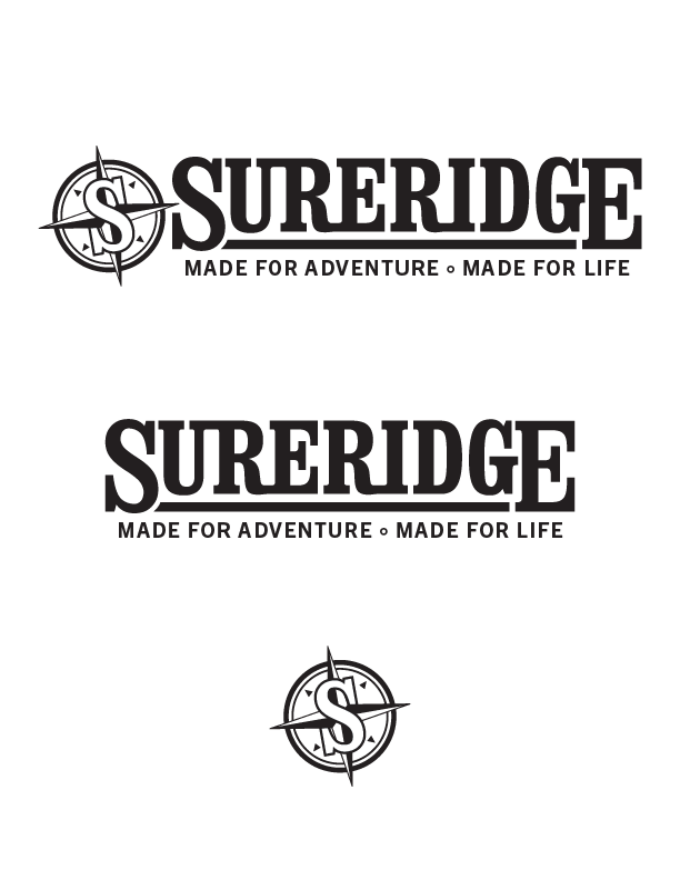
Anyway, about the SURERIDGE logo idea. Umm, I’m sorry, but I don’t think it captures the look and feel of the outdoors. It’s way too generic and unmemorable. I mean, you’ve just typed out the name and fiddled with a few details. There’s the opportunity on this logo to have some fun and to make it look original and adventurous, as the tagline suggests. Do that instead of a bland (sorry, but yes, it’s bland) and easily forgotten word mark.
This is perfect, exactly what I needed to hear to push this to what it should be. It’s pretty challenging to design in a vacuum, I really appreciate all of the feedback and examples.
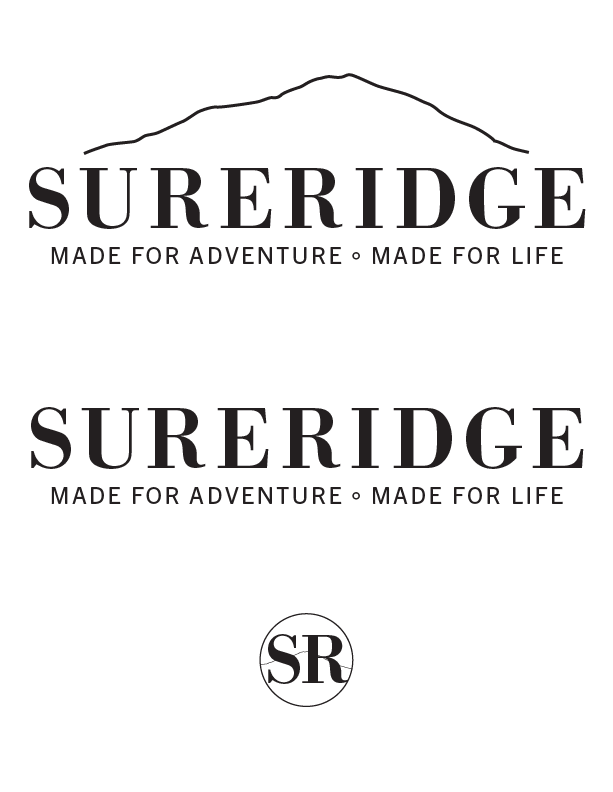
I’ve taken another stab at this brand mark set. This one’s a bit bolder, with a greater emphasis on making the name into a more cohesive mark, rather than the bland, plainly set type.
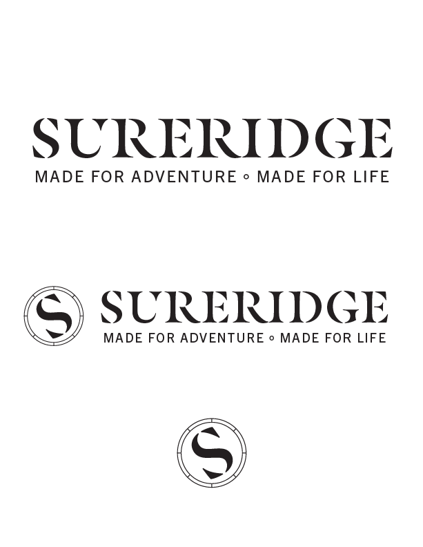
The 3rd version in my initial set was intended to be a compass–with the ends of the S forming arrowheads of the needle, however that obviously was reduced much too far! This version hopefully reads a bit better.
Sorry, but you have produced generic and cliché. What is unique and original about the company? How do they differ from their competitors? Who is their target market? Your solution should be very different if it is retired hobbyists compared to 20-something professionals. This, I’m afraid, doesn’t give any indication about what it stands for or who,it is talking to. It’s not hideous. I’ve seen it a thousand times before. It’s just entirely safe and forgettable,
These are all very familiar to me - I don’t know why but the latest iteration looks like Tyre brand I can’t put my finger on it - but it reminds me of another brand and it’s on the tip of my tongue.
All of it looks like you’re sat at the computer spinning ideas in software.
Best advice I can give, go for a hike - do what the brand says - cycle - walk, do all the things the brand needs physically - ok you don’t have to go up Everest or cycle the Tour de France, but a walk in your area, in a park.
Bring your sketchpad and pencil.
Sit, walk, lie down, walk among trees.
Sketch what you see. You don’t have to be brilliant at drawing (like me).
But make an effort. Step away from the computer.
I’d love to see your sketched ideas. Then bring those to life.
@sprout unfortunately, no demographics were supplied in this brief. I hear you on the safe yet forgettable points.
@Smurf2 walking away from the computer with a sketchpad was fantastic advice. I went back to the brief and noted additional keywords, brainstormed some concepts that related and then drew out a couple of ideas:
Reliable, Dependable, Enduring, Long-lasting
“Thrill of the outdoors” Exciting or even extreme sports: free climbing, whitewater rapids (rafting or kayaking) Backcountry skiing, hang gliding. Less extreme Mountain biking, trail running, backpacking, camping
Out of that list of words, things that overlap (at least to me) are mountains, rivers, trees.
Previous versions leaned too heavily in to the typographic stylings of luxury fashion brands, which as we’ve seen above really do not convey the necessary strength of a solid outdoors-focused brand identity.
These are better. And you’ve started really thinking about it which is great to see.
My take on them, being as critical as I can, because what’s the point if I’m not.
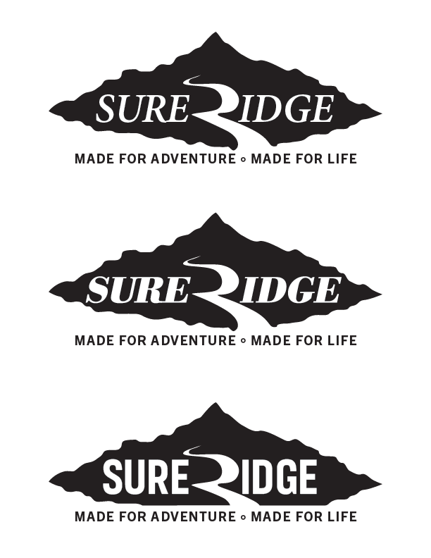
First one looks nice, nice use of the R to create a road, however, it looks more like something again for a car or vehicle journey, like a driving adventure holiday - I have to say this is probably my favourite design - but it’s not really hitting the brief. Feels more like an off-road adventure company.
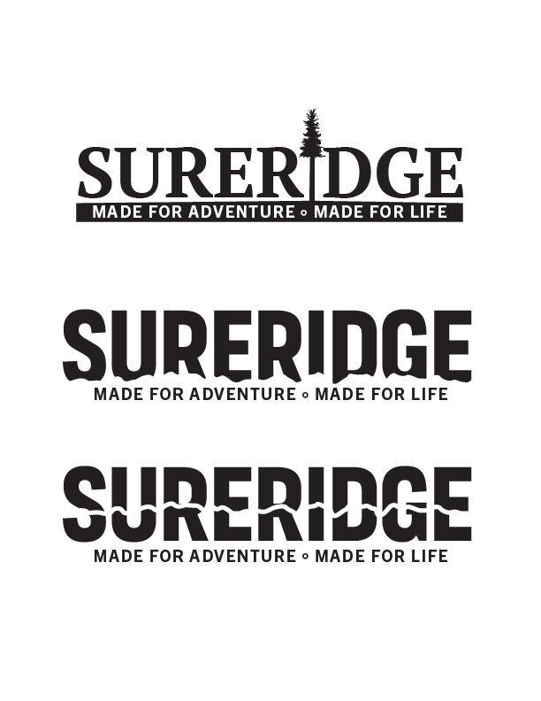
Second one with the tree
Because of the break up in text, initially I thought it read Super - then realised it was Surer -dge ---- then I realised it was supposed to say SureRidge
Because SURERIDGE is not a normal word - when you break it up with an icon for a letter it’s losing it’s meaning as it’s hard to congnitiively establish the word boundaries.
Third one
I like it - subtle play on the mountain range - wonder could this be pushed even further into the lettering. Really accentuate that it’s a mountain range - this is good.
This is simple - this works.
Last one
Not for me - looks like an electrical company, or well really not sure what it represents, it’s a bit strange.
On side note - you’re really set on using a tiny outlined circle for the text separator???
Odd - just to note at small sizes it will be difficult to replicate, across various mediums.
I intended that to be a river and/or waterfall, rather than a road, which makes me curious as to what would help in achieving that read, relative to what you see there. of course, now that you mentioned it, I can’t un-see it.
As to the tiny circle text separator, I just haven’t gone back to revisit that element - which can be anything really. It’ll probably be a solid bullet, or maybe a small triangle, like a tiny little mountain.
The last 2 use the same mountain ridge, one’s just a stroke through the middle of the word.