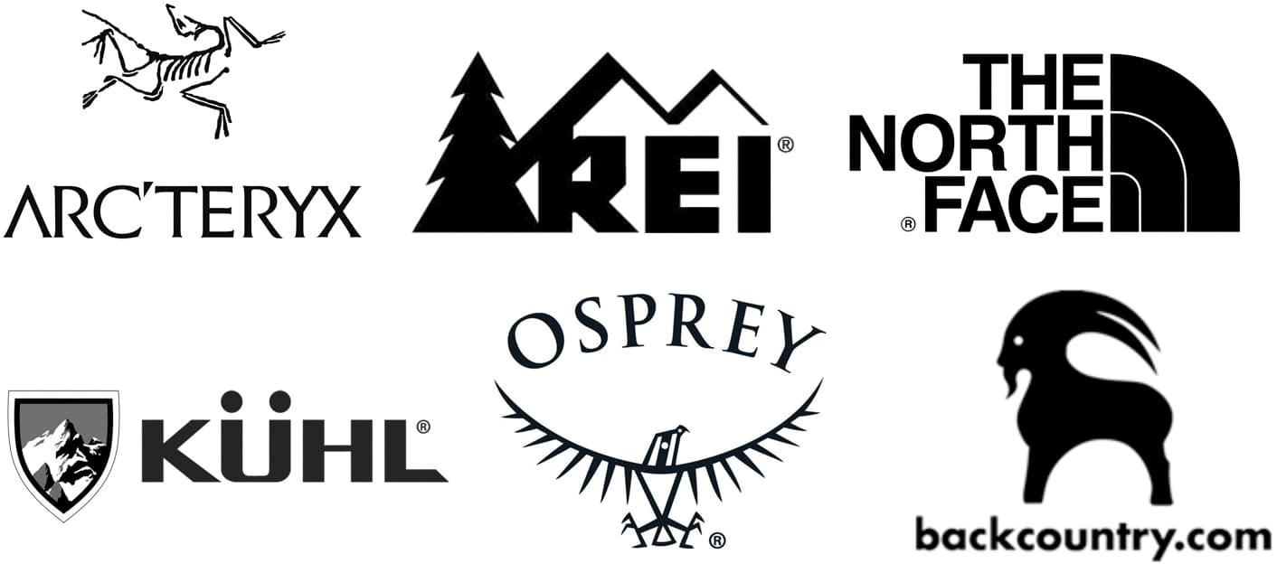
I live in Utah, which is a big outdoor recreation destination. My best guess is that around half the design work I’ve done over the years has centered around outdoor recreation. I’ve designed a few logos for outdoor companies, but mostly, my work has focused on editorial, advertising, and communication design work.
I’ve asked a few of the marketing people of these companies about their logos, and the usual responses have been that they were originally put together by the company founders and locked into the brand as the companies grew. When the companies are sold to bigger companies, the logos get cleaned up a little, but they seem to like the amateurish look that, to them, suggests their outdoor, individualist roots. They don’t want a slick look, so they hang onto their awful logos.
I agree that they need to have an outdoors look, but some of these companies don’t seem to understand the difference between that and amateurishness.
Anyway, about the SURERIDGE logo idea. Umm, I’m sorry, but I don’t think it captures the look and feel of the outdoors. It’s way too generic and unmemorable. I mean, you’ve just typed out the name and fiddled with a few details. There’s the opportunity on this logo to have some fun and to make it look original and adventurous, as the tagline suggests. Do that instead of a bland (sorry, but yes, it’s bland) and easily forgotten word mark.