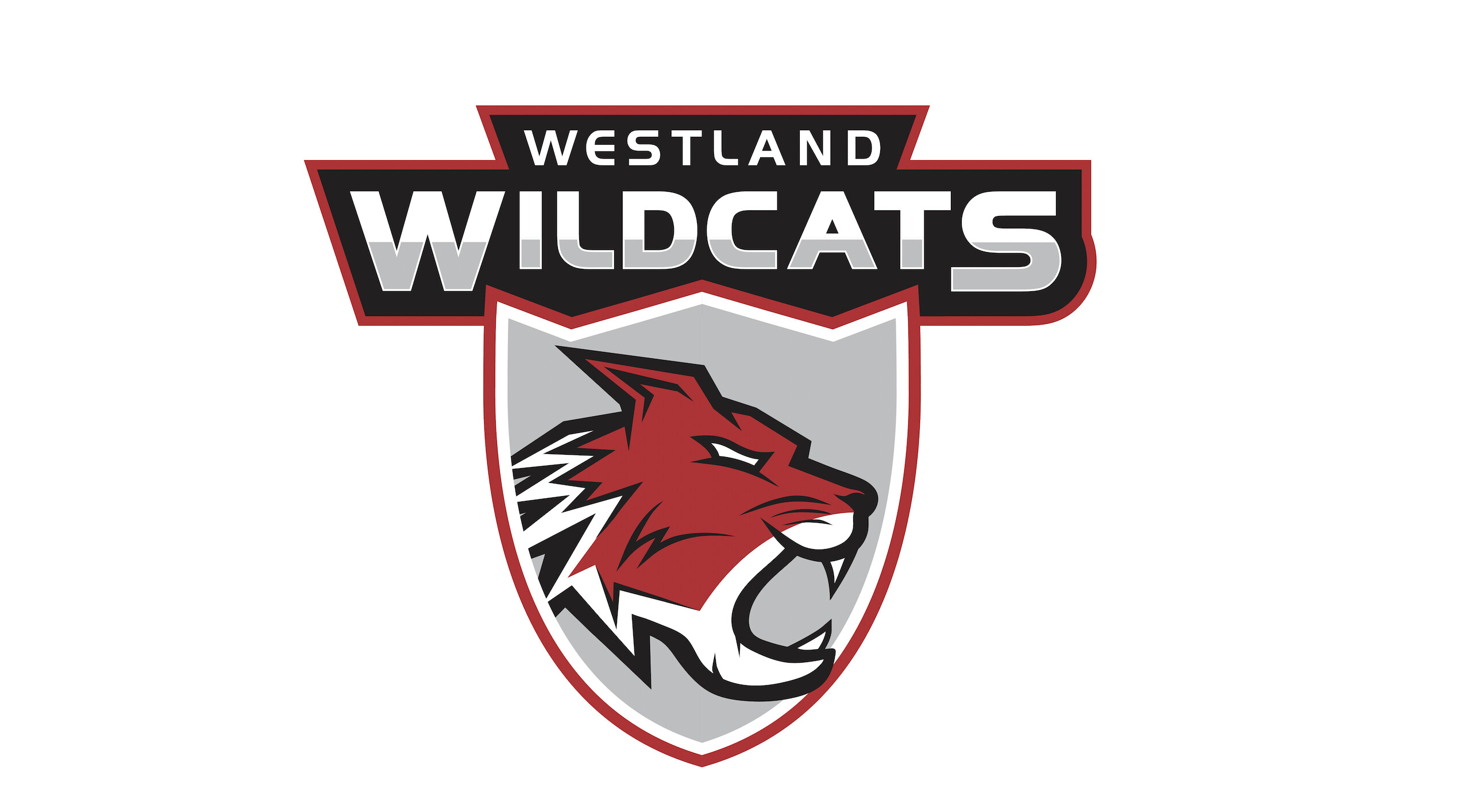
Hello everyone! I designed this logo and mascot icon for my old high school because the one they have now was taken from another sports team. The school is called Westland and their mascot is a Wildcat. I’ve never really designed this kind of logo so I wanted to know your thoughts!
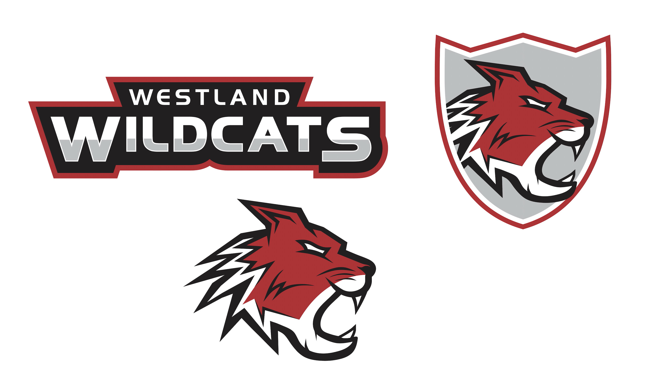
It’s not bad at all. If it was mine I’d continue refining. One thing I noticed right away was the proximity of the cat’s mandible to the edge of the shield. They collide in a way that isn’t working. It would be better if it was fully inside the shield shape, or breaking farther out of it. You went for the breakout and kind of wimped out. I realize you’ll have similar problems with other parts as you break it out farther, so maybe it will prompt a different shield shape, or dropping the shield altogether. Like I said, continue refining…
3 Likes
That’s great feedback! Thanks so much. I agree that it should break out completely.
I think you’re off to a decent start, but, as @HotButton said, it needs refining. In particular, I think the type could be much stronger. I’d experiment with a number of different font choices.
1 Like
As I research through different high school logos - your effort is ok - but it’s nowhere as strong as the ones I have researched.
It needs a lot more oomph.
Could you be a little more specific with what you mean exactly by “more oomph”?
I like the colors - I know that wouldn’t be your selection, since they’ve probably been established for a long time, but if you had any control on the tones, I think you did good there.
I’m also getting the low “oomph”, and I think I’ve got a couple points to put pins in - the Wildcat’s jawline, and the shield dynamism. The curl of the jaw on the wildcat seems to go much further down than back, giving it a kind of gaping look, rather than a snarl or roar look - if you followed the motion line of the upper lip into the jawbone furline and pulled the lower jaw up and back to match, I think you’d have a cleaner, sharper face. The back of the head fuzz might also benefit from a bit of grooming - the jagged stylization is on point, but their motion is kind of inconsistent, so they’re too much noise to ignore, but not enough to say something on their own. Personally, I’d smooth it out so the focus can move more to the face, but there’s an argument that tuning it up for a “wilder” look could work.
And on the shield, it kind of has a similar visual “oomph” problem, where it has enough going on that you stop to look at it, but not enough to add much to the composition. I think it would do better as a simpler shape, like a plain square/triangle, or even a more dynamic shape like an exaggerated “V”
Bear in mind my intention here is to point you to parts I think you could refine, not to try to dictate what actually ends up working. All in all you’ve done a very nice job, particularly on the rendering for this style.
1 Like
Thanks so much for your feedback. I agree with a lot of the points you made and I think the general consensus is to go back and refine a few things which I will definitely do.
Also the school’s colors are red, black, and white, so I played around a bit with the hues of red and made the black a bit more of a dark grey.
I think you have done an awesome job for your first effort. I’ve seen many Mascot logos and this is right in line. My only issues are this:
The Jaw - It appears as though the cat is saying Whut? vs Rawwrrr!! I’ve seen a few that do this on cat mascots and it’s always bothered me. Jaw work on a hinge .. they don’t lower ![]()
The Shield - I would prefer to see it all contained within the Shield or have it protruding on both sides. By that I mean the points of the back of the head. They look too cut off to me. Especially since the jaw sticks out on the right.
I hope that makes sense. And remember, these are just opinions. You do what you feel is best.
1 Like
I certainly can’t find the examples I found earlier.
Nevermind, lots of good advice so far.
Looks good to me. Good job.
1 Like
Imitate a cat by making a snarling, hissing, roar. You’ll find that as your face leans forward in an aggressive stance, your upper lip will pull up, and your bottom jaw will drop slightly and pull back. Cats do the same.
What won’t happen is for the lower jaw to jut forward or the mouth to open fully, as you’ve drawn it. Doing so results in a different expression that, as @Kaegro put it, results in a “gaping” look.
Looks good. My thoughts:
-
I like the red but I’m thinking if this should pop then switch back to black. I like that you don’t have the colors fighting each other for attention or interrupting readability.
-
This might just be me but I’m not a fan of the font. It reminds me of fonts used for construction or contracting or brand names for excavators. I like the style you gave it though!
-
I just realized the background shape is a cat head profile! Cute! Unfortunately it took me too long to realize it, it doesn’t fit well with the text’s negative space, and it ends up covering up the cool shape the outline around your text made! I’d love to see just the cat and text banner together.
-
The eye shape could be tweaked so the cat seems more fierce instead of unsure.
-
I definitely agree with this (and many other prior comments but I didn’t feel adding to those was necessary). I like the wild, pointed hair concept! Absolutely tells me, this cat is mad/wild because it’s hair is up. I think the red to white hair and markings need to be more in balance. Right now the lack of red with strong white points detracts from this cat’s grandness.
-
One more thing, if you want this cat to look truly angry then consider adding slight detail to show a snarl.