Hi everyone. I’m not a professional, so please be nice. Ha! I was recently approached by my High School to help with a larger scale rebranding project.
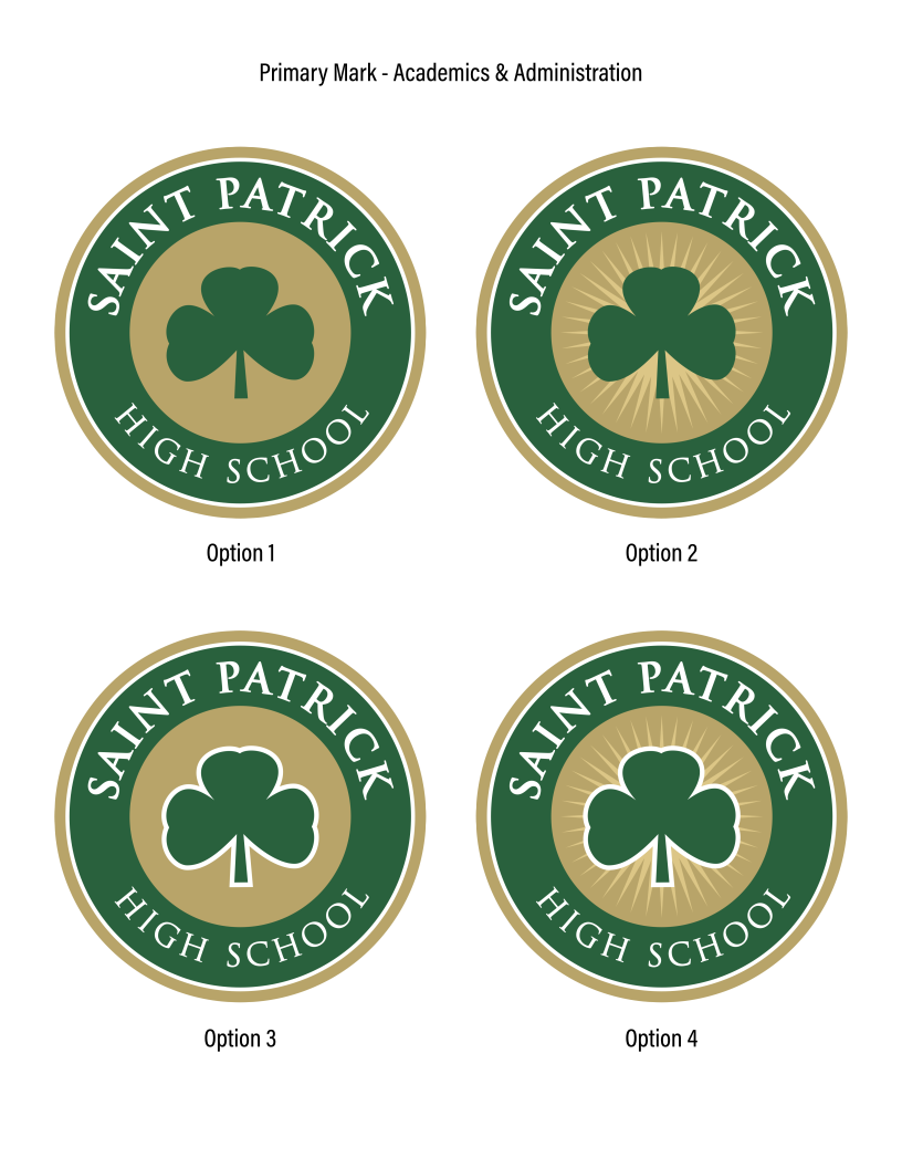
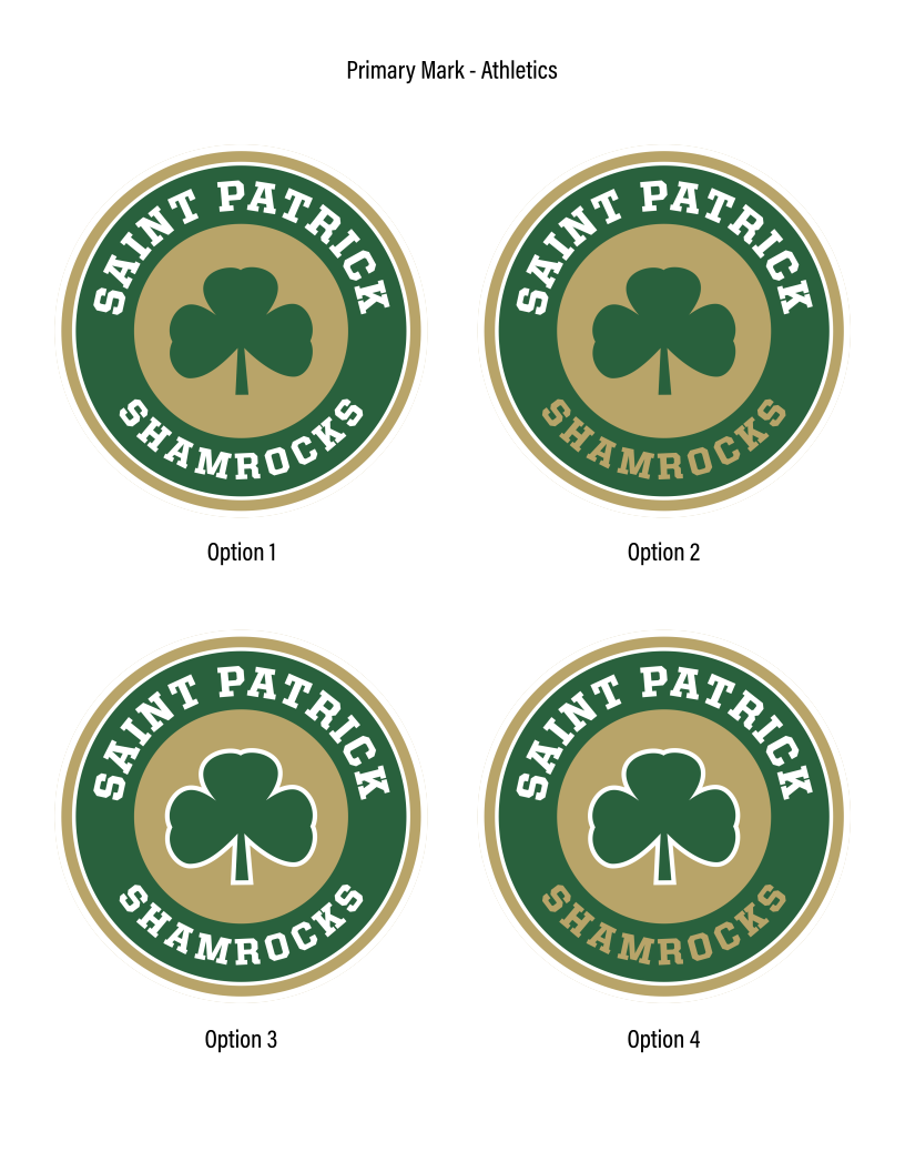
Our first stage of the project is to come up with a primary and secondary mark for both Academics+Administration and Athletics. Next steps will be lockups and other peripherals to fill out a proper Brand Guideline. As far as the primaries and secondaries go, we’ve done a ton of work to narrow down to a few options that we like. None of us are professionals so I figured I’d bring them here to get some expert advice.
The Shamrock logo has been used in the past and must be part of the rebrand. I have a few things that I’d like to get your thoughts on…
Do the green and gold contrast enough to not require a white outline (keyline?) around the Shamrock? Does it look better with the outline?
Does the sunburst add or take away value from the marks? Faith is one of the keywords that we want the brand to convey so I felt like the burst could help accomplish that. Also, give the gold an opportunity to be gold and not tan/brown.
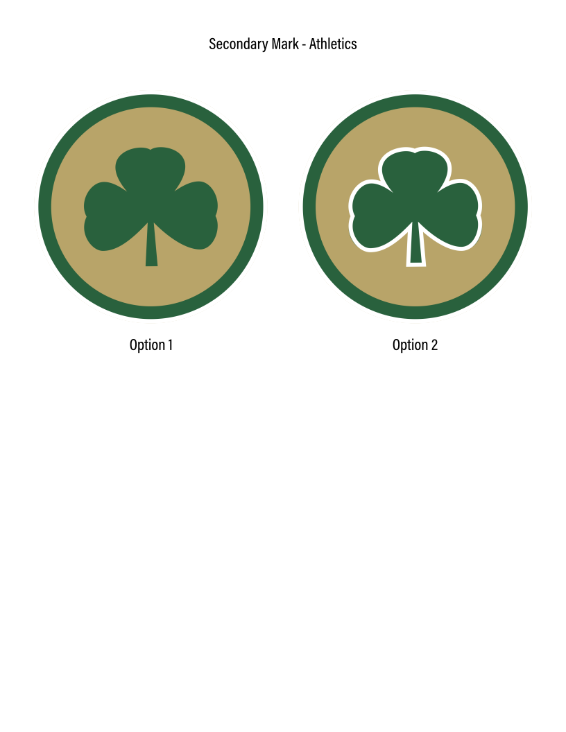
I’d love to get an idea of which primaries people like most (Pages 1 and 3). The secondaries will be a function of which primaries we decide to go with.
I appreciate any help you can provide. Hopefully I did this the right way. First post!
oy … I wouldn’t touch this. If they weren’t happy with a professional .. imagine how impressed they will be with someone who doesn’t know what they are doing.
Granted I have no idea what your qualifications are. But, it makes me wonder if they really did consult with a professional or are trying to find something less expensive. Please tell me they are at least paying you and you have some sort of contract?
I probably should have left that out - or clarified. I am very close with the team. They’ve already seen all of my work that led to these marks and love them. That’s not the part I came here for feedback on, lol. But I totally understand why that’s where I’m getting feedback.
If it were me, I’d eliminate the white stroke around the shamrock. It appears you’ve used it as a device to help separate the leaves from the background. The better solution would be to eliminate the problem rather than work around it using an outline. Lightening the gold color could do this.
I like the sunburst, but it could create legibility problems at small sizes. However, there’s no reason you can’t have both: the sunburst logo for times when it works and the simpler version for when it doesn’t
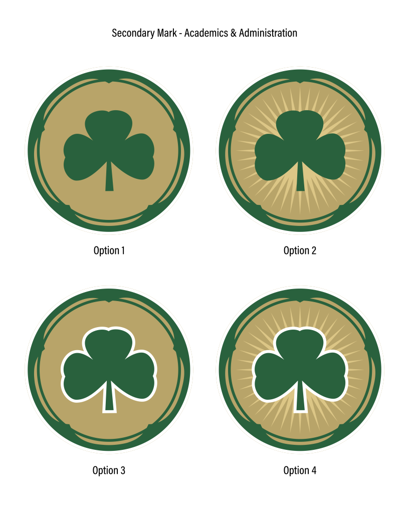
I’m not sure what’s going on with the secondary marks. The elaborate green border seems incompatible with the primary logo. I’m also puzzled by the secondary mark’s purpose. Will typography accompany it or is it a stand-alone mark? I’d likely rethink this one a little.
The typography on the athletics marks clashes with the typography of the primary mark. I’m guessing you think the typography has more of an athletic look, but to me, it looks like an arbitrary change that compromises the integrity of the primary mark. On the other hand, embroidering the small serifs of the Trajan face on the original onto a uniform wouldn’t work. If a new typeface is needed for the athletic version, I’d be inclined to pick a simpler typeface more in keeping with the spirit of the primary mark — not a slab serif with an entirely different personality.
Similar to your other secondary marks, I’m unsure why they’re needed, but I suppose the school has thought this through. Again, I’d skip the white outline and just use lighter gold colors to provide more contrast. I’d need to play around with it to see what worked, but I might even be inclined to make the sunburst white on a light gold background. How that would work, I don’t know without seeing it.
I think you’re on the right track with this, but the details of how everything works together seem to be derailing you a little.
The secondary marks are mostly for lockups and, as you said, uniform elements. The ornate version is supposed to reference the 5 pillars of Lasallian education, faith, and tradition. It’s a stretch probably to anyone that doesn’t know or see the brand standard explanation. We might eliminate that altogether and stick with the simple Athletic secondaries.
We do want to keep 2 separate fonts kind of like how major colleges and universities do with sports. However, we wanted it to be somewhat uniform. I might go back to the drawing board on fonts.
I’m not sure how much leeway I’ll have on the gold color. I think I can lighten a tad, and maybe darken the green a tad to create more contrast.