So, follow up to my Holiday Cards. In truth, I had these done a few months ago, but wanted to wait later to post them. If you have any worries about me overcharging for these, don’t. These are mainly just going to be a gift for close family and friends, and a portfolio piece. With that said though, feel free to RIP and tear into it as much as you want. Anything to help me improve.
If they make you happy I’m tickled plum to death.
Though next time you might not want to put snowflakes in places where they don’t read as snowflakes, but rather as mistakes.
Could you further elaborate on the snowflake part a bit. Just for future sake.
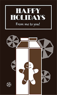
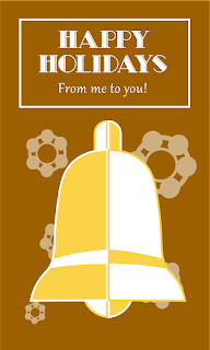
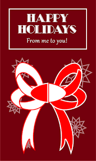
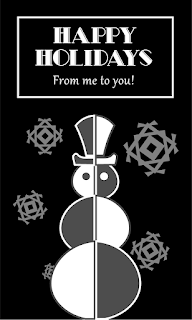
Snowflakes are always hexagonal. They have six points or sides. I suppose taking artistic liberties with that is OK, as long as the flakes still look like snowflakes and there’s a reason for it. However, most of yours don’t, which is too bad since they easily could have.
The positioning of the snowflakes looks a little too deliberate and evenly spaced. I’d be inclined to position them so that they looked more random and with more differences in their relative sizes. For example, the snowflakes on the bow match up with the loops on the bow, which draws attention to them.
The alternating dark-light shading is a bit odd. I understand why you did it, but the dark areas read as shadows. Shadows don’t alternate.
1 Like
The snowflakes on the first two looked like gears to me at first - it was only with the context I was able to put that together. I’d either try mixing up the snowflake shapes so there’s more than one style per face (the whole “~no two snowflakes are exactly alike~” deal everybody loves to tell their kids would help clear that up in the mind) or just getting a different image to use on those first two that’s a bit more detailed like the bottom two.
I’m also not completely sure, but I think the central images would look better without the strokes. I like it on the bell, but on the others it feels a bit…uncomfortable is the best word I’m getting right now, seeing the split down the middle.
1 Like
So I noticed that for the bow, I accidentally used an earlier PNG I had that makes it look a bit uneven. I I promise I corrected this issue before hand, and apologize for using the wrong one.
In terms of holiday cheer, I wouldn’t say the color palette is very representative of “Happy Holidays”
Have you explored different color possibilities? or is there an explanation of how you came to these colors?
1 Like
Mainly, I wanted to use colors that would make sense for the central image for each one. So good for bells, brown for gingerbread cookies, etc.