Hi everyone, I’m a freelance designer of about 10 years and only in the last few months have decided to really take it seriously, so I’ve been practicing and looking for critiques. Here are a few things I’ve done recently for a few different situations.
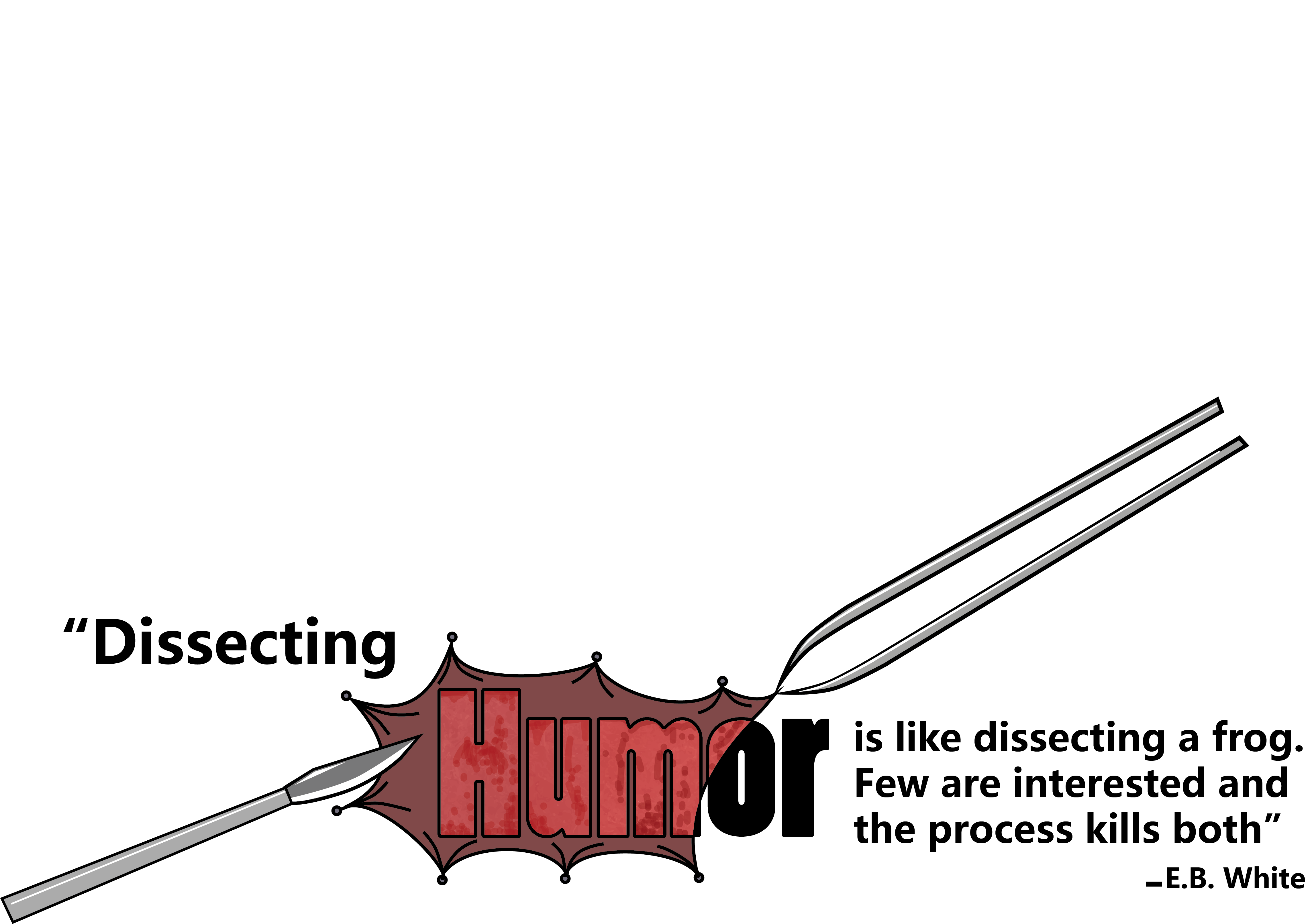
The dissecting humor piece is entertaining. Though i’m not sure it’s quite so practical for a bumper sticker. I can imagine anyone reading that from one vehicle to the next.
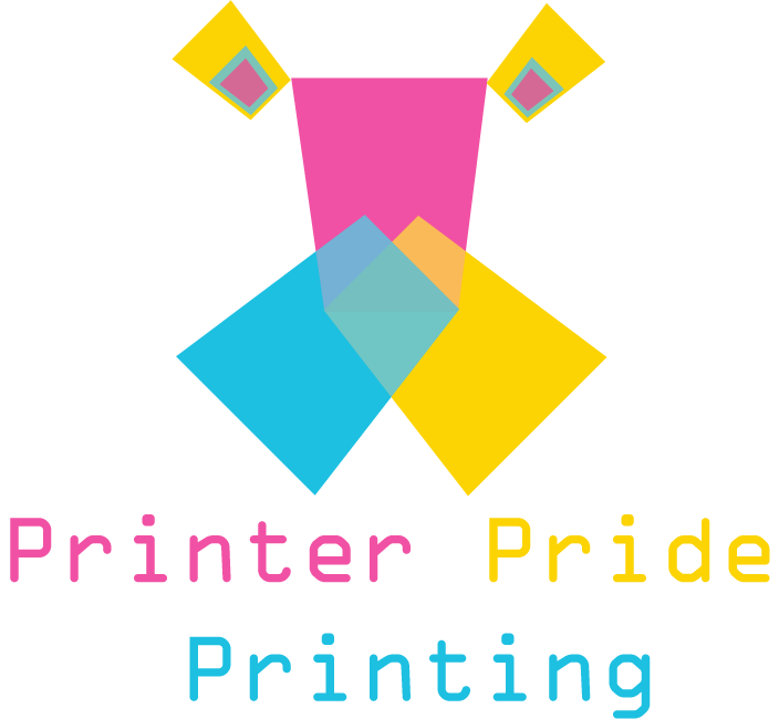
You’re lucky Print Driver went easy on you with the printer logo.
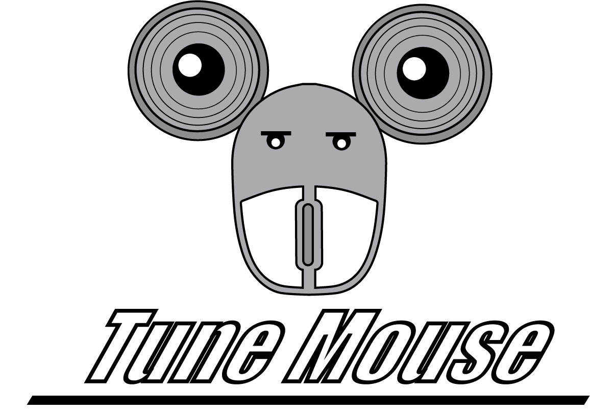
The stroke applied to your “tune mouse” logo has all but filled in the space in the typeface. Either increase the stroke thickness to that it fills entirely (not recommended) or applied your stroke to the outside of the typeface rather than the center or interior.
Excellent, thanks for the feedback! The printer one is very easily one of the weaker pieces I’ve done recently, but that’s why I’m here, to learn and become a better designer. Yeah a few people I’ve shown the Dissecting Humor have told me they think there may be too much text.
Readability… it’s best if viewers can read and comprehend something quickly and easily.
Contrast helps with that. Your printer pride piece is completely middle tones, and probably wouldn’t print out very well.
I too like the bumper sticker, but not as a bumper sticker. It’s too complicated to read fast, and the “Humor” is not readable. It would work on a humor website though.
Try printing out some of these at a small size, in black and white, and squinting your eyes. If you can’t read it, more work is needed.
A bumper sticker needs to be read from several meters away in moving traffic. It would take several times that long to read and comprehend your bumper sticker.
Your printer logo is just a bunch of random, process-colored shapes layered on top of one another. It looks as though it’s supposed to represent something, but what that something is, I haven’t a clue. Complex color combinations are bad news in a logo unless you also have a version that works in B&W.
I don’t get the mouse logo at all. Are it’s ears supposed to be speakers? I haven’t a clue what the face is supposed to be. Also, the obliqued, outlined letters are just not good typography.
I think I like this the best out of the three. But the others are right, it won’t work as a bumper sticker. Perhaps you could rework it as a poster?
I’m not able to figure out what the logo represents. And the text under it seems too scattered and perhaps also a bit disproportionate to the size of the logo. @PrintDriver, for those of us who are learning, could you please explain the issues with transparency overlay and why it won’t print well? Thanks.
The choice of font doesn’t seem to be working. Even the slant seems out of place.
Logos should have a color standard applied to them so they match in color across all media and output choices. This means everything from offset printing to wide format billboards to silk screen, to embroidery to web. That usually means applying a spot color from one of the industry standard matching systems like Pantone or Toyo or RAL, etc. When you apply a transparency, the overlapped mix is an undefined color and will print “as is” and will be different on every machine process out there. Even if done on the same machine but with two different vendors.
If the transparency overlaps are defined, you have added, in this case, 4 more colors for a 7-color logo. Each spot color has a charge attached to it for color matching or plate production, most likely turning this into a process printed logo (4-color CMYK) incorporating a halftone mix. 4-color printing can vary across print processes considerably.
A lot of defined spot colors do not auto-convert to the proper CMYK numbers for correct output. If you’ve ever seen a Pantone Bridge fan deck that shows an ink Pantone next to its CMYK equivalent, you will understand why a brand standard has different parameters for spot printing vs CMYK printing.
Transparency and the .eps file format do not play well together. If you use transparency, don’t ever save as an .eps. The transparency may possibly be flattened, or images may be sliced into a whole bunch of pieces, even if there are not spot colors defined. The eps file format is from pre-transparency days.
The biggest hurdle to using transparency in logos is that none of the software out there recognizes transparency in spot colors, or at least not well. There are all kinds of bad things that happen when a spot color and transparency functions live in the same output file. They don’t even have to be touching or interacting elements. You can have that one logo as a tiny little thing in the top corner but it can cause another spot color element to drop out of the file on output. Sometimes the atomic area of the transparency turns white or leaves a lighter color box around the transparent area (dreaded “white box syndrome.”) Occasionally text elements will vanish unless they are placed on top of the transparency. While most printers have learned to deal with this (note I said most,) there is always the chance on a rush job of something going awry.
Also realize that fuzzy drop shadows, inner or outer glows and the feather effect introduce transparency as well. Not to mention possible scaling issues if going large.
Yeah, obviously not full time,lol. Just as some additional income here and there, but I’ve made the decision that I want to do it full time so Im trying to talk to pros and people who know more than I.