How can I improve these flyers/which one is best?

  • Concept : Promoting an all ages, public ice skating event with a live DJ.

  • Purpose or Goal : This is a flyer that will go on a Jumbotron near the Ice Rink that this event will be held at. Also this will be run as a FB ad as well to promo the event.

  • Format : Flyer viewed on Jumbotron and Facebook Ad

  • Audience : Families, all ages

  • Your Experience Level : Learning marketing

  • Nature of Job: This is a paid opportunity

This is the original flyer idea sent to me:

This is the flyer idea I came up with using the same image:

Thank you so much for your critique and help!

The second is less bad.
What is the address for the online tickets?
How do you know the price? (not in the first flyer)
How big is the flyer/how big is the smallest font

2 Likes

It’s ok. Nothing makes it really stand out.

A few comments:

  • Your version uses the wrong year (2023).

  • The black text on the green at the bottom is hard to read due to lack of contrast.

  • The varying styles of the 4 leaf clover seems odd (photo in one, clip art in another, and illustration in a third)

  • Using the grungy display font for “Live music with” at that small size is also harder to read, I’d just stiuck to your sans serif font.

  • The 4 different fonts (and treatments) is awkward. (Patrick’s is treated with a mis-registered effect, All ages has a gray outline, skate and day are just solid white.)

  • Blurring the photo seems a little arbitrary. I get that you are trying to make the text stand out some against the photo, but it just seems random.

  • Not wrong, but it always bugs me when people include AM or PM in a range of times on the first time. That should only be done if it spans AM to PM (as in 10 AM - 2 PM). Otherwise I would just say 6:00 - 7:15 PM

1 Like

Hey Joe, thanks for the feedback!

  1. So for the Facebook ad, once people click on the ad it will take them directly to the url where they can purchase tickets.

So are you recommending that the URL be visible on the Jumbotron? It is a fairly long URL, so I was concerned with it looking like word salad haha but maybe we can put the main website URL only?

  1. Good point, the first flyer doesn’t have any price point - just that tickets are discounted online.

3.) I’m not sure how big the jumbotron is tbh, but I am concerned with the font being too small.

If it is on a jumbotron, perhaps using a QR code to buy tickets (and include a little blurb stating “scan the QR code to buy tickets”)

Will it be the only thing up on the jumbotron at the time? If so, you might want to make a standalone separate file specifically for the jumbotron since it will be a horizontal format, versus your vertical flyer.

1 Like

Isn’t it the wrong orientation and aspect ratio for Facebook and Jumbotron?

Hate to bring out the Irish in me but it is St. Patrick’s Day
I know it’s a play on words, but I think you might alienate people who are like me and don’t like it messed with.

Just for fun

I generated this image with AI

Thought it was pretty good.

There’s a shocking amount of these types of flyers
https://www.google.com/search?sca_esv=b9f5dc3cd9c9d28f&q=st+patricks+day+skating&tbm=isch&source=lnms&sa=X&ved=2ahUKEwjU78enxuCEAxVuSEEAHTICAe4Q0pQJegQIDBAB&biw=1324&bih=711&dpr=1.25

Pretty sure you can do much better.

1 Like

Thank you for the idea to use AI, that is something I definitely want to look into! I dig what you posted too, just so many unique things you can do with AI.

And I hear you on the title, I made 2 versions with the title as they wanted, and just made one with the “St. Patick’s” Day - Public Skate


This is such a good idea! I’ve created QR codes before, idk why I didn’t think of this for the jumbotron, thank you so much!

Also good to know horizontal format for Jumbotrons, I did not know that.

Hey Craig thank you for this feedback!

I made updates on everything you brought up, and it looks much better! Also cant believe I got the year wrong haha the small things overlooked after working on it for a while

Here’s the update:

It’s not working because it is too busy and too much going on.

The last one says save 5 the other says online ónly 8.

I think you can go with Skate Patrick’s day as much as it irks me, I’m not the client.

Just simplify everything and less busy.
Develop the hierarchy

And most of it has to be legible.
Some of it is not very legible.

3 Likes

I completely agree with @Smurf2. It’s way too busy and cluttered with stuff to the point where viewers’ eyes will bounce around from one thing to another, not knowing where to land. An advertisement’s success depends on engaging viewers who, two seconds earlier were focused on something else. Few viewers will take the time to decipher all the visual gimmickry you’ve crammed into it. Instead, they’ll shift their attention to something else.

Outlines around type, slanted type, type over photos, photos of skaters, shamrock illustrations, ice skates hanging from the type, backward letters, an abbreviation for the word Saint, black bars around type, and a whole bunch of different typefaces that clash with one another — some of which are barely legible. Aggggh — visual overload.

I’ve said this before plenty of times, but the success of good design depends much more on subtraction than addition. For example, the solution to typography that can’t be read against a background is not to add an outline. The answer is to identify what’s causing the legibility problem and remove it. There’s a reason for the design aphorism stating that less is more.

1 Like

First up, on a positive note. You came here for advice and help. Good on you for doing that. This means that there is part of you knows that your poster isn’t working as it is. Sometimes when you ask for help you are going to get some harsh truths and not necessarily like what you hear.

You are not going to like this, I’m afraid. It is not meant to be cruel for the sake of it, but you need to understand that if you are going to do this, you need to have a much better understanding of what design is about – especially if you are taking money off people for it.

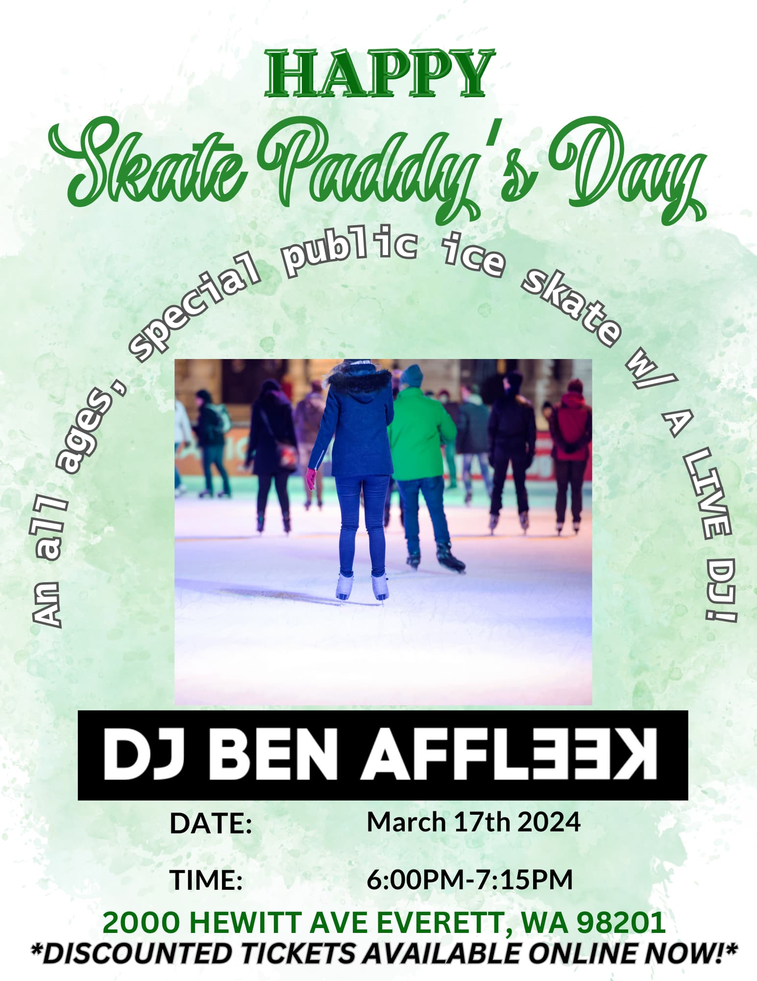
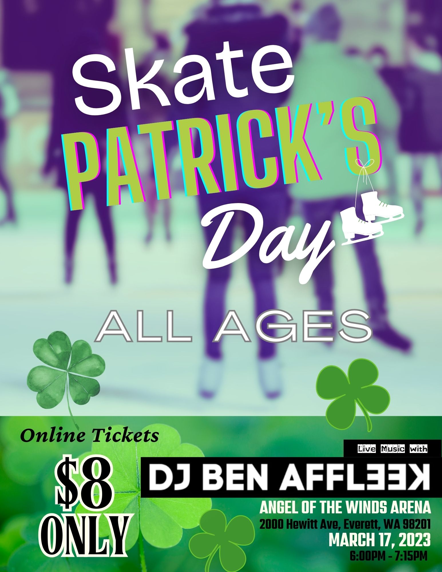
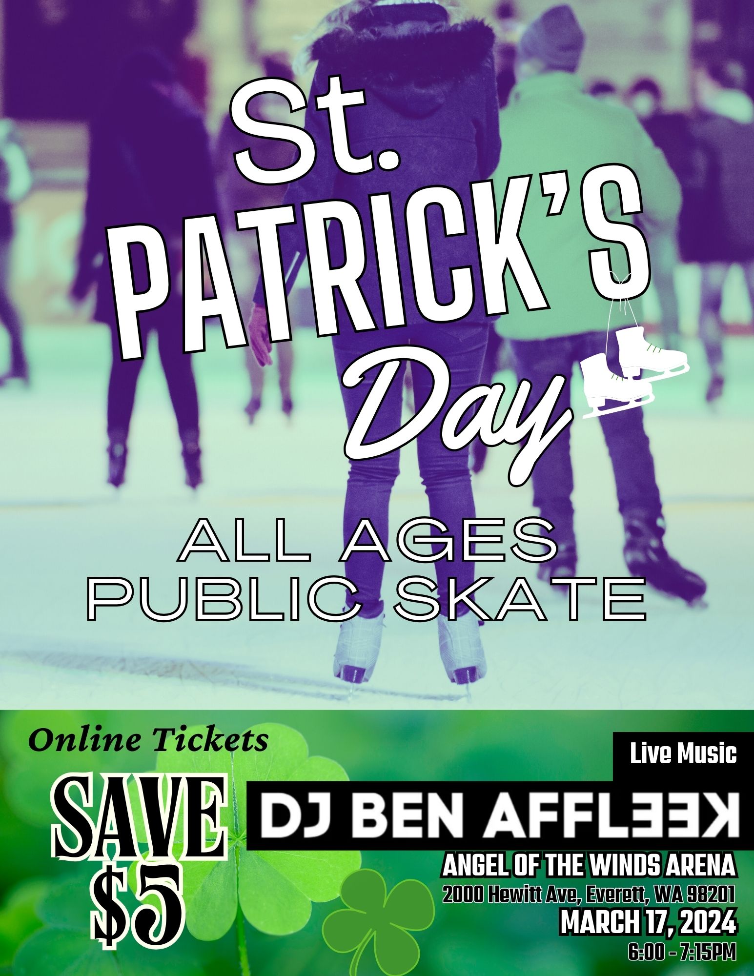
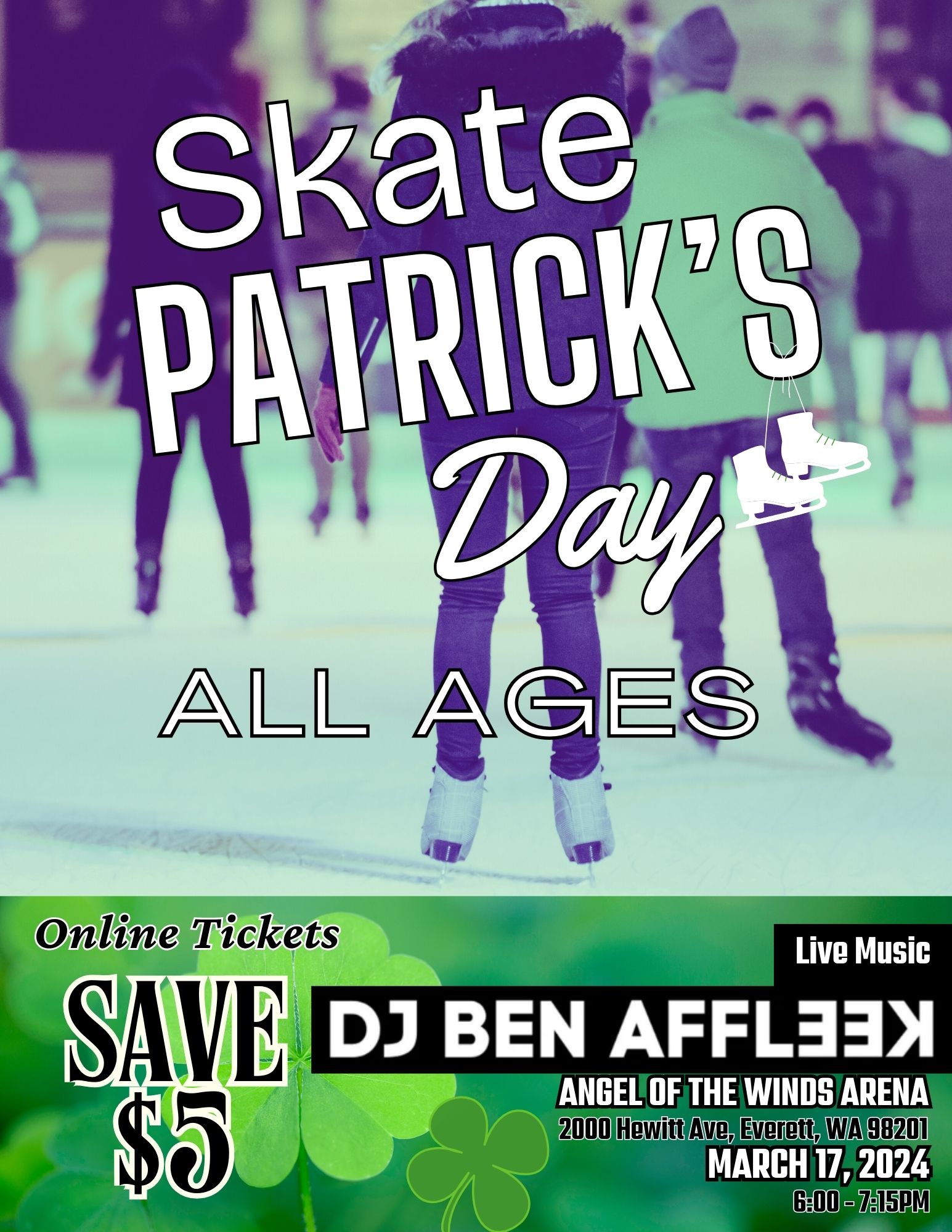
As it stands, this poster is exactly why professional designers are constantly belly-aching to their partners over breakfast about home-made design.

The irony is, much as the original is pretty hideous, it is slightly more effective than the one you have put together. Not necessarily from a story-telling and aesthetic standpoint, but there is, at least, a marginal sense of hierarchy, even if unwitting – well, if selling the DJ was the goal. Even then, at least it’s not a barrage of information all shouting at you with no focus.

Finally, I think billing a DJ as live music is pushing a point. A DJ is someone curating and playing recorded music. Live music, is musicians playing actual instruments in the same place as you. I know; there are DJs everywhere who’ll opine that they’re musicians too.

Im not sure how you’d say it, but their original description of Live DJ, if a bit ambiguous (no one’s going to hire a dead one) is more accurate than ‘live music’.

As I say, none of this is meant to be hurtful for the sake of it. please take it as tough love and an opportunity to improve. The best advice I can give you, is go and get yourself educated.

With that flyer, start again – simplify and ease up on the cultural clichés. Get the client to change the name.

Good luck.

2 Likes