To start with the last and circle back because I feel this is important:
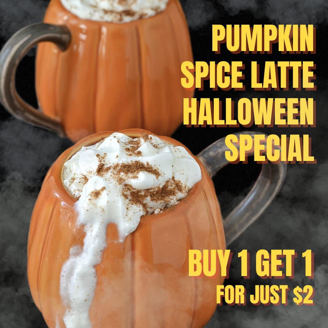
Every time I buy one, I get one…
…well at least, that’s what I think the ad is trying to say (did you mean get 1 free?).
The language is vague, and the visuals don’t help clarify the offer. The pumpkin image in particular isn’t appealing at all, it honestly looks like a gone-off pumpkin foaming like it has rabies.
Compare this to competitors in the same space a quick Google search for “pumpkin spice latte advert” shows how others make the product look warm, cozy, and crave-worthy.
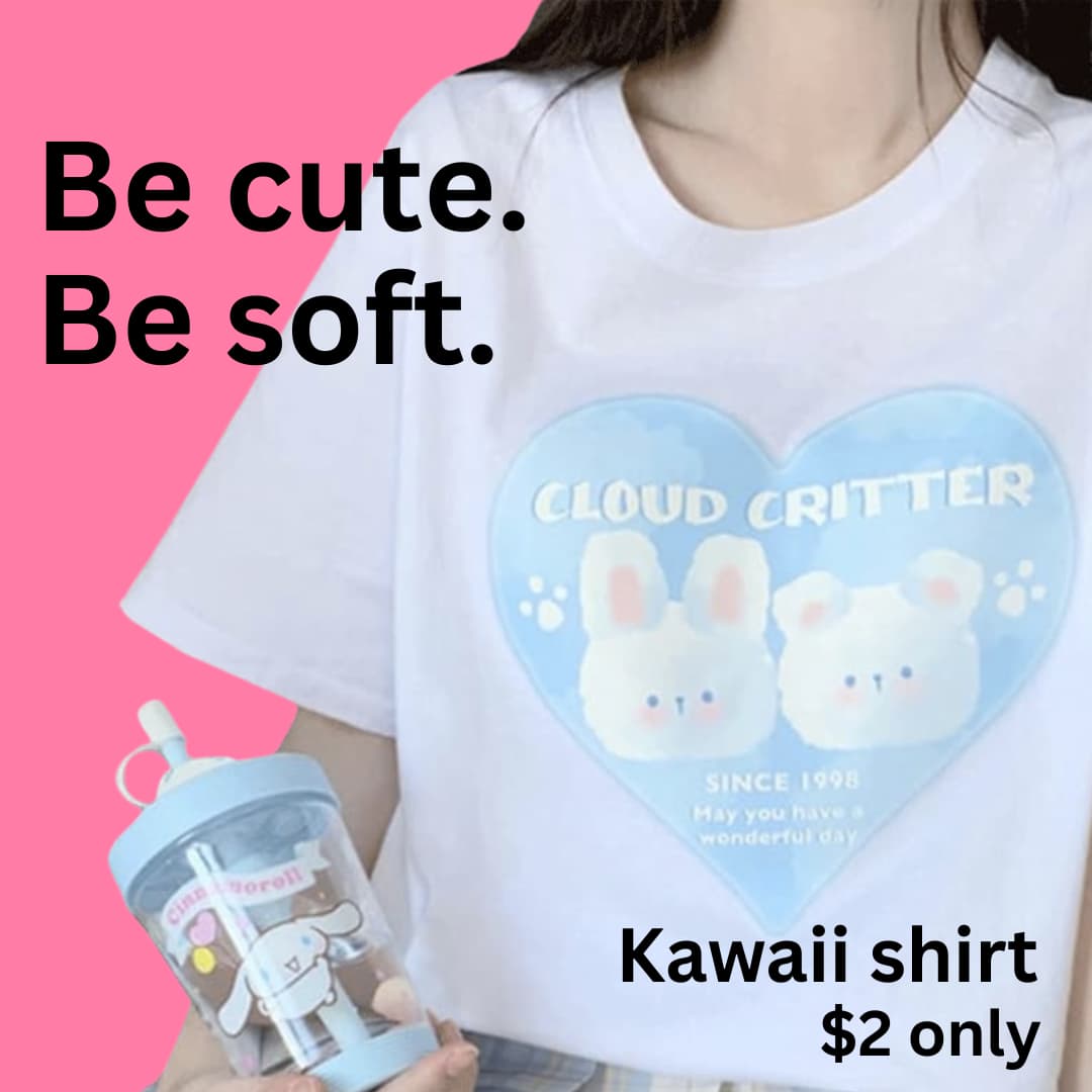
T-Shirt Ad
The T-shirt image is too muted and pastel to stand out. It’s hard to even see what’s being advertised, and the colour palette makes it feel washed out rather than trendy. At $2, it doesn’t exactly signal quality either more like a clearance bin item. The message “Be Cute. Be Soft.” adds to the confusion. Cute how? Soft what? There’s no context or emotional hook to connect with the audience.
If it’s supposed to be a “Kawaii” shirt, you need to show that vibe playful typography, bright candy tones, maybe even a model or mascot to give it personality. As it stands, I have no idea what makes it worth buying or why it’s only $2. Is it part of a larger sale, a limited run, a promo tie-in? None of that comes through.
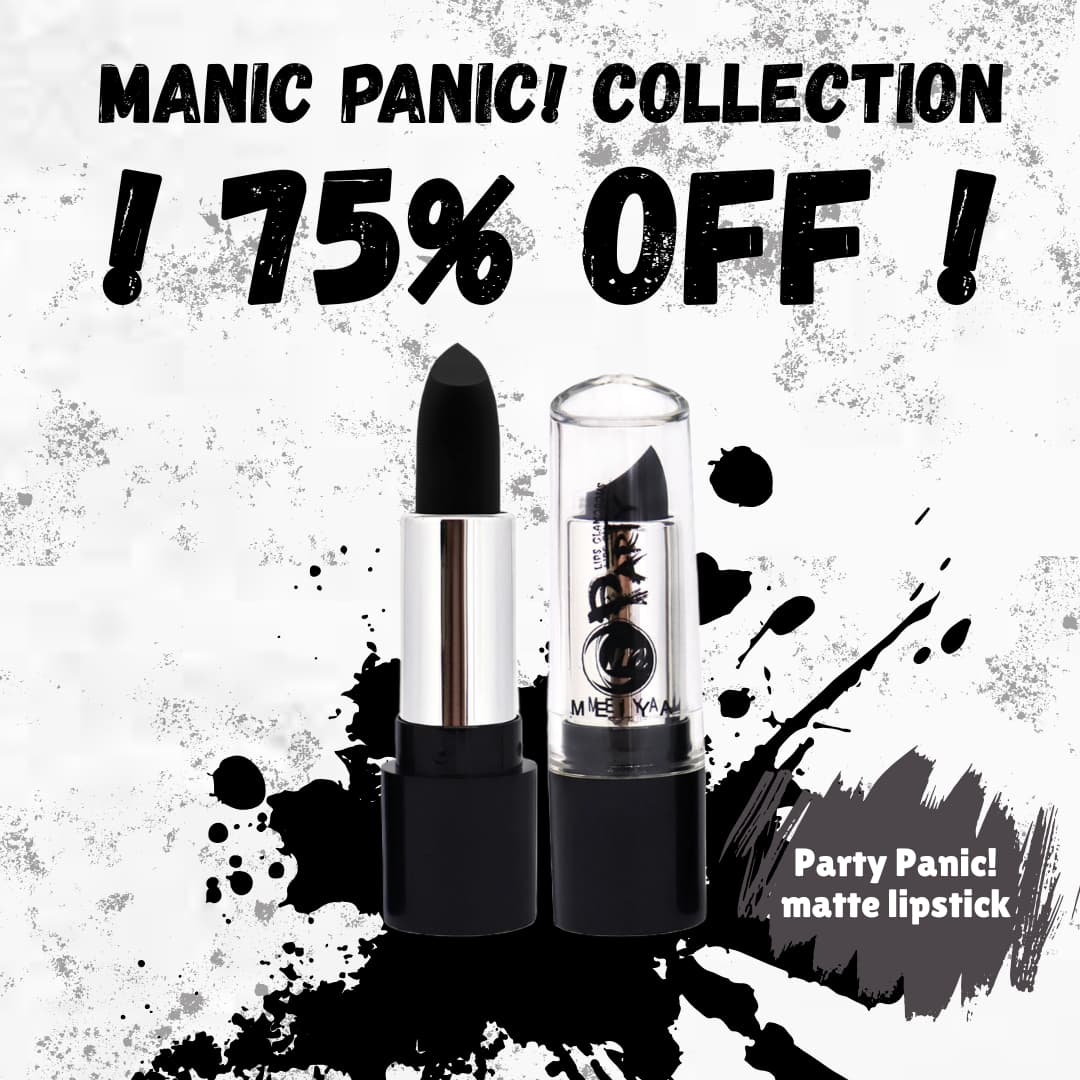
Lipstick Ad
The “75% off lipstick” headline is great, clear and attention-grabbing. But the execution falls short. What shades are on sale? Who is the target audience? My wife, for example, only buys one specific shade from one specific brand and I imagine many customers are just as particular.
The background design looks like you’re going for a youthful, edgy feel, with the splatters and loud contrasts. That could work for a rock-chic or EMO aesthetic, but if the goal was to look glamorous, it misses the mark. Makeup should feel beautiful, aspirational, elegant, not messy.
Overall Impression
You’ve clearly tried to build contrast and energy into the layout, but the design lacks structure and focus. There’s no clear visual hierarchy everything competes for attention rather than guiding the viewer’s eye.
Key elements like product, price, and call-to-action get lost in the noise.
Before finalising, ask:
- What’s the single message I want people to take away?
- Who exactly am I speaking to, what do they care about?
- Does the image enhance or distract from that message?
- Is there a clear, attractive ‘call to action’ (Buy Now, Learn More, etc.)?
Are you on the right track?
You’re getting there, the track is long and there’s no right track, everyone has their own track.
You’ve put some effort in which is great to see.
With a little more focus on composition, clarity, and storytelling, these could go from confusing to genuinely compelling. Keep refining and you’ve got a solid base to build on.