I’m working on my resume and I’ve gone a fairly non-standard direction with my bullet points. My question to ya’ll is how does it feel aesthetically? Is it way too weird and looks terrible, or is it genius and you’d like to hire me just because of these awesome bullets?
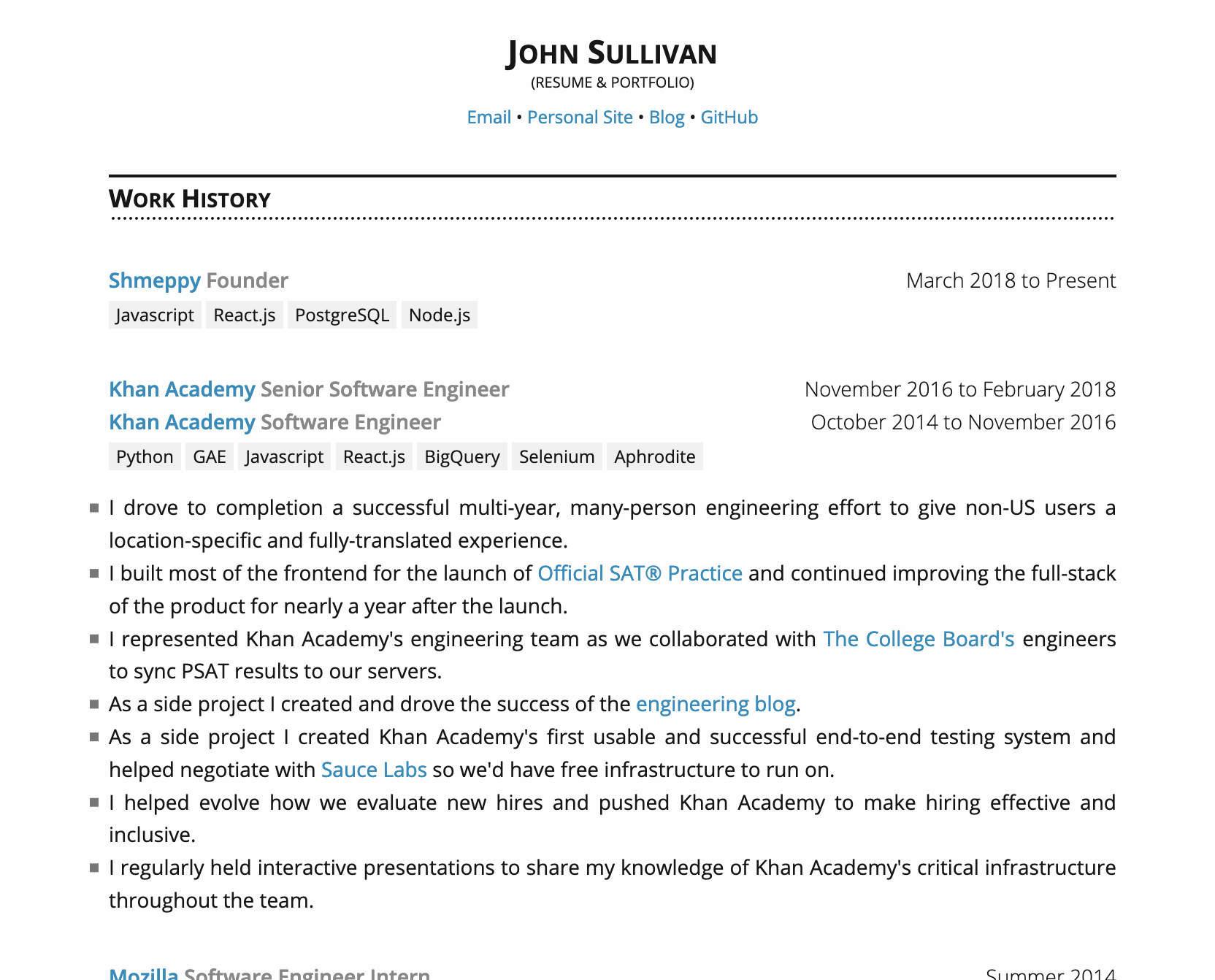
My resume is available online at https://johnsullivan.name, but if you’re on a small mobile device the bullets will disappear. So here’s a screenshot of the top of the page:
For a software engineer, it’s probably good. For a graphic designer, probably not so much. I mean it’s awfully conservative and traditional.
If hanging bullets off the side is playing with fire and edging up against being weird, you might go into cardiac arrest at what I could suggest, so I’m just not going to risk it.
I’m not a graphic designer and only an amateur (or at least self-taught) web designer. So my intention for my resume is for the design to be fairly invisible: the design of my resume is meant to be fairly traditional, and not draw attention the design itself.
That’s why the in-margin bullets worried me. I showed the design to my fiancé and they thought the bullets looked particularly unusual. So I started to suspect they may not align well with my goals.
I strongly recommend never justifying bulleted text. It’s hard to read.
If you just make it flush left, the bullets will probably appear more balanced being placed inside the margin to compensate for the additional white space on the righthand side.
I really like how you display your skills. The look of the “tags” is very relevant to your work.
Very nice-looking, clean résumé with nice colors and use of typography. I haven’t seen many aesthetically pleasing résumés from developers.
Previously the bullets were instead longer-form paragraphs and the justification made more sense. I didn’t realize how choppy the justification looked with the bullets til you pointed it out. Thanks .
I’d pull the bullets inline with the top text (so they’re not pushed out like they are) and give a half-line space underneath each point to make it easier to read (line-height:2?). I find the bullets pushed out like they are .. kind of uncomfortable. I’d also increase the font size to 15px to make it super easy to read.
I am a student just learning about design, but my reaction is that the hanging bullets are slightly distracting. I would also suggest re-wording the two bullet points from “As I side project I created” to begin with “I created.” This would keep your points in a parallel construction.
I know this response has very little to do with the bullet points themselves, but just something I noticed:
Avoid using “I” in your bullet points a lot. They already know you’re talking about your history/strengths. Just start with “Drove to Completion…” and “Built majority of the frontend..” especially if you keep them as bullet points. Bullet points are meant for lists or short thoughts (think of a presentation outline) pertaining to the main subject (you), so the “I” is unnecessary in most of these cases. Just overall tighten up the grammar and have someone proofread.
The shorter and sweeter the better. Remember that the people hiring do not have much time to read through 50-100 resumes in detail, so the shorter the better without leaving out any key details will grab their attention.
@DeborahB@Sprainkles this is a pretty old post, so the screenshot I took is very outdated. Check out the current version at https://johnsullivan.name. I think I may have already addressed both of your points.