Welcome @AhmadSulaimon ![]()
I’m assuming it’s for a nail salon but you haven’t given us any information to base a good response off of.
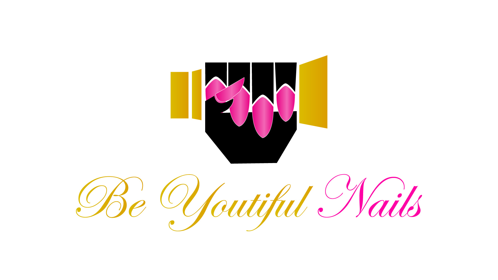
The only thing I will say is it’s very wonky. The lines are all over the place and some are so thin and that highlight is so subtle, I am pretty sure it will all blend together when printing.
What program did you draw this in?
Did you do any sketches?
Someday I’m gonna do a vinyl kit that shows designers what it’s like to weed type that looks like Balmoral in sign vinyl. Beyond that I got nothing. Way too much going on and way too many production issues. Not sure what the hand is holding either.
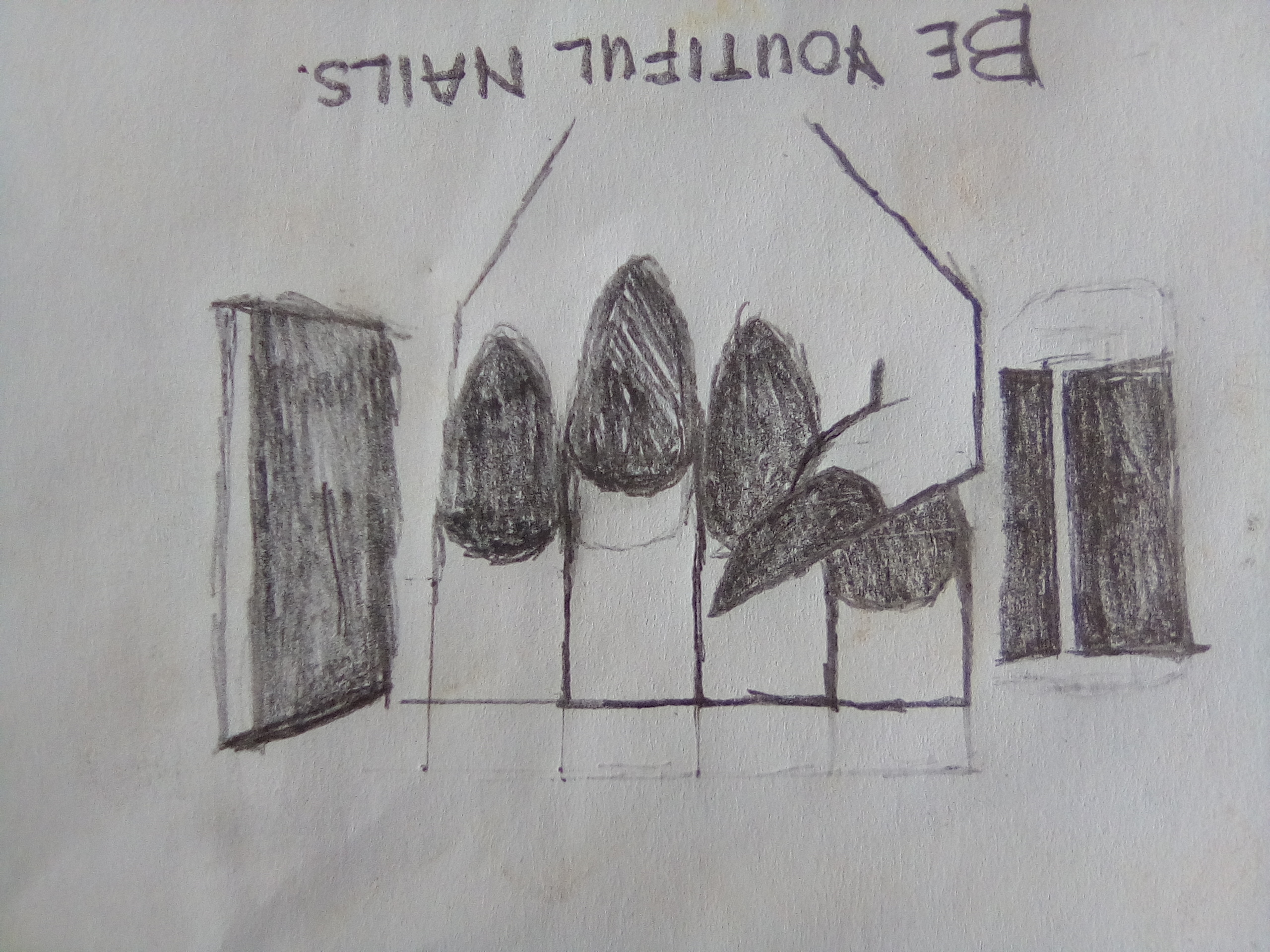
Ok, this just illustrates why we can’t critique this with any confidence.
We don’t have the details you do.
For one, this looks like a horrendous typo. Youthful is what it looks like it should read.
Without the BE in front of it, it just looks wrong, and even with the BE, it’s a stretch that doesn’t quite reach clever, but that may not be your issue.
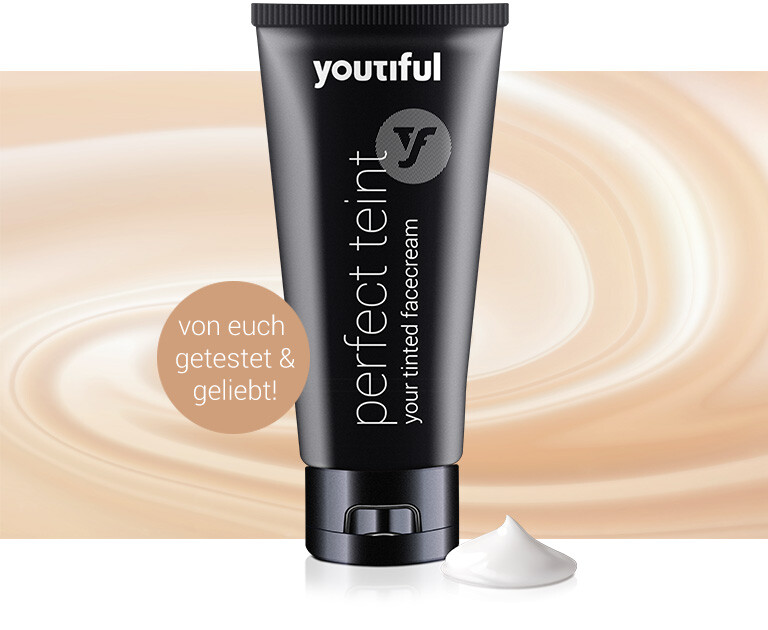
is it supposed to be “perfect tint?” That part of the label appears as though it is supposed to be in English even though the ad text is not. If it’s English, Face Cream is two words too.
What’s the brief or concept behind what you made. It doesn’t at all match the look of that tube. Is that tube the only thing they sell? Or do they have different products in different packaging? Is your thing a logo? an ad? a banner header? Who is the target market? Where is the target market?
I did not see a tube being held by the hand. All I saw were three gradient-filled polygons until you pointed out the tube.
The words beneath the logo says “Nails,” but what does a tube of face cream have to do with nails?
A hand does not look like you’ve drawn it — they’re not squared off at the knuckles. The fingers appear to be paper thin — otherwise the knuckles would be above the top of the tube, not nearly even with it. Logos don’t need to look realistic. There’s plenty of room for stylization but that stylization needs to be done in a way that looks aesthetically pleasing.
The way the hand is grasping the tube is awkward at best. A fist wrapped around a tube in a death grip just doesn’t have the right emotional tone.
The color combinations and typography leave much to be desired.
As others have mentioned, there are various technical problems that might cause reproduction problems in some instances.
I’m sorry, but this one is a do-over. I don’t think there’s anything here that can be fixed.