I’ve designed it, Please share your opinion.
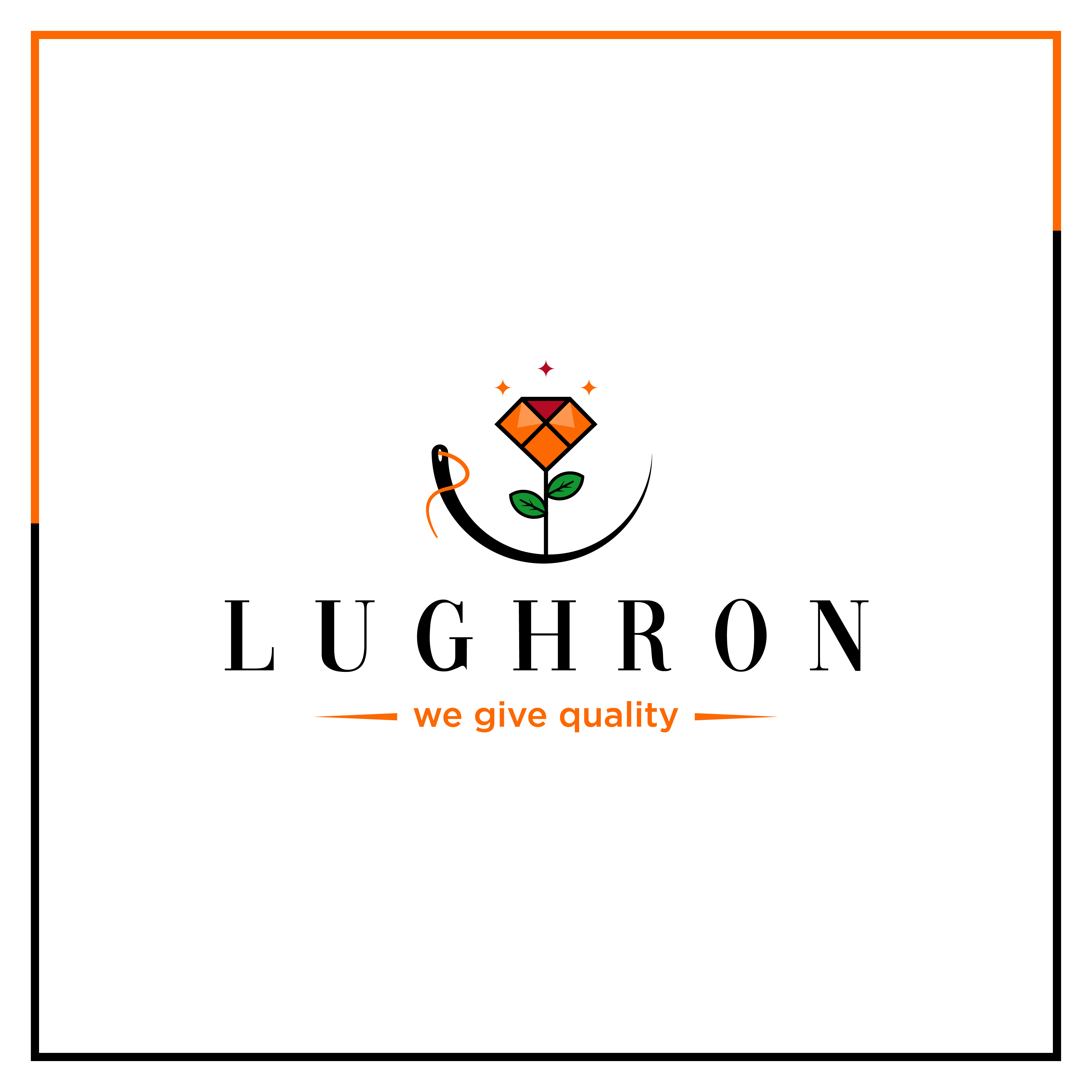
LUGHRON is a Gujrati word which means (clothes)
There are a lot of small details that could be problematic.
Is the frame part of the logo?
4 colors seems unnecessary.
There could be an element of language barrier here, but it’s a very good example of why taglines are just about always best avoided. “we give quality” is an awkward turn of phrase that adds nothing positive to the presentation, and in a literal sense, it’s untrue. It’s superfluous in that the quality of a product brought to market speaks for itself, and is implied, not to mention subjective; there’s no compelling reason to state it. Plus, unless the clothes are free, the company doesn’t give quality, they sell it.
Brother Frame is not a part of this logo.
Tough to give a thorough critique with no brief since we don’t have anything to measure against.
That said, I like the path you’re headed down: combining multiple elements to come up with a unique icon. However, I’d make two suggestions.
The first would be to simplify, simplify, simplify. Try to distill this down to the core idea. You have an aweful lot going on here: smiling needle, thread, flower, gem, and accents.
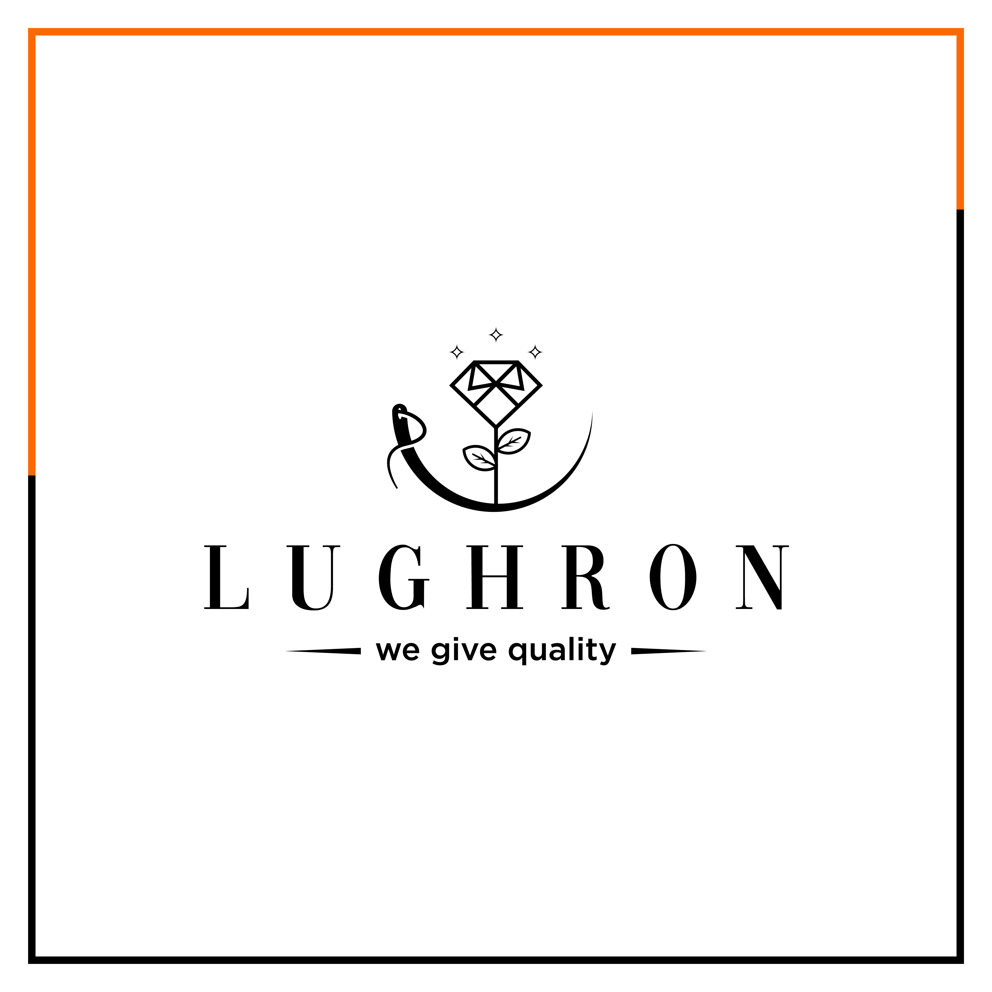
Secondly, keep in mind how well things mesh and go together. The LUGHRON type is a sophisticated looking face. To my eye, it doesn’t mesh particularly well with the lowercase Helvetica (or whatever face that is) tag line or the geometric, almost cartoonish style of the flower illustration.
I like your idea, i will try.
There are many things I like about this logo, but as Steve_) said, you haven’t given us much information. This leaves us with just being able to critique the aesthetics and practicality.
So from a practical standpoint, as other have said, there are small details that will be problematic at smaller sizes. The three little stars above the flower, for example, will just turn into three little dots as smaller sizes. Anyway, I’m not even sure why they’re there to begin with.
To me, a bigger problem is the tagline — it’s not standard English, and it would read as an oddly awkward phrase to most native English speakers.
Quality isn’t something that can be given or sold. Quality is an attribute of something else. For example, this clothing company might make quality clothing but they don’t give or sell quality — they sell clothing, which might be of any quality from high to low.
Since the logo contains a needle, a possibly better tagline might be, “Quality in every stitch.” Saying it this way, makes the word quality an attribute of stitch and by extension, the clothing.
I really like both the versions. Maybe “we give quality” can be in all caps instead of lowercase. I think it will tie the design together. But overall, I really like the use of colour and the choice of font. Bravo!
Hi Muzammil,
Your overall attempt is good. Border is not necessary in logo. The color combination is decent and thematic. The logo idea is unique too. Make it more inviting. Always keep your audience and their preferences in mind while designing a logo.
Through logo, your whole brand is defined. It should be that comprehensive. Keep doing your best effort.
All the best.
Thanks
I feel you are cramming too many ideas into one logo, but I really like that crystal which is also a shirt! I’d drop the thread-and-needle and the flower stem, and make the crystal the primary mark.
And as @HotButton and @Just-B said, I’d also drop the “we give quality” tagline.
This thread is 2 months old .. I’m sure the OP has moved on to another project ![]()