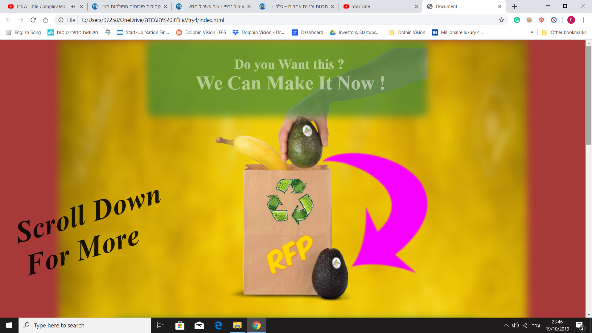
A fast sketch I built. The text is of course not real. Any thoughts? How would you make it greater? If you can improvise something simple/quickly for illustration I will be grateful. Any opinion will be accepted - colors, logo, fonts, etc.
I have no idea what this website design is about. It’s a blurry bunch of nothingness with a banana, two avocados and a paper bag. It makes no sense and seems to have no point. Sorry.
Hey, thanks for the reply. The product (the bag) can ripen fruits until 24 hours.
Meant for people that searched in Google for example: “How to ripen an avocado in 24 hours ?” and want to be part of a beta test.
Do you see zero potential in this design or there is something positive ? or maybe some idea how to improve it? If this too blurry what would you suggest to fix that?
Don’t be a worry for being too harsh, I just need an honest reply and ideas.
The bold, title case text looks amateur. Also, you really need to proof read, even if it’s just test.
As someone who buys a lot of avocados, I don’t find your website appealing. Take a step back and work out your brief including the demographic and the brand aesthetic. Research similarly placed products and brands.
Back to the drawing board on this one; there is nothing here to work with. Figure out what action you want the site visitor to take and then craft a message to move them towards that action.
After first looking at the design, I had no idea what the site is about. After reading your explanation, I still don’t get it. Are you looking for beta testers for a paper bag?
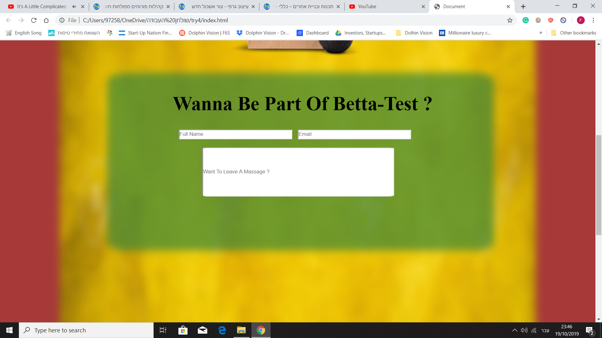
Setting aesthetics totally aside for now, your website needs to make sense to your target audience. At the very least, people need to be able to tell within a second or two what your website is about. Are you selling a special bag that ripens fruit faster? If so, you need something that communicates that instantly, like a brief headline. Then you need additional information that provides details. On the beta test form, you need something explaining what this beta test is about and what they’re signing up for.
Everything you’ve mentioned regarding the bag is missing from this website. I don’t see anything to represent ripening, gas, or time passing. Also, the choice of background color distracts from the image. This is a mess.
Here’s an incomplete list of what you need to fix:
Identify the selling proposition of your product. No one understands what it does, based on this design.
Who is your customer? I cannot tell and neither can they.
The design doesn’t support the reasons why I’d want to get involved. Even if you were not supplied final copy for the website, I should be able to understand the purpose of the product at a glance. You’d be better off having 2 bags, one with ripe and unripe fruit with the caption “3 days later” or something similar under the ripe fruit.
If you’re asking people to participate in a “betta-test” then you’ll need to find out what type of person that will be.
The term “beta test” is not used for physical goods. I would use the term “product testing” or “market research” instead.
The color palette is confusing. Use fewer colors and focus on ones that are part of the brand’s color pallette.
RFP is printed on the bag but never explained.
The typography on the top is not great. Likewise the tagline of “Do you want this?” is bad.
The fact that you have to spell out “scroll down for more” is a sign of bad design. You shouldn’t have to put instructions like this on a website this simple. This is a design problem.
The site contains no information about the company, its mission, or the product they’re testing. The lack of information makes it seem untrustworthy.
There is no styling in the form or a submit button.
The ONE goal is to communicate the idea that people can sign-up for a product test, yet, we’re struggling to understand the product itself. That’s a fundamental failure of your design.