Your opinion about my new website #2

Hey folks :slight_smile:
Last time I posted this before 20 days - How would you make my website better?
I tried a lot of changes and that’s what I came up with:

  • Smooth scroll down (More button).
  • First page purple lines + where h1 underline become bigger when mouse on.
  • The iframes/websites will be changed.

Your opinion/improvements are important to me, thank you very much in advance!

@Just-B
@Buda
@PrintDriver
@Steve_O
@SurfPark

I won’t have time to walk through the interactivity anytime soon, but just scanning the screen shots, I’d say you need the help of a writer.

1 Like

OK, I might sound harsh, but I am trying to help, so please don’t do hat I did and take my opinion personally.

  1. The opening page is a mess. The style I like. The execution is overbearing.
    a. designers rule of thumb - underlines should never be thicker than the thinnest line of the text to which it belongs.
    b. I’d delete the pink underlines from the headline. They are not working because they are causing the information below to merge - losing your headline and order of information groupings.
    That said, I don’t think you even need the first line.
    c. I like the black beneath the white text but it might not translate as well onscreen. The text should be centered visually - don’t use align tool with text (it’s never right).
    d. Use alignments wherever possible. Keep consistency throughout.
    e. Sample colors from your images
1 Like

I can respond from an Accessibility point of view - if you’re interested?

  1. User expectations are that things that are underlined are links. If the things you’ve underlined on the first page aren’t links, you risk confusing some users.

  2. The extreme contrast of the drop shadow white text on a pink background may cause issues for users with dyslexia

  3. A link with ‘more’ as the text could cause problems for screen reader users unless you hide text to explain what the link is

  4. On the contact form, when I enter the field the prompt (I assume) goes away? That means if I’m distracted or I have cognative challenges I might get confused about what I’m putting into the field. (Was it my name going in here?) Using separate labels above or next to the fields means users are less likely to get confused or lost.

You’ve also got some grammatical errors scattered throughout - but I’m sure you’ve got someone to help you out with that?

Hope that helps? I know this is a design forum, but I think Accessibility is central to everything we produce :slight_smile:

2 Likes

That’s a great tip, thanks!

1 Like

Another rule of thumb: avoid underlines altogether and use italics or bold type instead.

2 Likes

This time around, you’ve done a better job explaining to possible buyers what this bag is and what it does, but it still misses the mark.

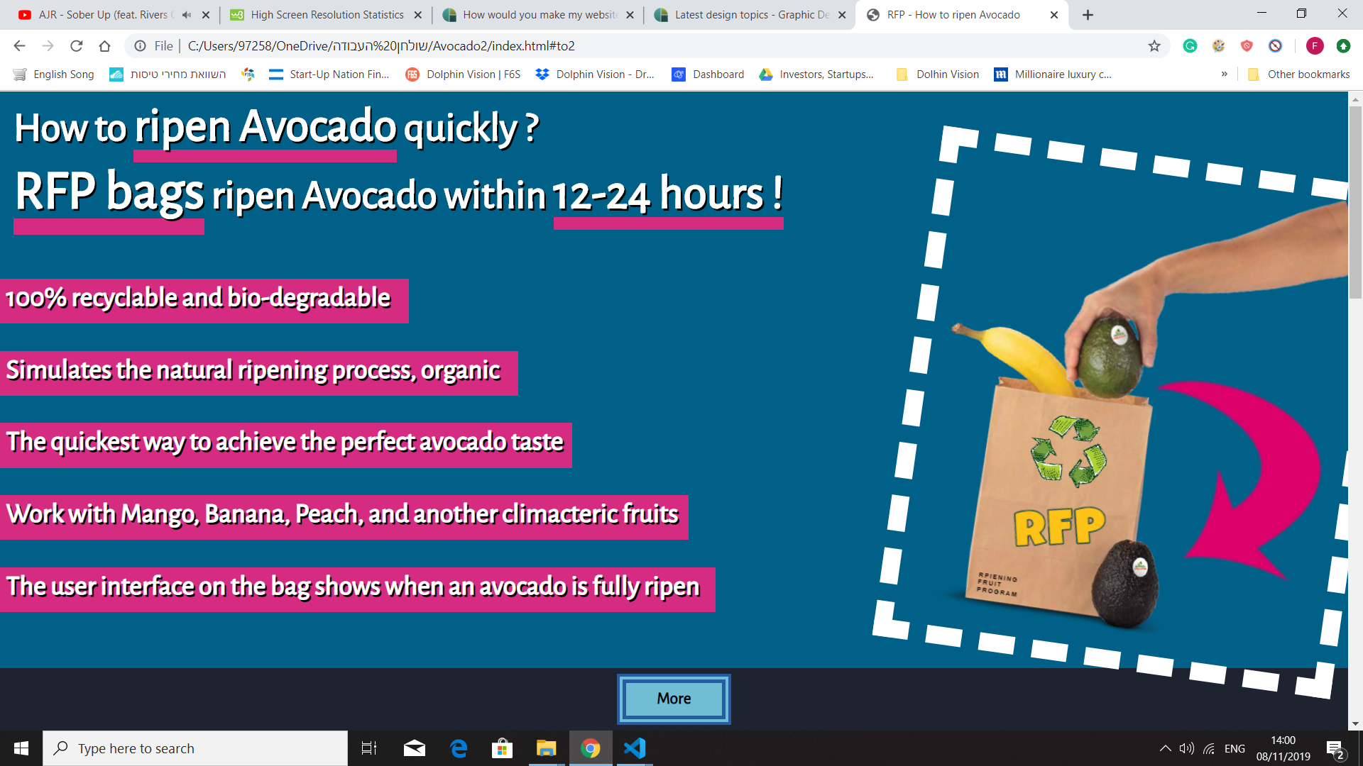
The headline, for example, focuses on avocados, but it’s not until well into the bullet points that it mentions other fruits. If it helps ripen a whole range of fruit, you need to say that up front or most viewers will just see the avocado headline and think that’s all it’s for.

What does RFP stand for? It’s a main design element on the bag, and it seems to be some sort of unexplained initials. In business, RFP is widely understood to mean a Request For a Proposal — it other words an announcement of a bidding process.

Don’t describe the visual instructions on the bag as a user interface — it’s confusing and is a geeky term usually reserved for electronic interfaces. I think you also need to tell people how this bag differs from just a plain, old brown paper bag

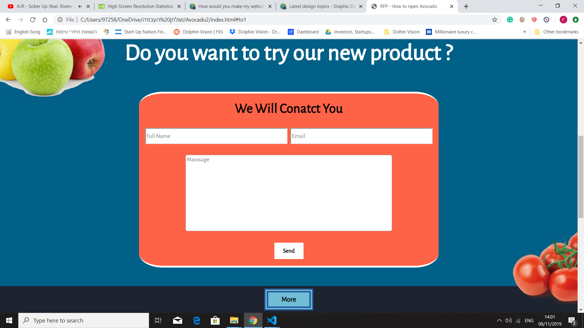
I think the second page will mostly lose all the potential customers who clicked through from the first page. Honestly, I can’t imagine very many individuals wanting to fill out a form that enables you to contact them about a paper bag.

Or are you aiming this at wholesalers and distributors who might buy bulk quantities of these bags. If that’s the case, you really need to clearly direct the message to them. You’re not intending to sell a few paper bags at a time, are you?

For that matter, the whole notion of someone filling out a form to be contacted will be somewhat off-putting to potential buyers. When people want to purchase something online, they usually want to keep it simple, find the information themselves and handle the transaction online without hassle. Hardly anyone wants an open-ended, back-and-forth conversation with the seller about an online purchase — especially about paper bags that ripens fruit.

You don’t mention how much these bags cost? People will assume they’re expensive (otherwise, the price would be listed) and not bother with it. You need to plainly state what you’re selling, why people need it, how much it costs, then enable buyers to quickly purchase it without the need for you getting back with them and haggling over details. You want to sell bags with a minimum of fuss, not carry on endless conversations about buying bags.

2 Likes

Agreed. Underlines are generally just distracting. If you can use a different font, semibold or color the text. All are better options.

1 Like

Agreed. People want the “Easy Button”.

When I was working at a national jewelry chain, we had a contest with the Grand Prize being a 4 carat diamond ring. Even then, people refused to fill out entry forms. This whole page can be a sidebar on the first page “To Request More Information, Samples, or to be contacted by a “wonderful” Sales Representative, click here…”

1 Like

@HotButton
@Neverman
@Julia
@Just-B

Hey, thank you all for the very detailed comments and the emails, you help me a lot. I really appreciate that. Again, thank you very much !

1 Like

As someone who does a lot with accessibility (InDesign/PDF files and websites), I am glad to see you brought this up here. More and more designers need to understand this.

1 Like