I scored 88.. am not sure whether that’s a good thing ![]()
1 Like
I also got 88 including 3 at 100%
1 Like
93
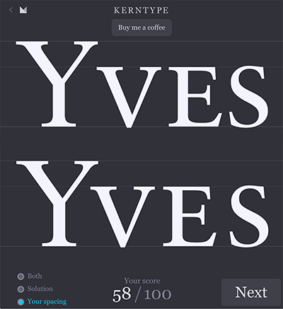
At the risk of sounding arrogant, given who devised the game, but I didn’t necessarily agree with all of them. The Yves one, I felt left too much space between he Y and v. There was another, (I can’t remember which now), that I felt slightly out too. Anyone else?
What worries me the most though, is that I actually find it fun. There are only so many people you can tell that to. It is only a small step away from being on the end of a station platform with a notebook and a sound recording device!!
3 Likes
It’s sorta like watching “printer porn” ie youtube videos of massive digital inkjets set to…uh…characteristic…music. Or so I’m told.
That thing’ll print 12meters x 50meters seamless! I’ve used it three times in my outsourcing life, but not that big.
3 Likes
Same .. I got 78 on that one because I spaced it right! lol ![]() Other wise it looks like Y ves.
Other wise it looks like Y ves.
I got 89% overall.
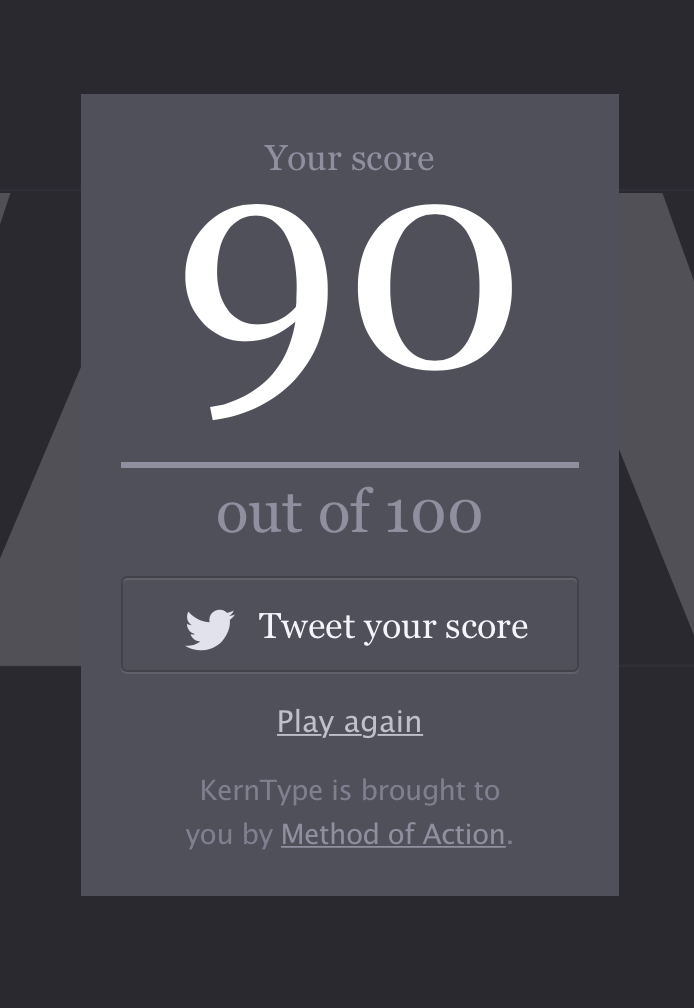
92%, and yes, I liked my kerning on YVES better than what they had.
1 Like
Pretty sure you’re in the wrong thread there buddy!
But yes, I’ve used something similar to that not long ago. I went to this digital printing place near where we have the offices. And from the outside it was very unassuming.
Once I got inside we were brought into this room that had gigantic floor to ceiling (100ft high) machines. And we went through the factory and looking around it was a massive operation!
We then got to the end of the factory and went through door only to find even larger printing machines. I was blown away.
Right thread. Sprout was discussing “guilty” things.
1 Like
I’ve run into this kerning practice website before, but like others here, I disagree with many of the solutions.
For example, the top one below is their solution. Mine is on the bottom.
I think much can be a matter of opinion. When kerning is way off, it’s easy to tell, but when it’s mostly right, opinions really start to differ. I can adjust the spacing on a word to the point where I think it’s perfect, then go away and come back to it in ten minutes only to find that I disagree with myself.
1 Like
I got 93%, and every score below 100% was a case where I’d disagree with their ideal. And, IMO, the predetermined word track (immovable last character) taints the exercise. I get why they had to design it that way, but it effectively shifts the focus away from the difficult pairs and prioritizes the whole word.
85/100
I agree the Yves had a bit too much space.
I’ve noticed lots of people like to put space between an initial cap and a following lowercase letter. Even lots of fonts are kerned that way. To me, it always looks a bit off, but again, much is a matter of opinion.
Doesn’t make it right though!!
The top, Y ves makes my brain hurt. It is surprisingly bad.
I did it first time and got 88, then I did it again when I knew what they were looking for stylistically and got 93, but I still prefer my 88 score.
1 Like
![]() Am glad I’m not the only one who did it a of couple times!
Am glad I’m not the only one who did it a of couple times!
The more I look at it, theirs looks better. Your solution (and mine iirc) has more equal spacing visually, but that is not the aim of proper kerning. The extra space between the capital Y and the v balances out the height differential. The slopes of the two letters move away from each other towards the baseline which looks odd at first, but look at the space at the top.
In my view, equal visual spacing is almost entirely the aim of good kerning. It’s the visual space between the letters and how that uniformity contributes or detracts from the uniform color of the word that matters. I don’t see the relative size of the letters, like a height or width differential, being much of a consideration in a well-designed typeface.
In those instances where that would come into play, there might be problems with the design of the glyphs themselves being inharmoniously designed to work with one another.
Apparently, there are many others who view it differently. Like I mentioned, the default spacing in many fonts contain extra spacing between the initial cap and the lowercase letters (or here, the small caps) that follow.
I found it fun too. I love doing kerning…it’s my favorite part of a project! Agree with you that a couple of these seemed off.
I am in Just-B’s camp. By the way, who died and made the creator of this thing, Pope of Design, anyway?
That’s true, although I think Kerning is one of those things in design (like visual balance) where there’s a degree of subjectivity to it.