Hi. I created a design for a relatives law practice. The design pentagram like as a way to convey words and truth are spells. I like it, but its a bit ridiculous. Any feedback would be appreciated.
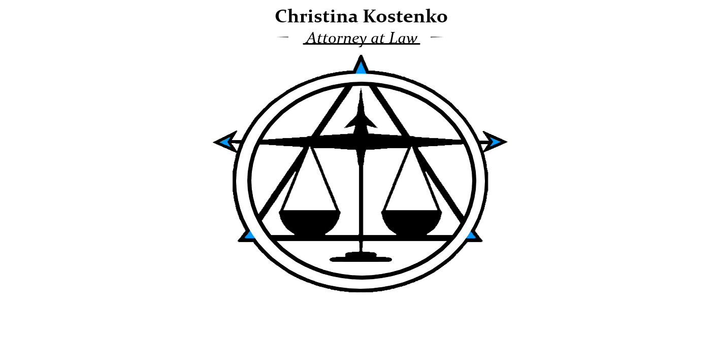
I’m having trouble following your words, but I don’t see a pentagram (a five-pointed star) anywhere in the symbol.
What do you mean when saying, “words and truth are spells?” It seems you’re trying to associate a law office with magic or sorcery, which seems inappropriate. I don’t understand your logic in any of this.
2 Likes
Uh. So there is five points. Law is essentially moral theory and philosophy. The word “law” binds you to a contract. You break law “word or words you go to jail”. I represent you in a court of law, I say words that will sway the opinion of a judge or peers in the direction of the, whoever. I guess metaphor has no place in here ey?
In any case, I just wanted help not for some asshole to just say its shit and walk away. Revisions, maybe this or that? Na just this. Maybe ill just be a simple tool next time
And empathetic my ass. Youre an asshole

3 Likes
You’re a self-described beginner. You’re here looking for help from those who work professionally in the field. Unfortunately, there’s nothing about your work that’s salvageable as a law firm logo. It’s conceptually inappropriate — a non-starter.
If you wanted people to lie and tell you your work just needs a tweak here and there, you’ve come to the wrong place. If you want compliments instead of critical analysis, you might be better off asking your mother or your friends.
6 Likes
Any reason you didn’t use a circle?
Why are the scales in the middle - for a scales they should be each end.
What are the arrows for?
Why use a Serif font?
Why did you underline and italicise Attorney at Law.
Back in the day - typewriters couldn’t italicise - so underlining was used instead to emphasise italics.
Have a look at some other Attorney at Law logos.
Just ask yourself honestly if it’s on par with what is already out there.
Ask yourself can you do better. It’s a serious question and one you should answer.
Forget about the computer - sketch your ideas on paper.
Post your sketches here.
Sketch 20 different versions.
Narrow it down to 5.
Then pick 3 that you really think work and do them on the computer.
But this isn’t working - it’s like something from the 1692 in the Salem Witch trials for an attorney prosecuting a witch.
Firstly; Bit rude! That response made me doubt whether you deserved the time of day to even write this, but as we all have to start somewhere… Buckle up, we’re in for a long night.
Did you want help, or just to hear what you wanted to hear. You got help. You didn’t like it.
People around here are always ready to offer free professional advice altruistically. Usually, they are very busy professionals, but with a belief that you need to put some of that experience back and help people in your position, they take the time. I wish, at your age I’d have had this kind of resource and been able to contact people who have worked in the industry at all levels with decades of collective knowledge.
As it happens, you had advice from one of the most experienced, knowledgable members of this forum and you chose to be offended and insult them, rather than listen to the words (ironically). Around here you are never going to get platitudinous praise when it is not merited. You will always get honest, if hard to take, objective criticism.
As to your work. To my mind, you are trying very hard to over-intellectualise it. You have to consider the people you are trying to communicate to. What do they want from a lawyer? It is definitely not pseudo-intellectual, over-complex guff. They need to trust that a lawyer will act with diligence, integrity and thoroughness to expose truths – unless of course they are the accused and actually guilty, in which case perhaps they do want obfuscation and semantics from their lawyer.
For now, let’s stick with integrity as the benchmark. This is where I would be going with it. Does the lawyer in question have a particular niche area? Corporate, Family, Criminal, etc?
From a practical perspective, your over-complicated, or rather, unfiltered, thought processes, have produced something that reflects this. Logos should be the distillation of a brand, a visual mnemonic. Visual brevity should always be strived for. Logos do not have to directly state every detail about that company. The have to be the glass that holds the liquid. Ultimately, once a brand is established they become the visual representation of brand ethos, they are not the brand ethos itself.
The relationship of type to icon is also some way off, I’m afraid. If you reduced that down to the size of a business card, it will be illegible. The icon itself has no visual coherence and despite all the rationale you used to justify it, ultimately it relies on a visual cliché as it’s main element.
The typography itself is an afterthought, when in fact, it should be the thing that works the hardest.
What stage are you at? Objectively, my advice has to be, go back to the drawing board, but I don’t want to be crushing if you are still in school. Then again, if you are, arguably, you shouldn’t be doing live, professional work at this stage anyway. It won’t do you any favours and it certainly won’t do the client any.
In short, though, I think you are running before learning to walk. Learn more, then attempt this sort of project. Right now, it is evident that your knowledge is lacking. I am not saying this to be punitive or hurtful. We’ve all been there. If I look at some of my early stuff, it makes my toes curl in embarrassment. We all start somewhere.
Are you still in school, at uni, planning on going to uni, etc? The stage you are at in your career will help us determine the advice you are given.
I hope this helps
3 Likes
Putting on the Admin hat …
You come to our house and act like that? With people only trying to help you? Another outburst like that and you’re out. You are lucky I didn’t see this last night before Just-B graciously responded to you again.
1 Like
That’s an eloquent way of stating what I’ve often had trouble explaining to clients. I might find myself quoting you at some point in the future.
5 Likes
Abusive language like yours, so abruptly to one of the greatest and most talented contributors to this forum (Just-B), only reveals your youthful ignorance. I wouldn’t give you the time of day.
This topic was automatically closed 365 days after the last reply. New replies are no longer allowed.