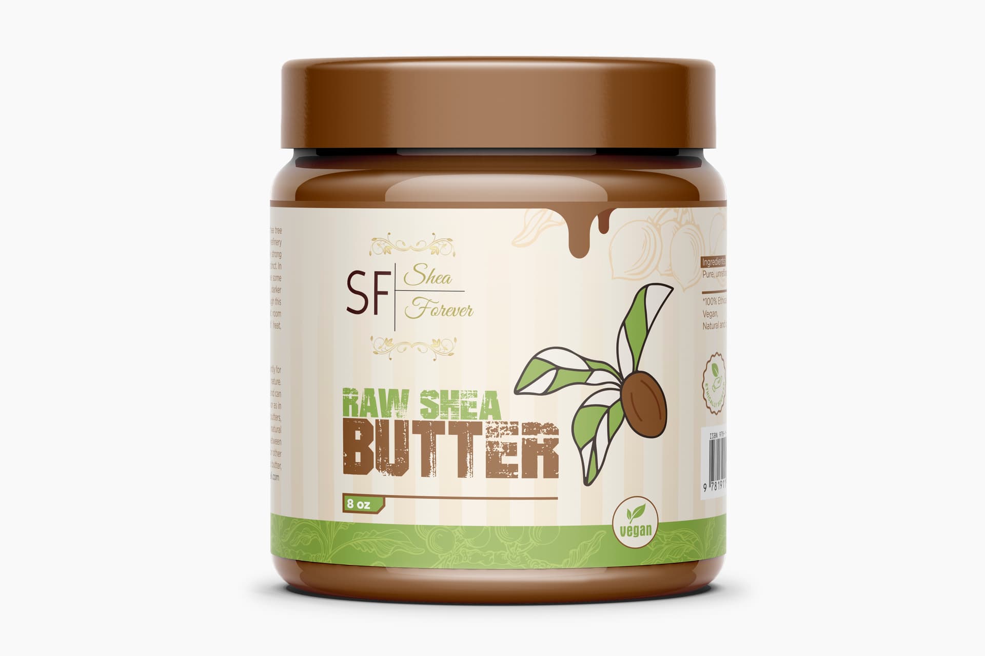
I’d say it looks like peanut butter or other consumable product packaging.
I’m pretty sure Shea Butter is for external use on the body - as a moisturiser or other skin health benefits.
It looks like you could eat this - so what am I missing?
I know you can eat it - and it’s used in cooking too.
So it’s confusing packaging as to who the end user is.
What do you mean by Consumable Product ? can you pls give me some examples ?
And Yes you are right it will use on body. but can you pls more define me how it look likes for eating?
I wasn’t especially familiar with shea butter, so I looked it up.
The label caused me to assume it was an edible spread, like peanut butter, marmite, or nutella.
I found that shea butter might be edible, but is more commonly used as a cosmetic salve. However, the packaging doesn’t look like a cosmetic. In a market, the context of where it was placed would clue people in to what it was for, but I also suspect that with this packaging, people might also try spreading it on toast.
Setting this rather important consideration aside, it’s a nice-looking label. I like the little drip.
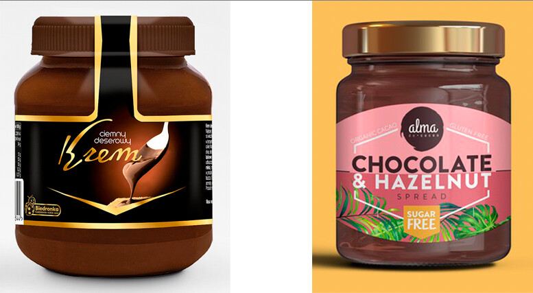
Food packaging looks delicious and tasty.
.
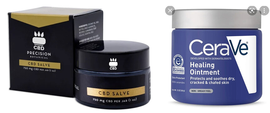
Salve and ointment packaging is more straightforward and unadorned with a vague medical look.
.
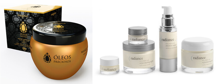
Skin care cosmetics typically use more elegant-looking packaging.
In addition, if the shea butter is used as a salve, ointment, or cosmetic, it needs to indicate that on the label.
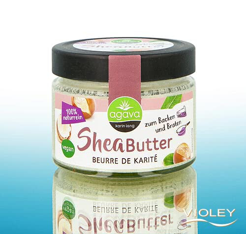
Here’s a cooking version
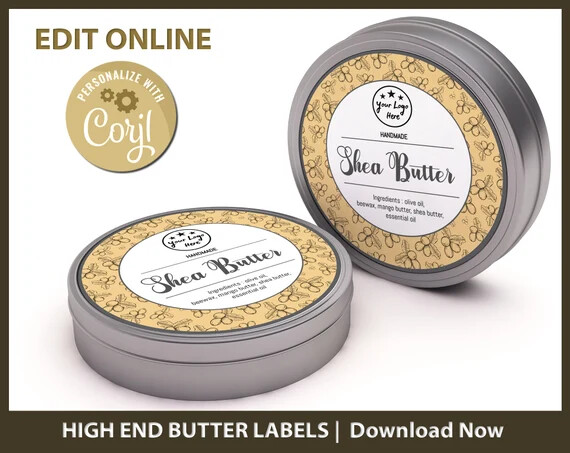
Here’s a cosmetic version
Just the general look of it - looks like a jar of peanut butter or chocolate spread - which I’ve already said.
Plus the drip down the side makes it look it is melted and/or spread onto a food or something.
Looks like it be - hey come and lick me
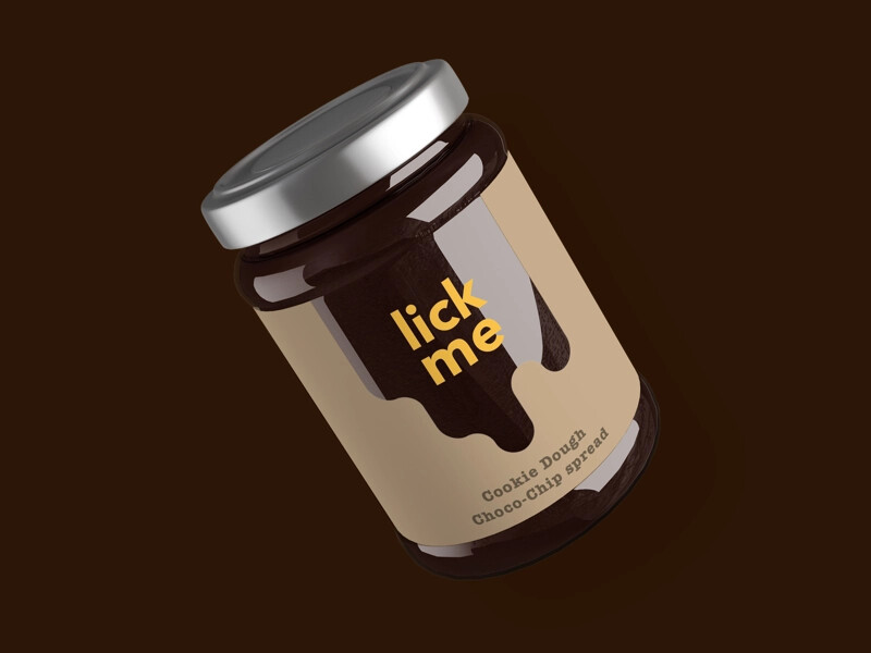
It’s a nice label - as already mentioned.
It’s just a bit confusing.
I’m not the target audience for this - so maybe some more focused audience members would have a different view.
I do like the label.
But should have something like ‘not for consumption’ or something clear on the label.
Short and sharp ![]()
- The brand is almost completely illegible (it’s so small and delicate).
- The distressed type for “Raw Shea Butter” makes it hard to read and feels inappropriate to me.
- There are so many conflicting styles of typeface on the label, that all send conflicting messages - it all feels very random
- As others have questioned - who is your target audience?
It’s pretty much all been said ![]()
The only other thing I see is it’s reading as “Raw Skea Butter.” The distressing isn’t working.
Definitely agree with this after viewing on my phone where the image is much smaller.