I am starting a graphic design business for small business branding. I am currently developing my personal brand. I’m open to any critiques + opinions!
In my opinion, you’re just decorating when you should be hand-sketching. Just you, a pencil, and paper; no color, no gimmicks.
2 Likes
Do about 100 more sketches. Then of those, pick 3 that will work and develop them more.
Right now, you got not much going here and all for various reasons all starting with Contrast.
Edit: Ha ha, sharing the same brain cell with HB
2 Likes
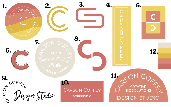
I think you need to establish what you want to convey with your logo, as your designs go in many different directions.
For example, some use tag lines like “Design Studio” and “Creative Biz Solutions”, which suggests to me that the logo is going to be used as selling vehicle. Where as others just have “CC” which suggests the logo is going to be one component of a larger selling vehicle.
Some of your logos use flowing lines to create a friendly, personal style. Others use stronger lines to suggest “power”. Some list your name (which again creates a personal aspect). Others use initials which seem more corporate.
These are all conflicting messages. So I’d start by defining exactly what you want to achieve. Once you’ve done that it will be a lot easier for you to come up with designs (and then also get feedback, because it’s kind of hard to give advice when it’s not clear what you are trying to do).
Also, when designing I’d think about how your work guides the eye. Because good design is all about controlling the eye, so if your logos struggle with that, it doesn’t help your credibility as a designer.
For example, logo 5 pulls the eye in different directions (with the Cs facing opposite each other), which is not really a great experience. For 3 & 8, it kind of looks like a rotated letter S, so you need to think about what that communicates. 1, 4, 7, 11, and 9 are awkward to read.
Don’t get me wrong. You’ve got a nice selection of colours and I do like how you have used shape and space. I just think you need to get clearer about what messages you are trying to send out. Hope that helps!
1 Like
Do you have a business plan? Usually in the process of producing a business plan, especially the part where you have to write out a prospectus, the focus of the business becomes a little more obvious.
1 Like
That’s very helpful, thank you!
I should have been more clear. I have been doing freelance design for a couple years, but I’m don’t want to pay the commission anymore, so I’m creating my own website to take clients through. I want it to feel like they are working with a human, so I do need to go in that direction. I agree about the letter marks being too corporate looking.
I’m going to go back to the drawing board and post again on here. Thanks for the feedback!
To my eyes 2. looks like the copyright symbol © and 3. blooks like the New Sheqel symbol turned sideways ₪. 6. just looks like the printing process got out of alignment.
I personally would choose something like 11. or 7. with a darker background colour and without the EST 2021.
I don’t like 1, 7, or 11 — sorry. The words suffer from serious legibility problems. Light, thin type on a light background is nearly impossible to read. Logos shouldn’t typically be packed down with words anyway. If you’re going after a seal look, make them look like a seal and not just circles with words in them.
Four and 10 have the same problems as 1, 7, and 11, but to lesser extents. Here you’ve switched to rectangles instead of circles and used fewer words, but the type is still too light. The contrast between the type and the light-colored background is still too weak. As a result, the legibility is poor.
2, 3, and 8 are more corporate, which is very different from the others. They also tell me you’re doing very little sketching, and that you seem to be just moving C shapes around on your computer.
What is 12? Is it even a logo?
Five, 6, and 9 could work, but they lack personality. Again, it appears you’ve just moved shapes around on your computer instead of coming up with a concept and doing lots of sketching. Number nine is interesting, but if you use script for a logo, it should probably consist of more than an out-of-the-box typeface.
In general, they all suffer from the same sorts of problems.
- You’ve decided on colors before deciding on the logo, which is sort of backward.
- Typographic legibility is poor due to contrast issues involving thin-weight typography and colors lacking contrast with that type.
- You’re apparently doing all your sketching on your computer since all your ideas seem to be little more than shapes that you’ve moved around. Get a pencil and paper, then start sketching ideas.
- Your ideas are all over the place. It’s as though you have no idea what kind of personality you want your brand to have other than with the colors you’ve prematurely locked yourself into.
Are you sure you’re ready to begin your own branding business? In my opinion, you’ve made serious mistakes and used less-than-good judgment in coming up with your own logo and brand identity. Honestly, and I really hate to say this, but I don’t see the experience, insight, technique, or maturity in what you’ve done to suggest you’re ready to begin selling these services to others.
If you were posting these as student work, I’d be more forgiving. But you’re struggling with a brand for a brand identity business. This is similar to an electrician going into business for himself who cannot wire his own house.
I know that this might be really long and might come up as a bit harsh but please bear with me. I’m just sharing my opinion as a designer whose focus lies primarily on branding.
From your initial post and from the lack of context, I wonder if you understand what “branding” means. It might sound stupid but a lot of graphic designers don’t really understand what “branding” really implies. It is, without any exaggeration, a huge body of work that contains many different disciplines. A “branding” project could include anything from strategical stuff like naming, positioning, targeting, etc. to visual developments to marketing. The end goal, however, is always the same: to create a system that could convey the values that a business (of any scale) is proposing to their targeted audience (be it B2B or B2C).
Now, if you are a brand designer, who’s working on branding himself or his business, you’ll have to treat yourself as your own client and have to answer basic questions just like those questions you make to your clients in a branding project:
- What are the services that you are providing? Would it be purely visual development (and if so, to what extent?) or would it be a mix of strategy, marketing, and visual development? What are your missions?
- What makes yourself unique? Which values distinguish your business from that of hundreds or thousands of other brand designers?
- Do you want to brand yourself as a designer or as an agency? Why did you decide to do that? Who are your clients and who do you consider to be your competitors?
- What are your visions for the upcoming future?
Answering these questions would give you a better grasp at what direction you should be aiming for, and ultimately decide the concept for your brand. For example, let’s say you are a brand designer who focuses on creating high-end brands for luxury businesses like jewelers, expensive wineries, high-end restaurants, etc. then your design concept will have to be more refined, more delicate. If you are a brand designer who focuses on creating brands for B2B financial or technological businesses then your branding will have to be bolder, more confident, more modern, or “contemporary.” You get the idea. Without deciding on any concepts, it’s hard to say what is the right choice for your BI.
Let’s put all of that aside and focus on your logo concepts: let’s be honest, they are all pretty bad. All of the concepts painted you, a graphic designer, as someone without a firm understanding of logo designing, much less branding. As @Just-B mentioned, some of the concepts are too busy, while some have serious issues with readability. Also, it’s very strange to start immediately with colors as brand designers usually start with pure black & white. It’s not a preference. It’s a common practice to ensure that your drafted logo is readable/recognizable and suits your business’s needs. Also, why do you want to include the sub-text “design studio” or “creative biz solutions” in your logo? These sub-text contributes nothing to your image and if anything, they make it harder to create an effective logo because by including all of these sub-texts in your logo, you subsequently kill its readability when the logo is scaled down to a smaller size (1 inch or less). And don’t get me to start on the weirder “est.2021” thing. Personally, I am against using it in any logo unless you need to emphasize the history/heritage of the business. If you want, try and study the logo of branding agencies from around the world: Pentagram, Wolff Olins, Landor & Fitch, Bulletproof, etc. They created big brands and big campaigns for huge businesses but they never try to over-complicate their own logo. Perhaps studying these businesses could help you to better define the logo you want to create.
Again, I’m really sorry if this comes across as aggressive but I sincerely hope that my insight could help you to determine your direction moving forward.
3 Likes
Ok, my 2 cents worth here. Number 9 is my favorite and here is my thoughts about the others:
#1 Color: The color is drab and off putting. It makes me want to look away. And number 7 is hard to read. Keep in mind that your logo needs to read and “feel” the same across several different mediums, print, web, phone, tablet…all of which show different color values. Don’t forget the client, it has to feel right to the client also.
#2 Your Mission. You state you are opening a graphic design business but in your logos you state “design studio” to me that is 2 different companies. You also state it is for “small business” branding. So, if a million dollar company came to you would you lock them out? Are you so set on “small” that you will give the impression of small and turn away big clients without knowing it? Then you added “Creative Biz Solutions” sorry, but in the 21st century that would include marketing and social media. Do you really have a true sense of what you want to do or are you throwing thing at a wall to see what sticks? These are questions you must ask yourself when creating your own branding. Above all you must be confident in your branding and it must reflect you. People can hire any company but why should they hire YOU? If you do not “Love” your branding and “believe” in it, that energy will be sent to everyone who looks at it. What energy do you want potential clients to feel when looking at you?
#3 Why I love #9. It is just black and black goes with almost any background. It has a clean “designer” look and feel and would look cool on shirts, b.cards and more. You could do some really cool animation with it for the web. AND you can replace “Design Studio” with really any title and it works.
Stuff to think about…hope it helps.