i need feedback in this portfolio project plzzz
what you guys think:
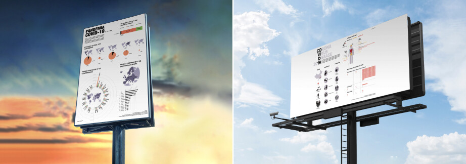
https://www.behance.net/gallery/131058305/INFOGRAPHY-COVID-19
i need feedback in this portfolio project plzzz
what you guys think:
https://www.behance.net/gallery/131058305/INFOGRAPHY-COVID-19
Hi Anaspage !
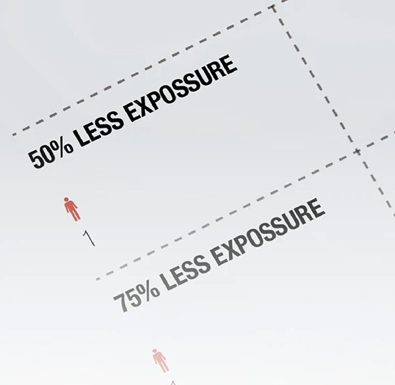
I like the infography about covid 19 but one there is one thing you should care, there are some letters like with black (very dark) and there are grey fonts which are the very light (i mean they are less dark). Make those grey fonts a little bit dark to just add some contrast. Just look yourself about the infography and compare the grey letters with the others letters and you will see they are very clear, i would suggest you to make them to look more like grey than clear.
The infographics look great, but I do have four suggestions.
![]()