Hi everyone,
I’m just new on this forum and I want to get feedback on my latest comission.
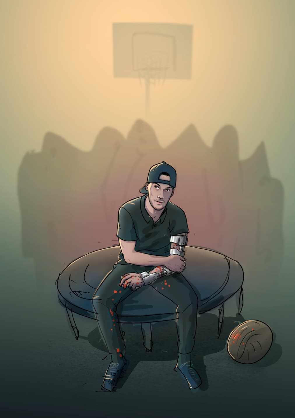
It illustrates a friend who had a creepy accident.
He wants to print it in a A3 format.
On the drawing, you see him seated on a trampoline, holding his broken arm. Behind him are the shadows of all doctors who help him in the recovery.
I wanted to make a bit of a dark atmosphere but being honest, I feel like there aren’t enough nuances in the colors…
What do you guys think?
I like your illustration of the fellow. But, honestly I wouldn’t know what you were going for here unless you told me.
I never would have known those were Doctors in the background. And I’m really confused as to how the injury occurred - was it from the trampoline, playing basketball or is that a rugby ball?
I like your illustration style; nice job. And I like the color palette. But it looks to me like the KKK is out to get your friend. Sorry; it’s just what came to mind. Also, I wonder why he still has blood all over his arm if this is post treatment. I’d think the doctors would have cleaned and dressed his wounds. Maybe there are blood stains on his clothes because he didn’t have clean clothes to wear home from the hospital. I could be nit-picking on the blood thing, but I’d seriously rethink the dudes in the white robes and pointy hoods. I suppose the one caveat would be that if you’re not in the U.S. and any reference to the KKK is completely lost.
Thanks for your quick return!
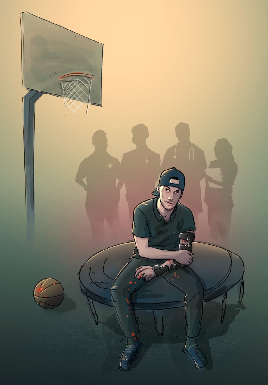
For the doctors in the back, I understand that it’s not clear. I’ll make their silhouettes more understandable in the process;)
For what happened, he jumped on the trampoline with the ball, targeting the basket but missed it and failed on the concrete and…broke his arm. I should make it more obvious on the drawing how it happened but I don’t know what to add for now
You’re totally right for the KKK XD
But for the moment, it’s still a sketch and I didn’t want to spend to much time on the background.
It supposes to be doctors and nurses that helped him after the accident.
You’re right about the blood on his skin, I’ll take it out and I might change his clothes for hospital clothes.
Thanks!
The illustration of the guy with the broken arm is great. The figures in the background are supposed to be medical personnel, but they don’t look like doctors and nurses. Instead, they look more like ghouls or people wearing hoods.
Why do you think they shouldn’t be changed? I’m interested in your reasoning.
I’d suggest trying a higher contrast in the subject/background/framing relationship. To me, the lighting comes off as ambient and passive, and I think you might want a more dynamic structure for the story you’re trying to tell. Color and brightness thereof are one way, but there’s probably a few other techniques you could use - you’ve got some focus contrast already, it just doesn’t feel like enough to me.
its a good point, but these days when pandemic is around, all doctors look like ghouls with the new PPE kit, not that I want to offend the doctors but visiting hospital itself is scary experience, especially considering sick people coming for check up and especially the emergency room, I had a weird experience when I saw people brutally injured, bleeding badly, that was horrific, personally I feel scared lol!
Hey, Martin!—Welcome to the Forum! Glad you joined us and I think you will find a lot of great input from the other professional designers who frequent these pages.
Getting to your questions, the shadows in the background do not look like doctors—they look more like KKK members on holiday, or Death Watch characters from the Dark Ages. I think a bit of (darkened) doctor garb in blue or gray, maybe stethoscopes too?
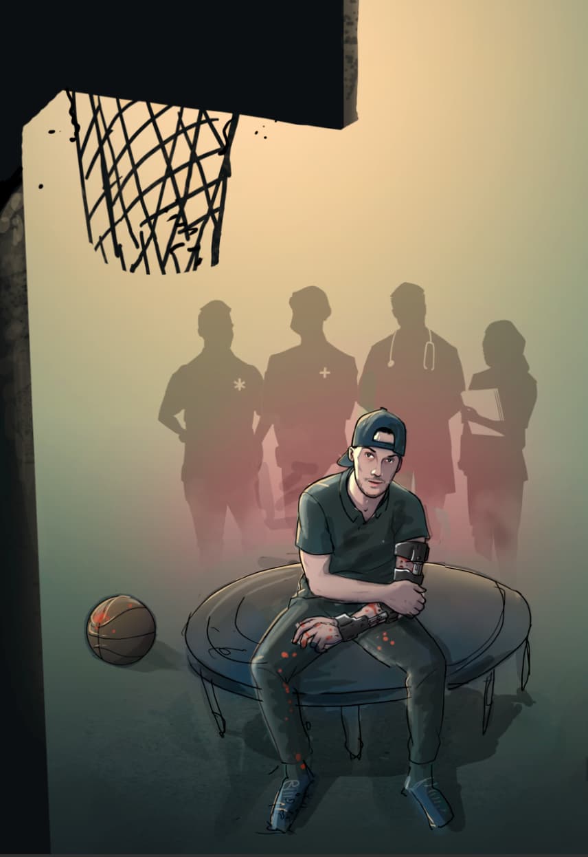
As far as the colors, the “nuances” are definitely lacking. Depending on how the image is to be printed, it may lose the effect I think you were shooting for. Speaking of shooting, the basketball backboard and net are not telling the story. Both it and the “doctors” need more definition. Remember, design is always about communication. If the image does not communicate, it needs adjustment.
One more thing—his left arm looks like he’s been fitted with a bionic arm instead of a temporary brace. Take the metal look out of it, and clean-up the black marks on the ball, so it communicates that it is indeed, a basketball.
I hope some of these suggestions help, but remember, I am only one voice on this forum and others may have better ideas for you. I wish you the best of success for this project!
Thanks for your input!
I’ve add more details into the doctors but don’t know if it’s enough… or not. I don’t want to make them the subject of the drawing.
I took out the metal look of the brace and put a real basket ball…
In overall, I’ve tried to make a story with the whole image… What you guys think?
I find the * and + on the two left figures to be distracting. I’m betting you’re trying to show them as first responders, but I don’t think they’re needed.
Out of the two, I prefer the first option. The backboard has too much visual weight in the second option.