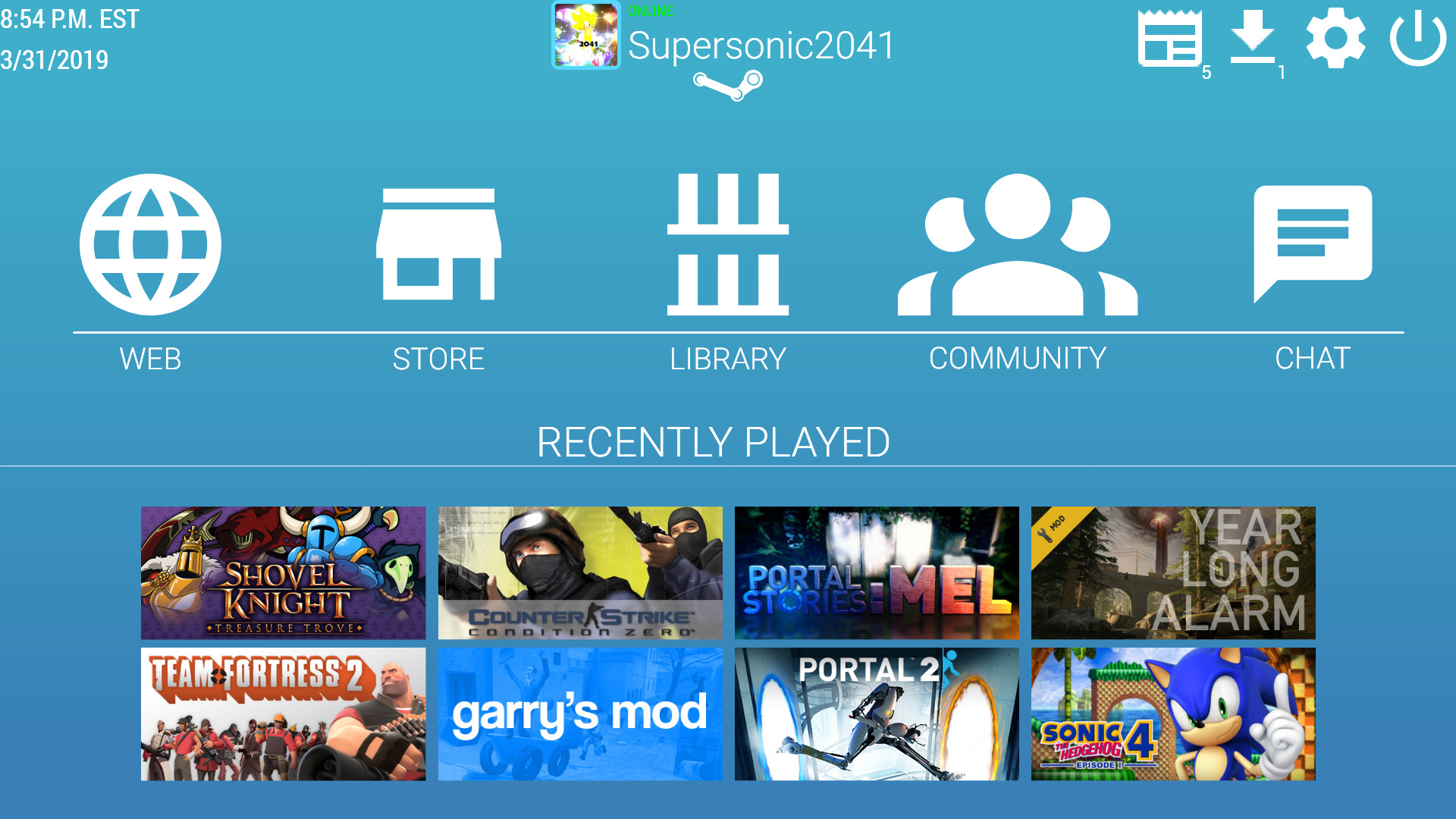
I spent last night and this morning recreating Steam’s Big Picture interface, giving the dark and grainy interface a lighter and more minimalist feel. Please, tell me what you think!
(This is what Big Picture normally looks like in comparison.)
Sources:
Game Images - pulled straight from Steam
Icons - Material Design and Material Design Icons
Steam Logo - Freebie Supply
Gradient Background - Hook Agency (Trust Me, I’m Blue)
I like the blue you chose, and I do think some of the icons are stronger than what Steam originally had.
However, I wouldn’t really call your version an update.
It’s lacking finesse. The icons, imagery, and text are too crowded, and most of the elements are too large. I also don’t think things are that well organized. Design doesn’t just mean “looks”, it also means “how it works”, and I think you didn’t overhaul or help the “how it works” part in your redesign. The badge numbers on the top nav icons are way too small, and the nav icons are too large.
Also, your time and date information / top nav icons are all “kissing” the edges of the artboard, which is really not attractive.
It’s nice you’ve taken the challenge :).
I’d suggest when designing a page like this, there are a few things to have in mind, that might make everything look a bit more compact, but also easier for the user to follow.
Try first designing a grid. Usually helps to have things aligned on a particularly interesting grid. For a redesign especially, helps to play around with it a bit more, so that it will look a bit more interesting. Check this guy out for example. He puts a lot of effort on the grid: https://www.instagram.com/rronberisha.grit/?hl=en
Overall size of the elements. Choose usually 2 sizes for the icons and stick with them. Then that size usually works best to be in a proportional scale with other elements.
Typography: usually for digital design, a slightly thicker font choice is necessary, unless you intend to use a very large point size. That is because screens with smaller resolution might lose some of the curves or straight lines of the type. Try to keep one to two sizes of type within the whole page/design.
Hope this helps as a starting point :). Would love to see the updates.
The arrangement is simple and easy to navigate, but it’s almost too simple, to the point it kinda lacks personality. Perhaps seeing how it changes as a user interacts with it would change that, but as a flat image it’s very plain. The icons are huge. I feel like they’re trying to punch me in the face.