
What is it and what are you selling?
That phone is really BIG for that guy’s tiny hand. (that’s a phone, right?)
If it’s a phone, is that how you hold one?
Guy is blurry compared to the rest of the imagery, need better resolution image of guy.
Clipping mask on the hand is poor.
Why is there an ad for a press in the top corner when you seem to be selling some kind of ‘test results’?
A sunburst? Isn’t that trend over yet?
As my Graphic Design teacher used to say, “Do Over.”
Honestly; it’s pretty meaningless and generic – and not particularly well executed. Quality of images and cut outs is pretty shocking.
Most of all though, without any indication of the brief and the problem you are trying to solve, beyond commenting on the practical execution, there’s not a lot anyone can say about how effective it is – or isn’t.
A person excitedly holding a giant phone is amusing and a good attention-getter. However, I have no idea what this is. I assume it’s an advertisement, but I’m unsure who it’s aimed at, whether it’s digital or print, or what it’s promoting.
The execution could be better. For example, the cutout of the guy’s blurry fingers looks pretty bad, but I don’t know what you had to work with.
For me the background is too shiny, the color combination does not make sense and more important that what do you try to sell ? is it a phone, service or gold ?
Guess it makes sense for the demographic - it’s something about basic education results in Africa.
Overall not bad composition, needs work like others have said, mixed resolution, and bad cutout.
But I don’t think it would detract from the use of the information which is pretty clear.
The whole point of a poster is like this is a ‘call to action’ and in this case it’s to call the number to get the education results.
And it seems to be a bit lost - the call to action needs to be stronger.
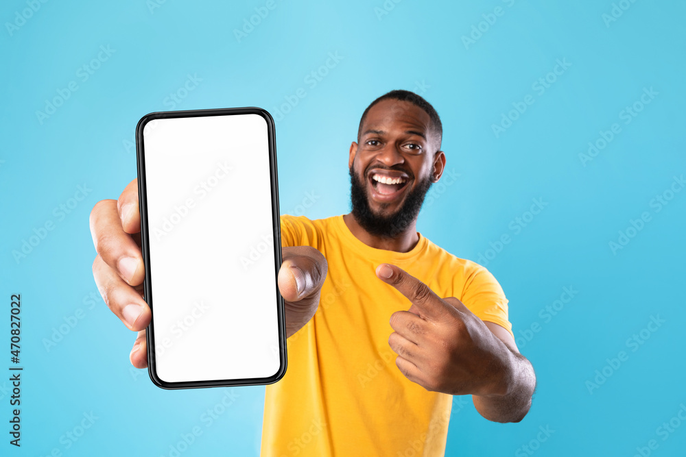
If you were to change the hand to a believable size then the man being out of focus would read as a normal result of his being out of the camera’s depth of field - you’d also need to change the background to a simple white to yellow graduation because the sharpness of the radiating lines would throw this effect off.
Your design makes more sense than the other. Here we know you are speaking about a app or a phone but the main one what I feel is that there is not focus on a product, what is he selling? i don’t but what I see in the other design it is so shining that it seems he is selling something like gold nothing else !