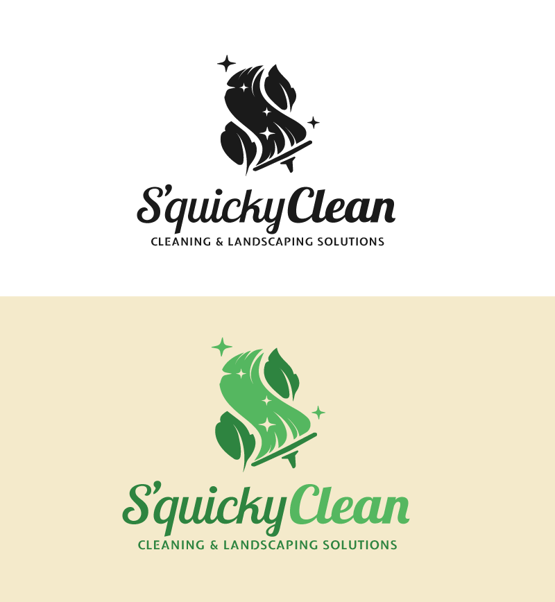
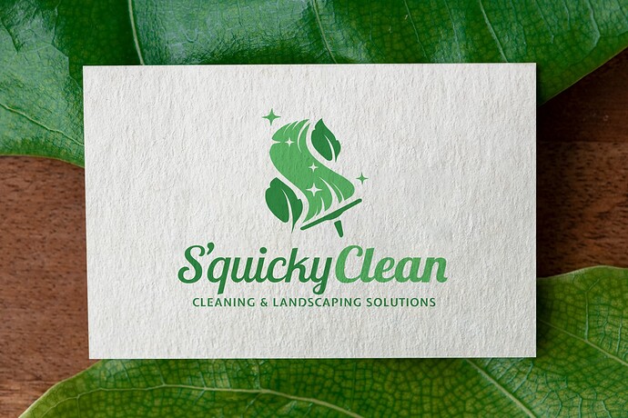
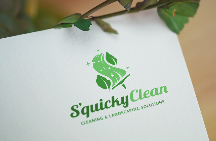
I’ve done logo design before, but it’s been many many years. I’ve wasted too much time trying to refine this design, going back and forth. I’d really appreciate your honest thoughts. To the pros I’d love your insights on how I can further polish this design.
I keep thinking it sucks and I’m considering starting from scratch with an entirely different concept
I don’t know. I’m kind of 50/50 on this.
I like that the tag line contrasts with the company name, but I don’t like that S’quicky and Clean are in two different weights.
I like the palette of greens, but I feel like the middle swish should be blue for water.
I like that you’ve found a way to merge cleaning and landscaping, but you end up with an awful lot going on. Also, there is nothing wrong with literal logos, but I don’t think a logo has to be literal.
Aside from those thoughts, it seems like an awkward combination. Are there a lot of cleaning companies that do landscaping or are there a lot of landscape companies that do cleaning? I suppose they are related if the cleaning is the exterior of a house (windows and power washing). But that’s not really your concern. Is this a project for a real company or real client or is this a self-directed project or something for a crowdsource or contest site?
I guess they clean the floor and mow the lawn.
What is the briefing?
I don’t like the name S’quicky Clean, but I’m assuming that’s not your decision. At first, I wondered if it was a spelling mistake until I realized the owners wanted the word quick included.
A logo for a company that combines cleaning services and landscaping presents some challenges since they’re two different things and, perhaps, two different audiences. You’ve understandably tried to combine the two in one logo using a squeegee and leaves, but again, it’s a weird combination that ends up being a little complicated and difficult to decipher. I have no idea whether the client would go for it, but I’d be inclined to do something a little less representational and a little more abstract and simple.
I wouldn’t use two separate weights for the name — especially two separate weights that aren’t that different.
I’m doing this for a friend of mine. They asked so nicely, I figured I’d lend a hand with the logo ![]() Not a fan of the name either, but I can’t change their view.
Not a fan of the name either, but I can’t change their view.
The company offers cleaning services for office spaces, hotels, and public areas. This includes room cleaning, facility upkeep, and more. Additionally, they take care of garden maintenance, such as plant care, planting, pruning, and overall green area upkeep.
First look I thought it looked like a sponge and squeegee which I thought was great for a cleaning company - perhaps in hues of blue. I only saw the leaves because their value is different when coloured green. The weight of the two names should be the same to create some balance. Other than that I really like the look of it for a cleaning company. Not your issue, but I just cannot put the cleaning and landscaping together as a business though. From a client’s perspective I would separate the businesses.
Is the client on this in love with the tag line?
it seems like something more along the lines of “site services” or “property management” might work better. Not particularly those words, but similar. Something that denotes outdoor maintenance, but not repair work.
Coincidentally, I ran across the word “squicky” used in a blog post I was reading a few minutes ago, so I looked it up. I found that it’s a slang word for something “engendering a feeling of disgust, distaste, nausea, or revulsion.”
I was unfamiliar with the slang word and have no idea how many people use it, but a Google search turns up lots of references to it — all negative.


